
Noted. (Relentlessly)
A conversation with designer and Footnote founder Alex Hunting. Interview by Arjun Basu
—
THIS EPISODE IS MADE POSSIBLE BY OUR FRIENDS AT FREEPORT PRESS.

Alex Hunting made his name as the design director of Kinfolk, the indie magazine that everyone loves, and has influenced thousands of would-be editors and art directors around the world. Which is why he was the guest on episode 17 of our sister podcast, Print is Dead (Long Live Print!). But that’s not why he’s here.
Along with Editor George Upton (also from Kinfolk), Alex has just launched Footnote, a “journal of artistic exchange,” in which writers are invited to, well, write a story which is then used as a prompt for a wide range of other writers and artists and illustrators to build and comment and add and create a magazine.
Now, this means a few things. First, Alex has no idea what will happen or how the magazine will end up. There’s planning, but there’s no flat plan, for you magazine insiders, because that comes much later in the process. And this lack of a plan includes, perhaps, potentially, the form the magazine might take. We’ll get into that.
Second, the magazine is organized via footnotes—yes, hence the name—but the footnotes are not organized as you might expect them. If there is an editorial eye, or a creative plan, it is in the arrangement of the various footnotes.
The result is baffling, stimulating, entertaining, and gorgeous. Footnote might be the most magazine-y magazine we’ve yet to present on The Full Bleed. It is a brazen experiment that plays with the idea of the magazine while being an oversized, tactile, designed editorial object. A magazine, in other words.

“I’ve always loved this idea of the muse.”
Arjun Basu: So Alex I think you’re the first person to appear on both of our shows. I’m not sure if that’s a badge of honor, or an indictment.
Alex Hunting: Very flattering.
Arjun Basu: I bring this up because I don’t think we need to go too deep into your backstory. I encourage listeners to pick up episode 17 of Print is Dead from our second season. But we should give an abridged version of your magazine work.
Alex Hunting: Yeah, I’ve been working in magazines for I guess pretty much my whole creative design career since graduating. So I did a year out when I was at university and I worked at a couple of places that were very editorially-focused studios.
And then when I went back into my final year, it was the thing that I was really excited about and really focused on. So when I left, I got an internship with a guy, Matt Willey, who I’m sure your listeners will know, at his old studio in London called Studio 8, and again, was just a bit more exposed to editorial design. I worked in another couple of studios and then I really started my own thing probably nearly 10 years ago.
It’s not that I’ve necessarily set out to focus purely on editorial, it’s that classic thing: You do one project and another one comes along, people see it. So yeah, I’ve worked on lots of magazines, but really, I guess independents, small budget, small audience magazines, and then also done work in brand magazines. So across lifestyle, luxury. Worked for some I guess fairly well known as well newspaper brands worked on supplements and magazines for that. But I love it. I absolutely love it.
I’ve always wanted to do my own magazine. I never really knew what form that would take, and ultimately it came to a point where it just felt like the right time to just have a bit of fun and launch this title.
Arjun Basu: Yeah, I think most of our listeners who know you probably know you through your work at Kinfolk. Kinfolk feels almost like the Velvet Underground of magazines. That joke about the Velvet Underground, that they sold very few records, but everyone who bought the record ended up forming a band. Kinfolk just feels like this weird nexus of a lot of things. The height of indie in many ways. So let’s talk about Kinfolk just a bit before we move on to why you’re here. What is it like working there? Because there’s a central sort of hub in Copenhagen, but you’re not there obviously. How does putting it together work? How involved are you, in other words, from the beginning?
Alex Hunting: Yeah, sure. I’ve lived through a kind of a couple of iterations of it. I got involved, quite a long time ago now. I can never remember the exact idea, but I was brought on to redesign it initially when they first moved from Oregon, from Portland, over to Copenhagen. And the founder, Nathan, got in touch and asked me if I’d be interested in redesigning it. And so I did it then and the team has changed quite a bit since then. So there’s a new editor, there’s a new art director, there’s now a studio team as well.
Arjun Basu: Was there a single thing that you had done that he said, “Oh, that’s the guy I want.”
Alex Hunting: Yeah, I think I’d just worked on the Rapha magazine—Rapha the cycling brands—so I’d just done a magazine for them called Mondial. And I think, obviously, they’re completely different sort of types of magazine and I guess there’s a bit of audience crossover potentially, but I think what they wanted to, it wasn’t just Nate, was to reflect it leaving its like American roots and being seen as a slightly more internationalist Europe, not necessarily European, but have a bit more of that flavor.
And I think in some of the designs that he’d seen that I’d done on a couple of things, he thought that could work. Because I guess some of the design principles that I feel like maybe that is in quite a bit of my work are fairly Kinfolk-y and it’s quite minimal and quite restrained.
But I think I wanted to move it away from being quite so bookish. I guess it was just very of its time, right? Like it was a reaction against a lot of the mass market kind of media, like very busy stuff. And it became a very stripped-back bookish format. And I think they wanted to refresh it a bit.
Arjun Basu: Total Velvet Underground thing. It was like punk in a way, but just clean punk. There’s this line of Scandi-aesthetics and Kinfolk is on it. All the restaurants in Copenhagen are on it, but IKEA’s on it too and that’s like the other end of it. So then we get to Footnote. It’s gorgeous and it feels like a lush experiment in form. What is it exactly and why does it exist?
Alex Hunting: I’ve got some amazing clients and brilliant projects that I get to work on, but they’re not personal projects, so there’s always a restraint. I often don’t get to commission necessarily the people that I would like to commission, or we don’t have time to conceptualize maybe some of the features or the pieces enough. So really it was just like an opportunity to just have fun away from the client work that I’m working on and collaborate with the people’s work that I love and admire.
I’ve always loved this idea of the muse. And so the concept of Footnote is each issue, we’ve commissioned a different piece of writing. So there’s a master text piece of fiction, and then the rest of the magazine is just a series of footnotes to that piece of writing.
So different contributors, photographers, poets, writers, illustrators, they all will pick a word, a phrase, a passage, a sentiment from that piece of writing, and then create a piece of work based on that. The magazine is a study of this text. So it’s a study of this central piece of text. I’ve just always loved that idea of being inspired by something very purely, and I’ve fascinated myself as to how the magazine will grow, change issue to issue based on that initial text.
And I think that the really exciting thing for me is thinking about seeing when it all comes back, seeing the writing, seeing the photography, seeing how it works together. That’s quite exciting for me. So it is just a project that’s just to push myself, have some fun, and work with people that I really admire.
Arjun Basu: You call it a journal of artistic exchange, which is both very true after I’ve read it, but it’s also very nebulous, and so it means that every single issue is going to be completely different. Everything hinges on the central text, but then it depends on the people who are chosen to comment on it. And so the central text plays such an important role. Obviously a design comes at the end, but at the beginning the editorial decision is the central text, so choosing that person and then curating the response. But the response is not something you can control at all.
Alex Hunting: Yeah, and that was interesting with it coming back, conceptually, because I should say as well that I started the magazine, but I’m also working with a brilliant editor called George Upton, he’s also the deputy editor at Kinfolk. George and I, we’re working on issue two at the moment, and we’ve just confirmed the writer for the second issue. Fingers crossed, it’s an amazing writer. So much of the work is that, particularly given that it’s so early as well in the second issue.
You want the writing to be different in style to the first issue. You want it to be different so that the magazine can, tangibly, really feel different in that second issue. And yeah, so much of the work is sort of reading, thinking about the right writer and then as you say, curating the contributors that we want to approach to then create work off the back of the text.
Because, for example, if we just had the same contributors on each issue, again, it’s not such an interesting project if it’s the same photographers. I want to be looking at contributors that I personally really think will reflect that text. So we get it back and read it and then we approach the contributors that we want to work on it.
Arjun Basu: And what do you tell them?
Alex Hunting: With the first issue, we had difficulty trying to explain it. It sounds very much as a sort of high school art project, really. But I think they get it. A lot of the photographers obviously, it’s refreshing for them in a way to have that freedom, to be able to pick apart a piece of writing and create work. It might be that they’re working on a personal project that has similar themes, that it’s something that they can expand on within their own practice.
So we just explain it to them. We just say, this is the text. You can do what you want. Pick a word, phrase, idea from the text. And the only way that is reflected really in the magazine is it’s just purely like a footnote symbol in the text. And then the footnote is just then expressed over however many pages, et cetera, whether that’s a photo story or a piece of fiction, a poem.
I feel like it works quite well for the first issue. And I’m hoping that it works. I do think that the challenge is curating that group of people.
Arjun Basu: What are your inspirations for this? It really does feel like something fresh. But it also almost feels academic in a weird way, the way we’re using footnotes here. But it does feel like the magazine is being pulled in a new direction. It feels incredibly experimental. And few people might be able to pull it off, very few people I think. Your credibility is allowing it to be thrust into the world. So what were your inspirations for this visually or even contextually?
Alex Hunting: It’s interesting you say that, sort of academic. Particularly for the first issue, I wanted to spell it out quite clearly for the audience what was going on here. You have the text up front, which is just the writing with these little footnotes. And then it’s very much like signposted throughout to signposted clearly, it repeats the extracts. The photographer or artist, whoever is responding to it, repeats it.
You see the series of images, you see the text, you carry on. So it was really about letting the work speak in that format. So I think the design is pretty light touch. It focuses on the graphic footnotes symbols. But it’s still a fairly light touch.
It’s really supposed to highlight the work. But to be honest with you, it felt right for that piece of writing, and it felt right for that first issue. But in my mind, personally, I don’t see a problem with the design changing at all, really, issue to issue.
If there’s a particular, I don’t know, dystopian or, I don’t know, something where there’s something quite strong design-wise that the issue can reflect, I have no problem with that at all. And I think that’s part of the joy of it. Like I want the issues to be different and to celebrate that piece of writing.


“It’s supposed to be a lovely object, something that doesn’t get thrown away.”
Arjun Basu: The whole thing feels like every editor or art director or anyone who’s starting up a magazine always talks about the thrill and the fear of the blank page when you start, when you have nothing. You literally have no idea where this magazine is going. From day one, you have no idea. I’m happy you said there’s no real visual template for this because even the visuals are totally based on how that text comes in. So it feels almost like a meta take on the construction of the magazine. If there’s a subtext to this, it’s about making. Everything starts with a blank page. Then you hand over the reins to the creators and, bang, it’s like a self-driving car or one that doesn’t crash. Or not, I’m trying to think of a metaphor here. Like a broken telephone, that game that kids play. You never know what’s gonna come out the other end. That is thrilling. Talk about handing over control.
Alex Hunting: You’re quite right because to be honest with you, the work that I did before, I was trying to design, like, what does this look like typographically, what does it look like, in format and size, all that sort of stuff. And then the initial writing comes back, you read it and you think, oh, it wasn’t quite right. And then even then, even the type of articles or features or whatever you want to call them, the layouts that I was designing for the concepts, again, they weren’t right either.
So you basically do have to start from scratch when that text comes in. But I guess, again, it comes back to it’s a testament to the quality of the contributors, like the responses that come in. The design’s holding it together a bit, but if the photography was crap or if the writing was rubbish it falls apart. It’s really been testament to that. And I’m excited by the idea of the design evolving. I don’t see it as being fixed. I really would like it to reflect the text so that each issue becomes its own exciting object.
Arjun Basu: So would you even change the format?
Alex Hunting: Potentially. I love that it’s oversized. Again, it’s one of those sort of stupid wasted-money formats, really. It’s supposed to be a celebration of print. It’s supposed to be a lovely object, something that doesn’t get thrown away.
And again, work on lots of client stuff where some have good budgets, some have bad budgets but you’re getting restrained by postage and really practical sort of things. And again, this was supposed to be something that was more enjoyable, I guess, for the reader. More luxurious.
Arjun Basu: It just feels great and it fulfills one of my edicts about how print needs to be printy-er with different finishes and everything. The previous episode of Full Bleed, or one of the previous episodes, we spoke to the editor of a new magazine called Elastic. It’s about psychedelic art and writing, and it also starts with a prompt. It’s more like a theme issue: it’s a word. And she then went out and called up writers and illustrators and artists to tell them what the theme was. She said none of the pieces she received was what she thought she was gonna receive. She loved it. It was the first issue, and it became very different by the end than what she had conceived of, even as she started to commission pieces. With Footnote, the serendipity is just built in.
Alex Hunting: Yeah, it is. And it is funny because when stuff starts coming in, you think, "Oh, this is great and this is great," and then one piece comes in, you think, "Oh, does that sit quite right with everything else?"
But you have to let that go a bit and trust that the themes that are getting pulled out by all the contributors is the thing that ultimately ties it together. Even if the image-making style is slightly disparate or the writing is a bit jarring. It is that serendipity.
The variety of approaches you can get to the text is interesting. And I think George did a really great job as well with choosing some of the writers, particularly some of the fiction. They’re just really delightful sort of little stories.
Format wise, I definitely think it can change. I was thinking like it could easily be, if it’s appropriate, I don’t know what it would be, but, I don’t know, something a piece celebrating, I don’t know, about childhood. It could be a tiny format, like there could be lovely little things. That could easily change,
Arjun Basu: That first writer has so much power in their hands. It’s really quite amazing. So who do you think the audience is for Footnote?
Alex Hunting: Hopefully bigger than the sales, which suggests currently.... no . Photographers, writers, anyone that’s interested in the visual arts or writing, really interesting new writing. I think it is a concept. It’s not a current affairs magazine. It’s not a lifestyle magazine. It is essentially a sort of art project. But I do think it’s interesting and I think that we’ll see where it goes and where it ends up, but it’s quite experimental.
Arjun Basu: All of the above and, but also I think people are just interested in the magazine period. Magazine lovers, because it is, to me, a very meta sort of experience about the magazine. Even if you don’t know anything about it. It is this weird concept. But you figure it out, page three or four, you’ve figured it out,
Alex Hunting: How quickly did you get it from picking it up?
Arjun Basu: I did what everyone does the first time they pick up a magazine. I flipped through the pages from back to front. You don’t say what’s happening completely. You do allow for discovery and so you treat your reader like the intelligent people they are. And then, you start the story, but you realize that the page opposite it is your footnote symbols and the footnotes and it functions like a TOC, a second TOC, and then you start reading it and you see the symbol. So it took me about the first or second paragraph to figure out how this was gonna work. I’d read the editor’s letter but it was still conceptual until I saw what was going on visually. You can read this magazine many times. You can experience this thing in vastly different ways every time you look at it, depending on how you attack it. It’s like its own little rabbit hole. It is like a closed loop. The first time that I felt like a magazine functioned, oddly enough, even though it’s a very print-y magazine, that functioned like the internet.
Alex Hunting: In what sense?
Arjun Basu: The footnotes feed onto themselves. Now it’s a limited thing. It’s not unlimited like the internet can be potentially if you just click on every link. You have to go through a lot of decisions. Am I gonna read this text completely right away, or am I gonna start going to the footnotes? When footnotes are at the bottom of the page, it’s very easy to just find them and see the backstory. And some writers create incredibly long footnotes, and so you realize you can’t really do that and you might do it at the end of a chapter or whatever. It also depends on how they’re designed. Sometimes footnotes are only at the end of the chapter and sometimes they’re at the bottom of the page. So you could, if you want to, go from page six to page 74 and see what the result of that is, or you can ignore it and you can also go backwards. Once you’ve read that first text, you can go backwards and reread it in many different ways because you’re seeing it in different ways because you’re reading different interpretations of, sometimes it’s a word, like you say, sometimes it’s a feeling. So it was an experience as opposed to a book. In that sense it was 3D.
Alex Hunting: Yeah. That’s good to hear. A lot of it, as you say, is the experience of how you’re navigating it, right? Because you can, as you say, use that like a table of contents and you can, if you are reading the text and you see that footnote symbol, you can think, "Oh, I wonder how they responded to that."
And you can go and see it. That’s probably a more disruptive way rather than just reading the piece of fiction. But you can reread it. That was because one of the only real bits of curation that is done is the fact that the footnotes in the rest of the magazine, I didn’t put them in the order that they appear in the text.
That’s probably the only really hard bit of curation. That’s just about the normal magazine making experience of pace, right? Pace and kind of when you want a visual, like a pause when you want it to feel a bit busier, people versus different types of image making. So yeah, that’s the only real kind of heavy bit of editing in there.
Arjun Basu: Then I was thinking about your studio because your studio, of course, does a lot of brand work. Editorial, consultancy, visual identity. Client list is broad, major brands, cultural institutions. I do brand work as well and the heart of a brand is the storytelling core that you build around that nugget. And so it also felt like a brand experiment, this whole thing, because when you do the brand work, you have the nugget, the heart, and then you work your way out and see how it radiates. What was going on here seems to be the prompt. And I think prompt was the key. To me it’s a magazine about magazines, but it also feels like this thing about brands or at least it’s influenced by the work you’ve probably done for brands in your studio.
Alex Hunting: Yeah, I think that’s probably true. I think we normally try to define pretentious language, sort of design territories or editorial territories for particular projects. So things that we want to pin structures on, or the way that we will put together the magazine, the details, the typography, the space, is normally informed by a core strategic idea.
If it’s a brand magazine, it could be a strategic line that they’re working with that they’ve given us. And it could be a concept that we’re pinning how we interpret the brand. So yeah, I think that probably all feeds into how, I guess, I’ve approached this personal project as well.
The idea is quite pure, it’s not muddied that much along the way. I’m glad that you understood it because in my mind, it’s quite simple. It’s a piece of writing and then it’s a series of responses to it. But I appreciate putting it together. You hope that comes across, but yeah I think you’re right. I think it is similarly influenced by the way we approach other projects.


“Digital media has destroyed my ability to read the way that I used to be able to. It’s something I’m noticing so much—in a shocking way, actually.”
Arjun Basu: I want to go back to the idea of what I said before about this magazine being both print and digital. The internet made everyone stupid. Especially people in the magazine world. And the panic was understandable. When it became clear that the internet was this crazy, powerful thing and the ad dollars were obviously gonna go there, a lot of bad decisions were made because people weren’t thinking clearly. One of them was that magazines tried to emulate the internet on the page, which was stupid because they couldn’t. I thought print should get printy-er, like I said, and I probably said that on the show many times. So Footnote to me becomes this interesting thing because it’s not a combination of print. It’s a very print-y magazine like I said, but it also has this digital sheen to it. The footnote exists in both worlds. When I was in the agency world we were rebranding. We had merged actually with an agency in London and we were rebranding and we came up with the word “bookmark” because it was also a word that bridged both. How much of your print work is influenced by what you see on the web?
Alex Hunting: The only time to be perfectly honest with you, and it’s pretty much my favorite time of the week, is when I read the newspaper on the weekend—the print newspaper—and then I get it delivered and it comes on the weekend and if I have the time, which normally I try and carve out to do it, but the rest of the time, like everyone, I’m news apps constantly.
It is an amazing way of consuming media. It is more practical. So I use a lot of that stuff. I’m really aware that I’ve got all the different news outlets. So I consume lots and lots of it, so I think it’s probably just seeping in, that sort of digital media. I don’t know in design how much, it’s come into magazines and newspapers quite a bit as well. Like digital design has seeped in.
I remember when The Guardian designed quite a few years ago. That, to me, feels like a very digitally influenced piece of print sort of design. I guess it’s navigation, like UX design, I guess you would call it, crept in a bit more. How much has it influenced me? I don’t know. I’m not sure. I guess a bit. I think I’d probably package things a little bit more in design in ways which probably feel slightly more familiar, in a sort of digital design context than maybe even I used to. Yeah, I’m not sure. That’s not a good answer, is it?
Arjun Basu: I don’t know. I don’t think there was a good or a bad answer to that. I was just musing aloud but it’s something I think about a lot. Footnote really brought that out to me. I was thinking about how it almost felt like the rabbit hole that you go on, that you can fall into when you’re on the web. Even the way the pages were, it functioned as a whole, but some of the pages had this great movement, for example, and some of the pages were quite traditionally print-y, static sort of things. It felt like a world, let’s put it that way. A lot of print magazines don’t often feel like a corner of the world and they can be very powerful corners of the world. But Footnote just felt more expansive. And so it had that feeling of, even though it’s confined to these covers, that it actually is larger.
Alex Hunting: When I first was thinking about it, I was toying with the idea of having a digital edition more because it lends itself, as you say, it’s sections of text, things being pulled out. You can imagine how it could translate into a very interesting digital experience. If you click on something you’re led into seeing this, then you know, you bounce back to something else. I think as a development, we do quite a bit of digital design and I think as a sort of digital design development exercise, it would be really fun.
But I bounce around with that because digital media has destroyed my ability to read the way that I used to be able to. It’s something I’m noticing so much—in a shocking way, actually.
And so actually part of this as well was also me wanting to focus on it being in print and something that I can enjoy reading on the page. I still think anything more than, 500, a thousand words, you just really shouldn’t be reading on your phone
Arjun Basu: Well, the writer in me agrees with you a hundred percent and the editor in me agrees with you. Despite everything I’ve said about how this made me feel, I think this should be a print product, I don’t think it should be both. I think you’d have to rethink the whole thing. You’d obviously have to rethink it from a design point of view. There’s a hundred questions you’d have to ask with every word almost, but it would lose its power if that existed.
Alex Hunting: Good because, not enough hours in the day to do it. No, I think you’re right. I do think it’s an important question to ask. I love print to bits and it’s a core part of all of the design that I do. But there are lots of things that are just better to consume digitally. And yeah, I guess this just wasn’t it.
Arjun Basu: You kind of work in these parallel worlds. I don’t even know if they’re parallel, you have your magazine work and then your editorial work and then you have your brand work. You’ve probably thought somewhat about the future. Of the magazine as a form. So what is it?
Alex Hunting: I’ve never worked at Condé Nast or Hearst or something like that. So I guess I’m not as exposed to the conversations that have been going on so much for the end of print and that sort of thing.
Because I guess the clients and the projects that I work on tend to be smaller brands and those are companies which are deliberately making that choice for print. It’s not: should we get rid of this thing we’ve always done and do it digitally, or let’s cut this marketing expense.
They’re aware that there is something that print can do that digital can’t do. It often represents a high point of editorial output that they really want to celebrate. And so luckily that’s often the people we’re working with, like Rapha, or it could be a hotel chain, or it could be something like that. But often it has a real purpose. There’s an audience for it. So yeah, I’m very buoyant really about the future of it. It’s a cliché.
People use this example all the time, but podcasts, which is a new format, but it’s essentially radio, recorded radio. Listening to the radio is one of life’s real joys for me. And TV didn’t kill radio. I guess the days of massively lavish newsstand titles are maybe gone. It is certainly not the case that lavish sorts of luxury magazines are gone because you only have to go to MagCulture or any of those places and see the insane proliferation of those sorts of titles.
The reaction against those titles is something you still see. They’re still kind of corners of society or special interest titles. So I think it’s quite buoyant. I think the independent sector is really great. I think the brand magazine sector is really exciting. Like I can only really see that being, more and more if a brand’s got like a clear story to tell.
Arjun Basu: A hundred percent. If a brand wants to get into print, then they’re a smart brand to begin with. Like you want to work with them no matter what they do, because they’re smart, and it’s probably the brand person that’s winning an internal argument rather than the marketing people, because brand is such a long-term engagement.
Alex Hunting: There’s something, it is such a cliché and it often feels like when you’re having these conversations, you’re preaching to people that understand it. But I do think it’s true that anyone who’s not in this world, they might work in the corporate world, they could be an investor in something, or if you hand them something tangibly that you know that they hold and they can fill it, they will often understand it. And if they can understand the value of something that’s gone into it in a way where if you send them to a microsite that’s been designed, it doesn’t. There’s something that people inherently understand when they hold something thick.
Arjun Basu: This is why luxury brands still understand the value of print because it’s how they value their goods. And hotels too. Same thing. Hotels are all tactile experiences. Otherwise it’s just places we sleep. Hotels are all brand and so are fashion brands and luxury brands, and so they’re the ones who get it.
Alex Hunting: Yeah, for sure. But also I’m convinced that there’s more to the brand magazine world. I’m amazed that I would love, say, like Patagonia or, there would just be some brilliant brands that you think, wow, if you got the right, got a team together the stories that some of those sort of brands could tell, and the access that some of them would have, whether that’s, I don’t know, athletes or politicians or whoever it is, there could just be some amazing magazines. Do you know Colors magazine from years ago?
Arjun Basu: Of course.
Alex Hunting: Yeah. So obviously that’s not like Benetton’s magazine, but it’s essentially a magazine from them and that’s such a good, again, example of a philosophy that a brand brought to print, and it’s probably one of the most interesting magazines that I can think of in the history of it, in terms of visual arts and storytelling. I think it’s quite exciting. I’d love to see more brands come into it in a big way.
Arjun Basu: Wouldn’t we all. I think Patagonia, I don’t know if they still do it, but they had a magazine for a while. We could go on talking about just brand magazines forever and maybe , we’ll get a panel together and do that at one point. What are three magazines or media you’re digging right now?
Alex Hunting: Oh oh, The Fence. It’s a British satirical a bit, it’s a bit like a younger version of Private Eye. I dunno if that’s familiar, it’s an American audience, but it’s like a satirical British sort of current affairs magazine. Has great writing. It’s really cutting. Can be quite sarcastic and rude. But just a lot of the pieces laugh out loud and it’s a great format. It’s a weekly, like a New Yorker, throwaway format, and it’s two-color printed, just black and orange. Quite text heavy, but just with one illustrator that kind of runs like throughout. But it’s in that old style of weekly news magazines. And it’s really beautifully designed. See, I love that. Have you come across that? Did you get that?
Arjun Basu: People have mentioned it on this show for this very question. So I have seen it and the first time someone mentioned it, it was the first time I saw it and I’ve never held it in my hand, but I know of it, yes.
Alex Hunting: So yeah, that’s great. I just love that format as well because it’s very, you can just take it anywhere, chuck it in your bag, like the opposite. It doesn’t have that same value. Yeah, I love that. What else? This is for very different reasons, but, so M, the magazine of Le Monde, there’s now an international edition of that, so that’s the Saturday magazine.
So again, it’s one of those I admire, hugely admire the design. From the magazine, it’s the, yeah, the weekly magazine of Le Monde. But obviously I can never normally read it because it’s in French. So I purely liked it from a design point of view. And now they’ve launched this international edition, so it’s so nice to be able to enjoy it. And it’s just like they’ve got such brilliant photography. There’s brilliant photography, great art direction. So yeah, I’ve been really enjoying reading that.
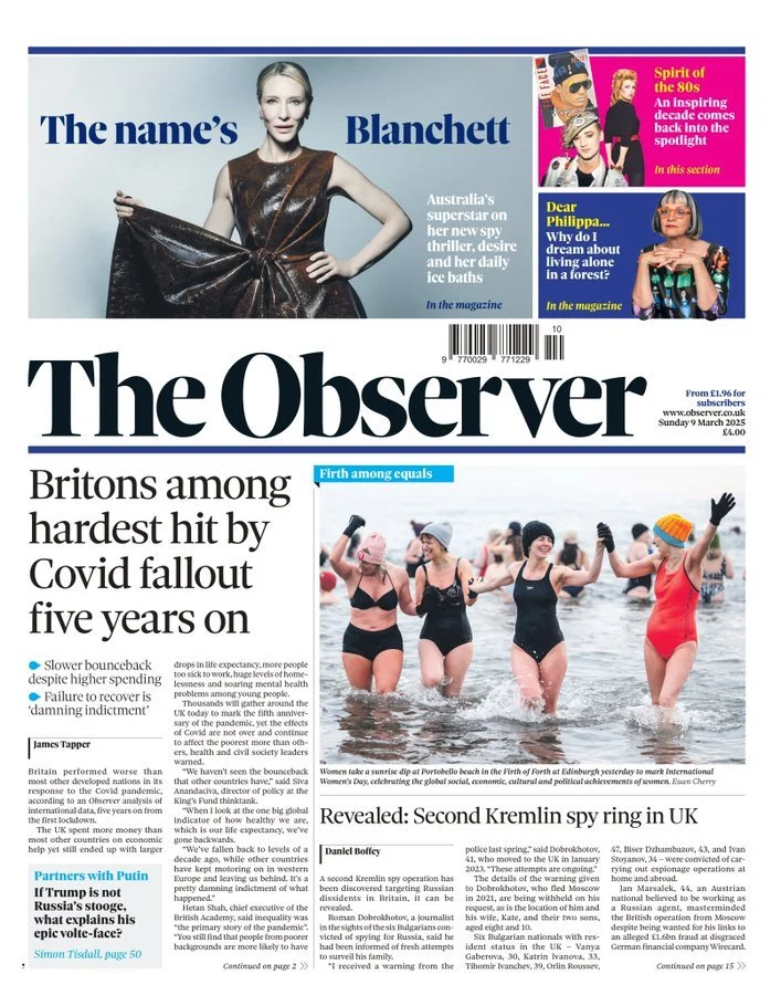
And then what else is there? Oh, not a magazine, but the Observer newspaper. So that’s just been taken over, I don’t really, I’m not sure, but by Tortoise Media. And Tortoise is like a slow news media company, but they do amazing investigative podcasts. So I’ve loved them for quite a few years. And then they happened to have merged or taken over the Observer, which is the oldest Sunday newspaper in the UK.
Arjun Basu: That split from the Guardian seemed to be a little messy.
Alex Hunting: Oh yeah. I think it’s been very acrimonious. Maybe there’s lots of bad politics there but I picked it up. It was the first issue that I think that they’ve done as the owners this weekend. I’m sure there’s been a lot of talk I know about the investment and I don’t know, some people are not happy with it, but personally, I love what Tortoise were doing. I totally love it and have always really enjoyed the Observer. So I’m hoping that’s a marriage made in heaven for the future. So yeah, those three.
Alex Hunting: Three Things


Click images to see more.
More from The Full-Bleed Podcast