
Ich Bin Ein Designer
A group of passionate admirers have curated the ultimate retrospective of one of the most important magazines ever produced. By Serge Ricco
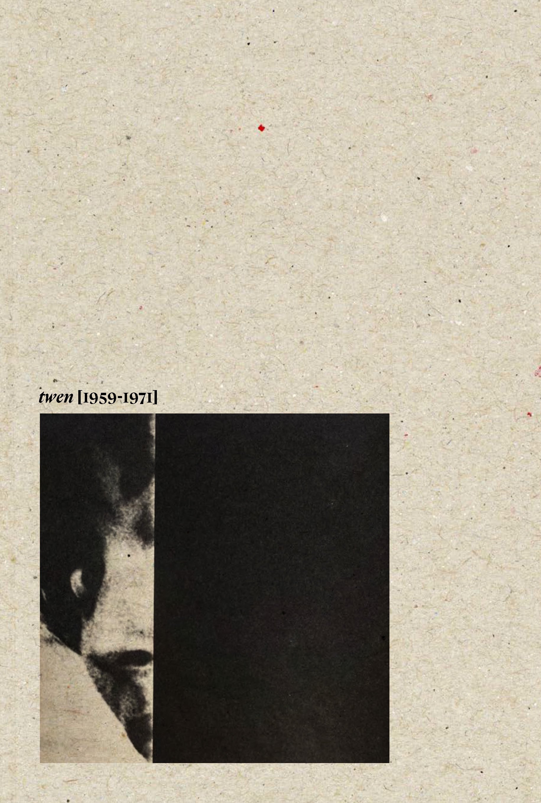
Editor’s note: Bureau Brut’s new book, twen (1959–1971) is a spectacular exploration of art director Willy Fleckhaus’s work for German magazine twen, with more than 300 illustrations. From 1959 to 1971, twen was arguably the most influential magazine in the world thanks to its visual audacity and graphic innovation, and many contemporary designers still consider it an unavoidable reference point. This book retraces this unparalleled editorial adventure by focusing on Fleckhaus’s extraordinary layouts as well as twen’s exceptional history and legacy. Below, author and friend of Magazeum Serge Ricco’s essay from the book.
“Although aimed at young Germans, Fleckhaus’s TWEN would revolutionize the entire global magazine industry. ”
New York, 1958. Alexey Brodovitch (1898–1971), the greatest art director of all time, has just been given his marching orders from the Rolls-Royce of fashion magazines, Harper’s Bazaar, owned by the mighty Hearst group. Plagued by a severe drinking problem, a common affliction in press circles at the time, he would not design any more magazines before his death in France 13 years later.
His departure marked the end of an era in the history of 20th century magazines. It had begun three decades previously, in 1929, when another Russian (born in Ukraine to a family of Turkish origin), Doctor Mehemed Fehmy Agha (1896–1978), had been asked by Condé Nast, Hearst’s main competitor, to take over the role of art director of the US edition of Vogue.
The story goes that Agha was the first to introduce full-page, full-bleed photography in contrast to the traditional white margin layouts of the fashionable ladies’s gazettes from the turn of the century.
Brodovitch may have been sidelined, but he wasn’t ready to admit defeat yet. In 1959, in collaboration with his former student, the photographer Richard Avedon (1923–2004), and the writer Truman Capote (1924–1984), he published the colossal Observations, a homage to perfectly orchestrated layout and rhythm. In an image by Hiro (1930–2021), a young photographer whose career he had launched while at Harper’s Bazaar, Brodovitch can be seen pirouetting like a dancer between his mock-ups laid out on the floor. Every page is an epitome of grace, and the line-up of well-known personalities featured (Bardot, Chaplin, Picasso, Bogart, Hitchcock, Chanel, and more) is truly astonishing.
Bold close-ups of surgical precision, photos within a photo or an image repeated to slow down the narrative ... Brodovitch stopped at nothing.
A gallant last stand by a wounded man who had been traumatized by the loss of all his archives—destroyed in two fires in 1956 and 1959—and even more so by the death of his wife Nina (also in 1959).
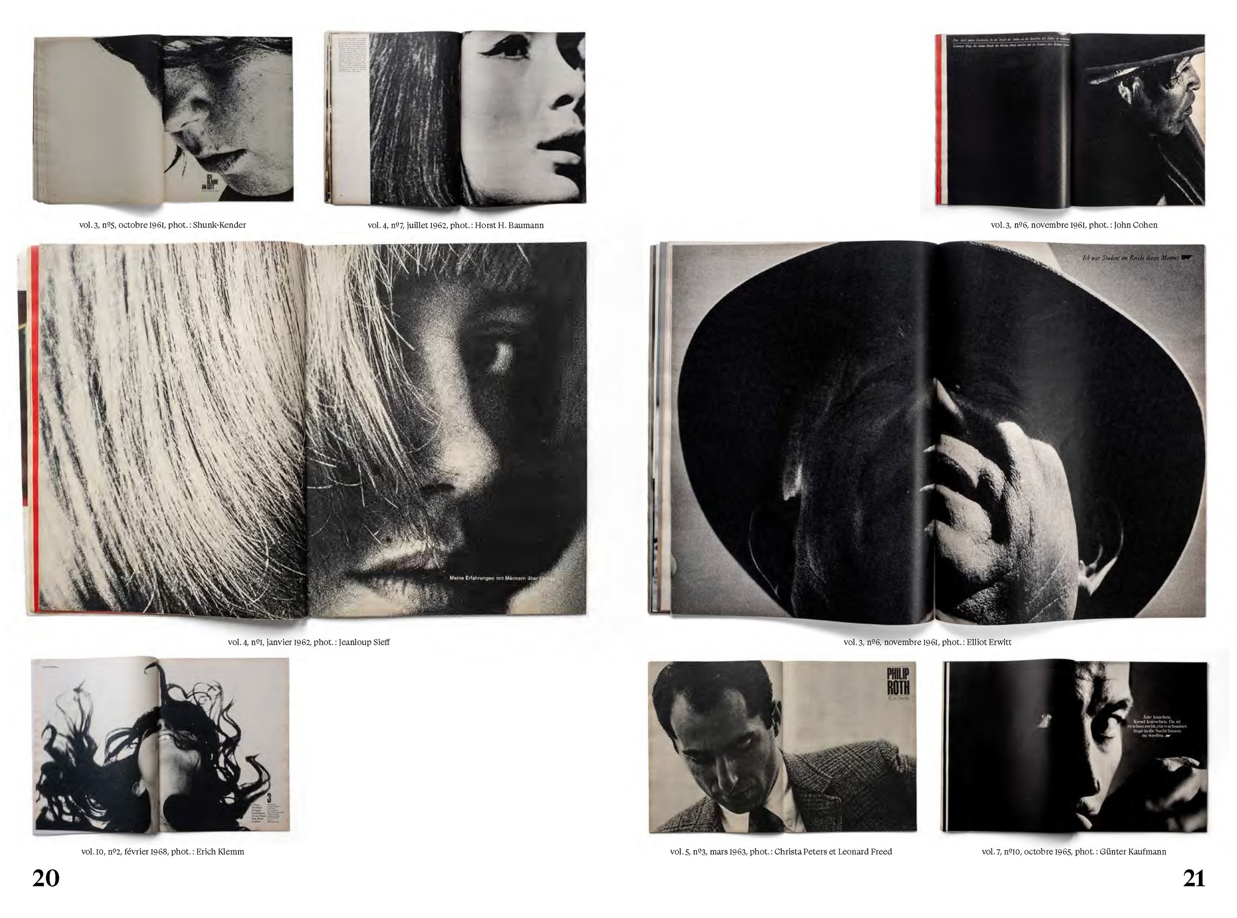
The fact twen was launched in the same year that Observations was published can be viewed as something of a changing of the guard. Willy Fleckhaus was clearly an ardent admirer of the great Brodovitch’s masterful cropping techniques and handling of white space, which in turn influenced his design of the magazine.
“Creativity was rising from the still smoldering ashes of the Second World War and TWEN was setting a precedent.”
1959: Year Zero
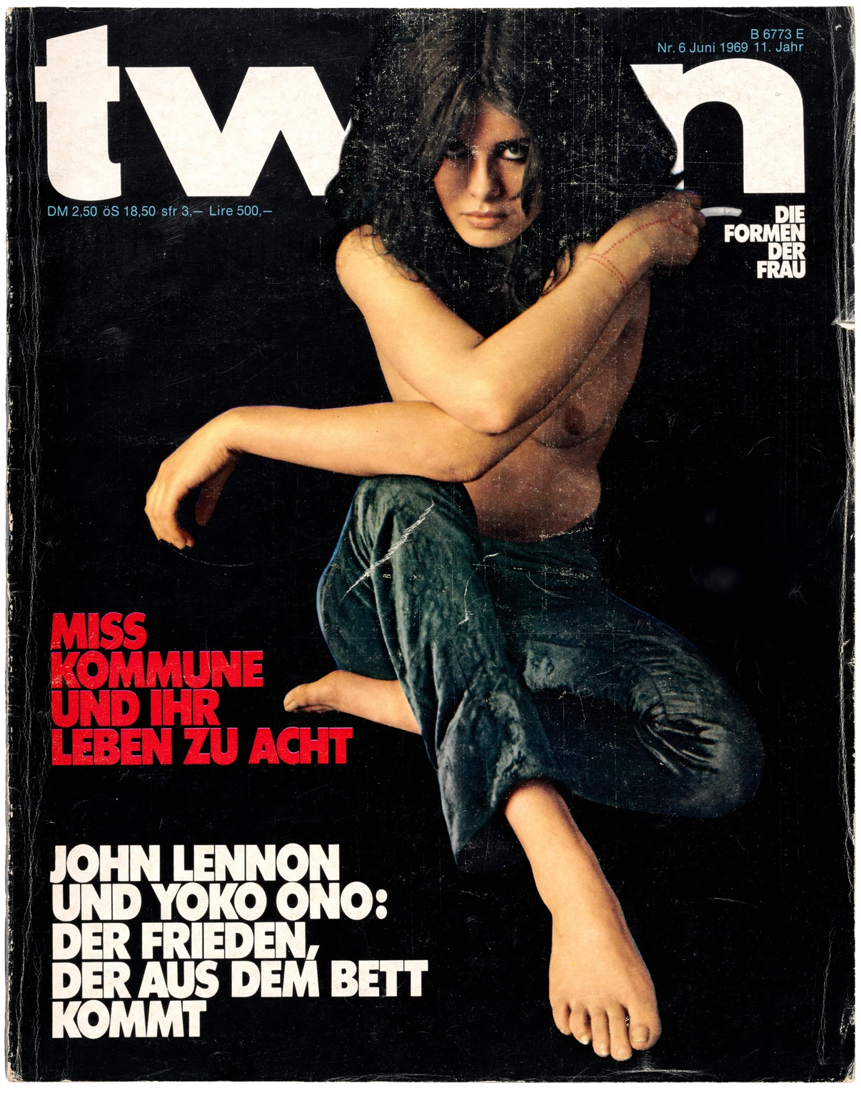
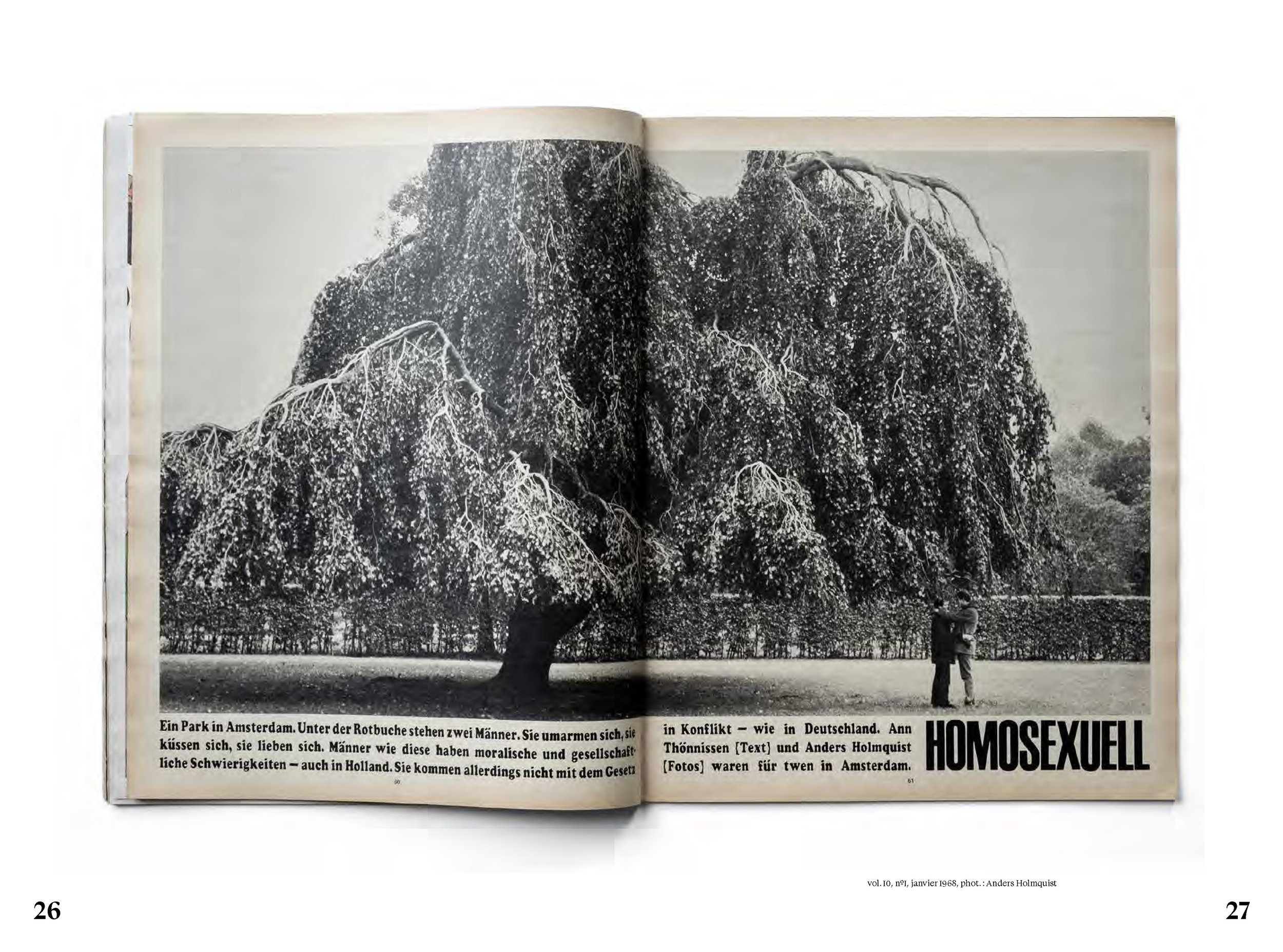
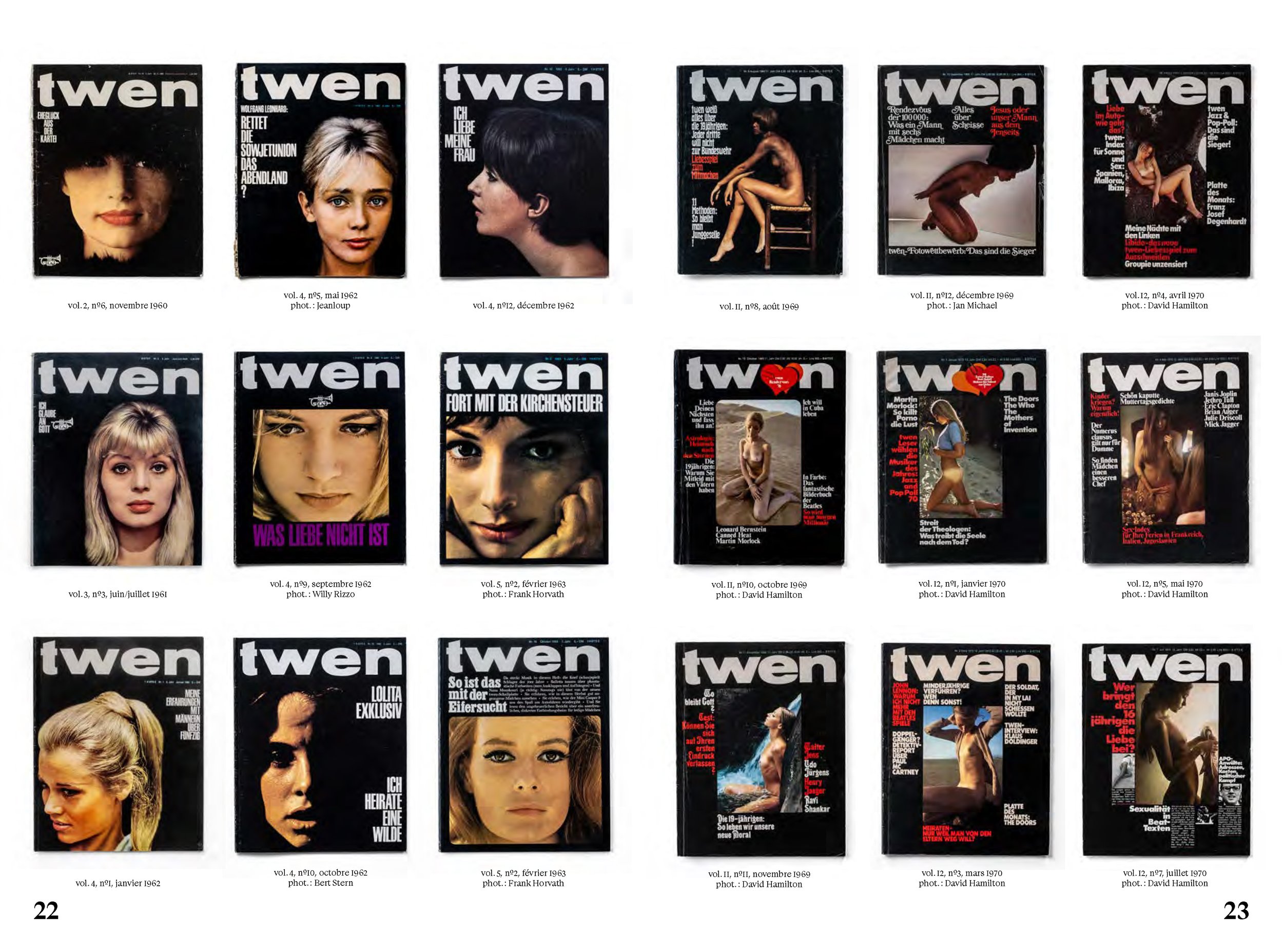
Although aimed at young Germans, Fleckhaus’s twen would revolutionize the entire global magazine industry. The black background of the covers contrasted sharply with the front pages of competitors’ publications, even if the very first one featured a rather tame image of a couple on a bike worthy of the late 1950s.
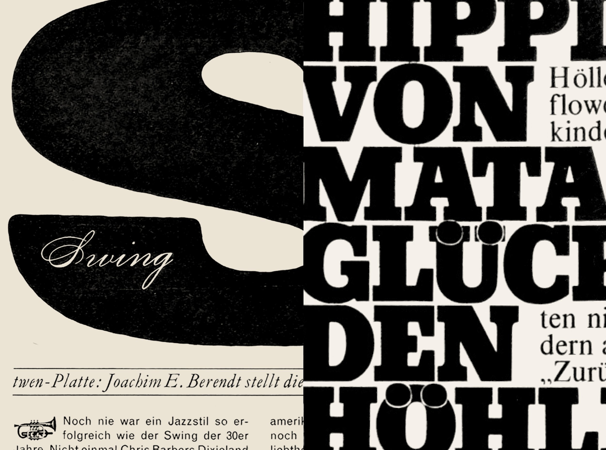
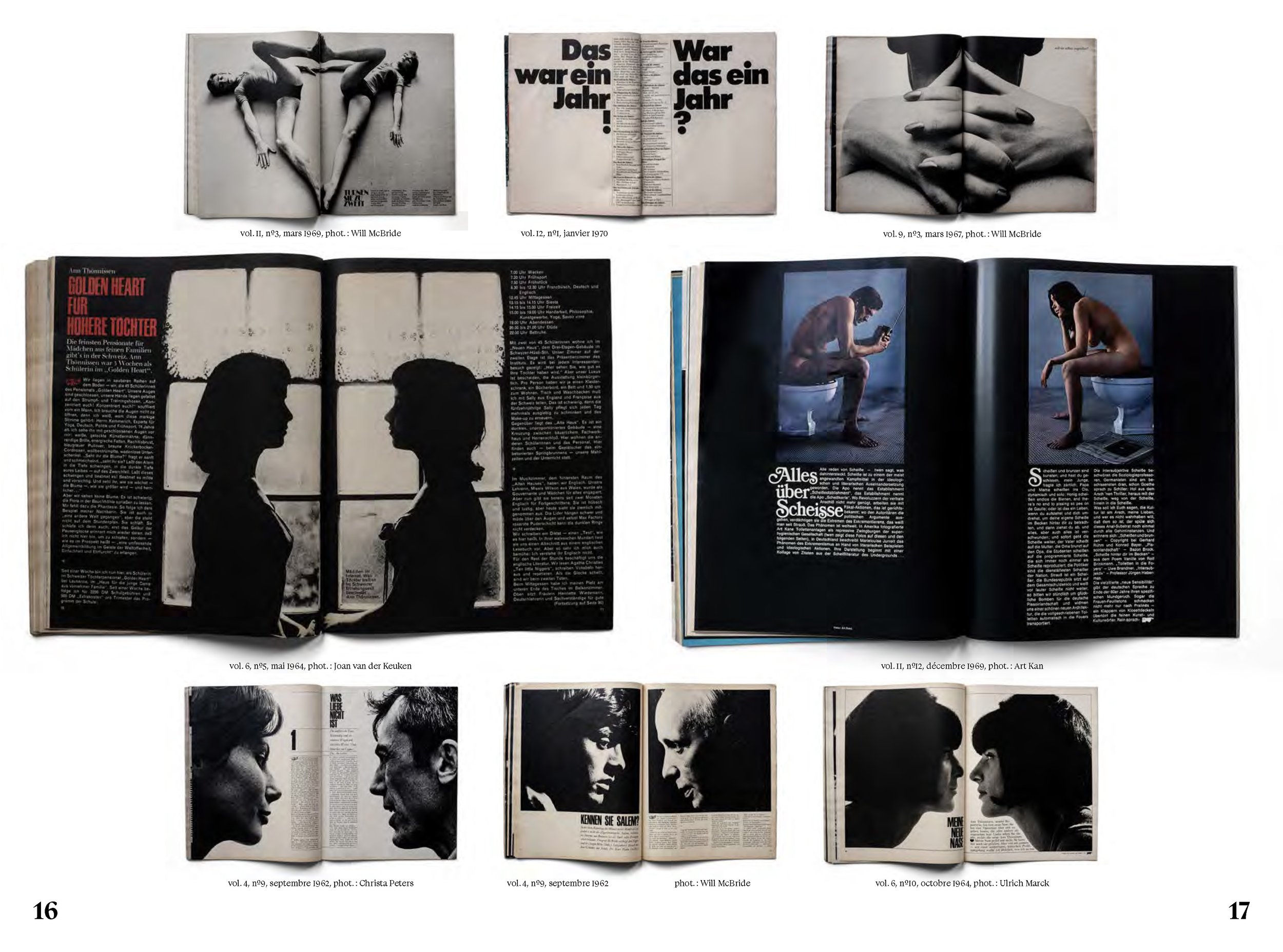
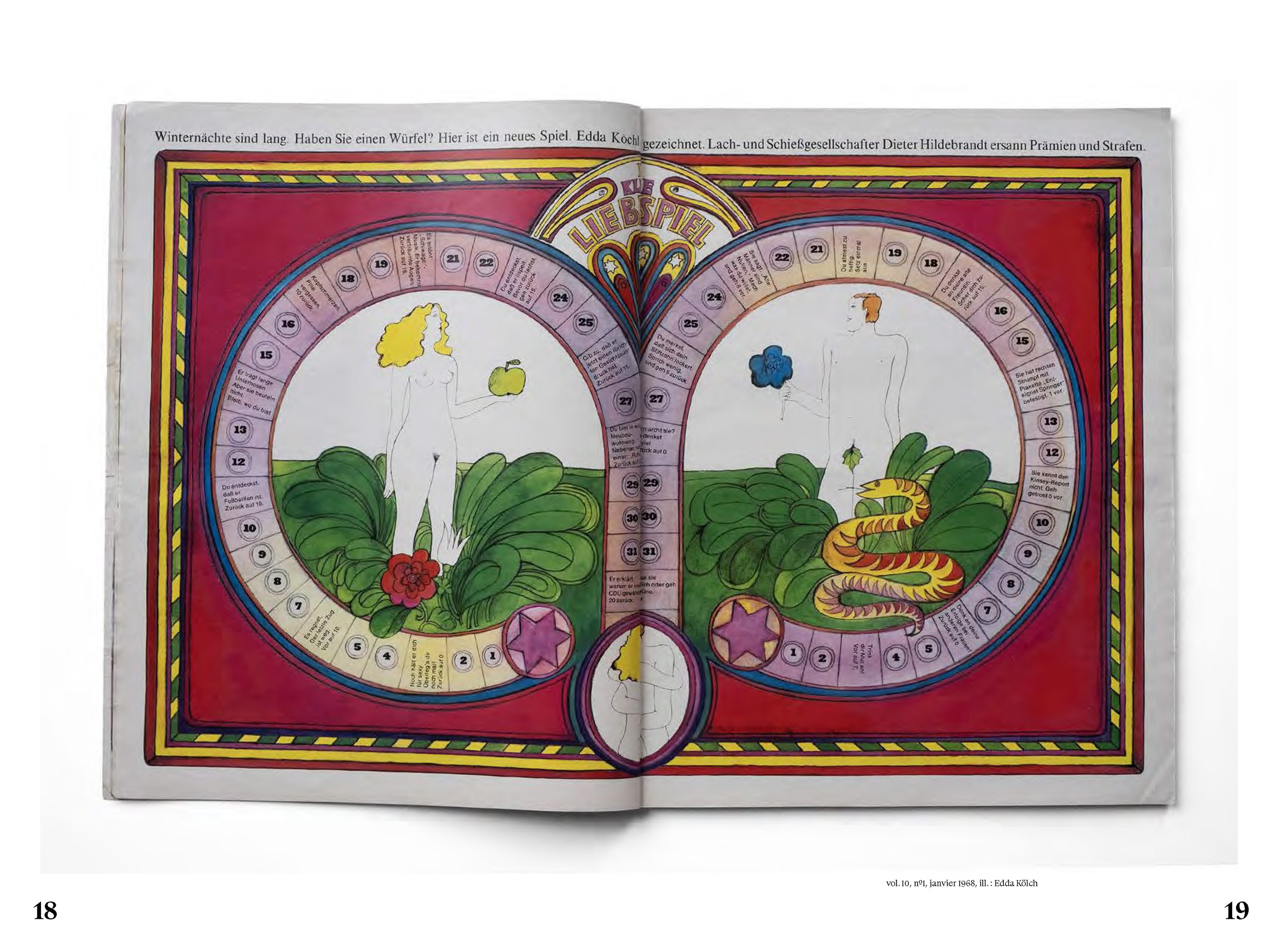
However, it was the inside page design that would cause the biggest stir. A small cornet graphic replaced the dropped initial letter, trumpeting the arrival of the 1960s visual revolution. Fleckhaus, the Miles Davis of magazine design, used his three favorite instruments—typography, photography and illustration—to jazz up the 12-column grid. But there was no repetition, rather a surprise for readers every time they turned a page.
At the same time, art direction in New York was losing some of its sparkle. It seemed to be going round in circles and had become very conservative. The brilliant Esquire art director, Henry Wolf (1925–2005), had of course taken over from Brodovitch at Harper’s Bazaar, but he left in 1961 to help launch the art magazine Show.
In Europe, meanwhile, creativity was rising from the still smoldering ashes of the Second World War and twen was setting a precedent. In Germany, Kontraste debuted in December 1960 and was the first magazine to take its inspiration from the graphic language Willy Fleckhaus had introduced barely 18 months earlier. It used the same format, black and white photos and display typeface (sometimes in red). The influence was obvious, all the more so because it was aimed at the same young readership. And, from 1966, it even adopted the black background of twen’s covers.
French journalist Hélène Lazareff (1909–1988) had founded Elle in 1945, modeling it on the women’s magazines she had discovered in the United States, where she had gone into exile during the war and notably worked for Harper’s Bazaar. In 1959, she asked the young Swiss graphic designer Peter Knapp (1931–), who had also spent time in New York, to take on the role of art director of her weekly publication.
He was not the only Swiss designer to settle in Paris in the early 1960s. The list was long and included one of Knapp’s former fellow students at the Kunstgewerbeschule in Zürich, Jean Widmer (1929–), who took over at the helm of Jardin des Modes in 1961, where he remained until 1968. Both adopted some of Fleckhaus’s techniques, coming up with more and more new and innovative ways to use photographic material.
Simultaneously, the twen style crossed the Channel and found its rightful place as an integral part of the nascent Swinging London scene. German-born Tom Wolsey (1924–2013), who had fled to the UK in 1936, was appointed art director of the men’s fashion magazine Man About Town in 1961. He was soon instrumental in changing the name to About Town, then, in July 1962, it became simply Town, adopting the snappier, more eye-catching four-letter format of twen and Elle. In the design of the inside pages, Wolsey frequently resorted to Schmalfette Grotesk, the display alphabet made popular by Fleckhaus. He also used it extensively for his external work—his ads for the fashion designer Mary Quant (1930– 2023), for example—until the end of the decade.
Some British Fleckhaus devotees even made the pilgrimage to Germany to meet the man himself. In the late 1960s, one-time twen photographer Harri Peccinotti (1935–) was moonlighting as art director of the magazine during the month-long holiday Fleckhaus took each summer.
Drawing on his experience heading up the radical London monthly Nova (launched in 1965), he commented at the time that he couldn’t read the German texts in twen, but visually he understood it perfectly. Another leading British graphic designer and former Nova man, the brilliant Derek Birdsall (1934–2024), was also briefly hired as a consultant by Fleckhaus in 1968.
Twen’s fan base extended as far as the United States where Will Hopkins (1936–), a young designer from Arkansas, was one of its most ardent supporters. In 1963, while working for Chess Records in Chicago, he discovered Fleckhaus’s work and decided to go to Germany to study with the master. He spent three years there, familiarizing himself with the “twen formula,” before joining the New York magazine Look alongside another design wizard, Allen Hurlburt (1910–1983).
Willy Fleckhaus, for his part, was just as curious about the art direction scene across the Atlantic. In January 1967, an article by John Sack (1930– 2004) that had appeared a few months earlier in Esquire (October 1966) was reprinted in twen and Fleckhaus jumped on the occasion to pay direct tribute to the famous “Oh My God—We Hit a Little Girl” cover created for the American magazine by the advertising executive George Lois (1931–2022). The only difference was that the headline in this instance extended over a full double-page spread and the Bauer Bodoni font of the original was replaced by Schmalfette Grotesk (of course).
In France in the early 1960s Régis Pagniez (1929–), art director of the Filippacchi group, had already referenced twen by using its little signature cornet at the start of each article in Jazz Magazine. Pagniez and Fleckhaus met up regularly when the latter visited Paris, where he bought photos that had originally been published in Filipacchi titles to use in his own magazine back in Germany.
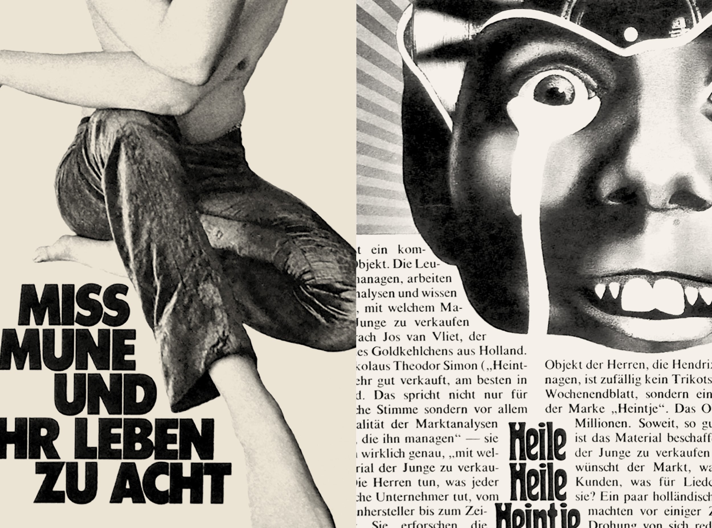
Unlike many art directors of the time, Fleckhaus was not himself a photographer. He did, however, have a desperate, almost compulsive, need for strong images produced by others—and he had an exceptional eye for them. Photos that had already been published elsewhere would often get a spectacular makeover when they appeared in twen. One such example is the close-up of scarlet lips and out-of-focus cigarette shot in 1961 by Irving Penn (1917–2009) for Vogue when Alexander Liberman (1912–1999) was at the helm. The image appeared several months later on the cover of the French men’s fashion magazine Adam before der Meister gave it an unforgettable, striking visual rework in the December 1963 issue of twen.
1971 was an annus horribilis for magazine art direction. Not only did Alexey Brodovitch die—alone and penniless in Le Thor, a tiny Vaucluse village—but also twen ceased publication when a change of shareholders led to the sacking of its art director. There had been an early sign of its ultimate demise when the iconic black background of the covers was changed to immaculate white.
“My emotional response must have been similar to that of a young jazz lover on hearing the opening notes of Miles Davis’s Kind of Blue.”
The Successors
After various (and unsuccessful) attempts to resurrect twen in the 1980s, and Fleckhaus’s sudden death in 1983, you could be forgiven for thinking that the magic was lost forever.
At the very end of the decade, when I was still a student at the Estienne School of Applied Arts in Paris, I bought my first issue of twen second-hand at the Salon du Livre et des Papiers anciens (a vintage books and magazines fair) in the city’s Espace Champerret. I was immediately blown away when I saw the brilliant cover, with its ebony black background and 12 images of a woman’s face, sitting on top of a pile of magazines. The headline was a single word—“ABTREIBUNG”—the German word for abortion, but I didn’t know this at the time.
Neither did I know that 20 years later I would be the art director of French weekly Le Nouvel Observateur, which had published the famous Manifeste des 343 petition that positioned it at the forefront of the women’s lib movement in France. This issue of twen would provide the fundamentals for my work as a magazine art director.
My emotional response must have been similar to that of a young jazz lover on hearing the opening notes of Miles Davis’s Kind of Blue which, like twen, also made its first appearance in 1959. It was only natural that discovering such artistic perfection would change my outlook forever. I have spent my whole career trying to replicate the brilliance of that John Coltrane spread, but alas it requires the “perfect eye,” the visual equivalent to the perfect ear.
In 1991, the twen approach was reborn in the UK with the new format of the British film magazine Sight and Sound. Simon Esterson (1958–), the future art director of Eye, created a bold yet elegant layout where white space was just as important as texts and images. His handling of the proportions and rhythm of the opening spreads is an enduring tribute to the work of Willy Fleckhaus. It was neither imitation nor plagiarism: on the contrary, his was a rework of the principles of the German genius. And his obvious talent made the use of a grid quite unnecessary.
In 1995, Mark Porter (1960–) undertook a complete revamp of The Guardian, the previous format (1988) having been created by David Hillman (1934–). Two years later, his Spice Girls cover for the weekend supplement of the British daily broadsheet will, to my mind, remain as one of the best of all time. This single image, with its bold cropping and playful juxtaposition with the headline, is the very embodiment of the spirit and creativity of twen.
In Porter’s words, “Willy Fleckhaus was a master of scale and contrast, juxtaposing big and small, near and far, to spectacular effect. This is an important lesson I have always tried to follow.”
Although from a younger generation, the Italian Francesco Franchi (1982–) also expressed his love for twen and its heritage in his layouts for Intelligence in Lifestyle, the monthly supplement of the financial daily Il Sole 24 Ore, where he was art director from 2008 to 2016. One very good example is his skillful use of perspective with a se- ries of three photos of the same person on the same spread.
There are also many contemporary European and North American titles—Monocle, launched in 2007 by the Canadian journalist Tyler Brûlé (1968–), for instance—whose visual format echoes, to a greater or lesser extent, the German magazine and the iconic black background of its covers.
Nowadays, the British designer Matt Willey (1974–) is undoubtedly the most obvious heir to Fleckhaus’s vision, and its most effective exponent. He learned from the best, having worked with Vince Frost (1964–) on the culture magazines Big and Zembla, before going over to Elephant (2009–2011), launching the biannual publication Port (2011) and then moving to The New York Times Magazine. Willey has kept the twen spirit very much alive and relevant.
When Mohamed Ali died in 2016, I myself could not resist paying tribute to Willy Fleckhaus, but instead of his cornet I used a little engraved crown to celebrate the King of the Ring in L’Obs.
Forty years after his death, Fleckhaus is still the Cassius Clay of art directors with his knockout double-page spreads. The boxer’s motto, “Float like a butterfly, sting like a bee/The hands can’t hit what the eyes can’t see”—is perfect for him too. And twen will forever be his finest match.
twen [1959–1971] by Hans-Michael Koetzle, Serge Ricco, Stéphane Darricau (156 pages). Get your copy from Bureau Brut.
ARTICLE ©SERGE RICCO/BUREAU BRUT