
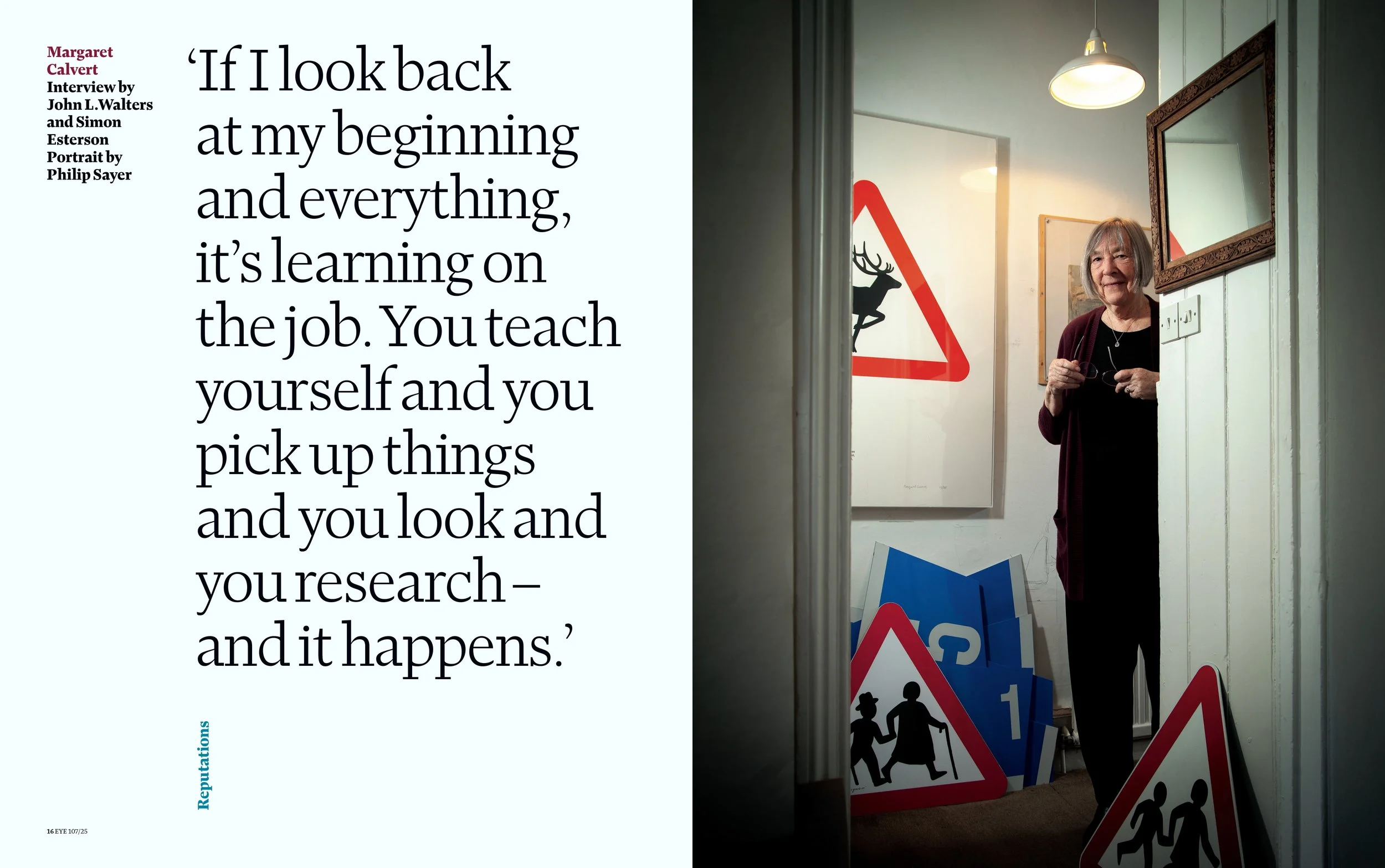
This Is What Happens When You Have Graphic Design
A conversation with designer Simon Esterson (Eye, The Guardian, Blueprint, more). Interview by Patrick Mitchell & Debra Bishop
—
THIS EPISODE IS MADE POSSIBLE BY OUR FRIENDS AT COMMERCIAL TYPE, MOUNTAIN GAZETTE, AND FREEPORT PRESS.

Simon Esterson is one of the most influential figures in British magazine design shaping the field for decades with his distinctive approach to editorial work.
Unlike many designers who built their careers within major publishing houses, Esterson chose a different path, gravitating toward independent publishing where his influence could be greater and his contributions more impactful. This decision allowed him to play a key role in fostering a rich culture of design-led publications.
His early work at Blueprint, the legendary British design and architecture magazine, set the stage for a career that would lead him to The Guardian, The Sunday Times of London and the Italian architecture magazine, Domus, before establishing his own London based studio, Esterson Associates.
Today, Esterson’s most visible project is Eye, the internationally-renowned journal of graphic design. As its art director and co-owner, he has been instrumental in maintaining its reputation as one of the most essential platforms for design professionals.
Thanks to his nonstop editorial work, Esterson is widely considered to be a mentor and role model for generations of British designers proving that great editorial design does not require vast resources, but rather a clear vision and an understanding of how design can elevate content.
That’s what great designers do.
“I’ve just ended up working in kind of smaller, feistier—hopefully feistier—things.”
Patrick Mitchell: Simon, you did not train to become a magazine designer. You told me you learned on the job. Can you talk about how you landed in the publishing world?
Simon Esterson: I did the school magazine. And I think I originally wanted to be a journalist. My best friend who sat next to me at school turned out to be a much better writer and journalist than I was ever going to be. But there was nobody who put the school magazine together.
There was a printer who put the school magazine together when we first arrived. And it was like, you know, single column, wide measure, monotype set, Bembo. So it was basically a book with subheadings. We had a very keen master—as we called him in our school—a master looking after the magazine.
And he said, “Well, I think we should change the format.” And we changed it to a magazine format. Suddenly the printer needed help, so I just began marrying up words and pictures and drawings and learning about column setting. When I didn’t know how to do something, I’d go and ask the printer.
I was quite young and he had a little type specimen book, and I said, “I’d like to set the whole magazine in Univers.”
And he said, “Oh, well, we’ve only got 9-point and 12-point.”
And I said, “I’d like some bigger type than that.”
And he said, “Well, I think you can rent the matrices for monotype.”
So really from quite an early age, I was already discovering how far you could twist the brief and work with your supply chain to get bigger type or something. It was all set in metal. So when we started messing around with the layouts and having some kind of house style for the typesetting, the galley proofs that came back were just covered in corrections.
The author’s correction bill was humongous. And I think I might have been the first pupil to actually have a conversation with the bursar. That’s the guy who looks after the money in our school. And I got a message to go and see the bursar and he said, “We’ve got the bill here for the latest issue of the school magazine, which I gather you’re responsible for. Why is it twice the normal bill?”
And I said, “Oh, you know, that’s what happens when you have graphic design.”
Patrick Mitchell: Fucking designers.
Simon Esterson: Yeah!
Patrick Mitchell: If you look at it from 30,000 feet and you’re looking at little Simon, what would you say enthralled him/you about this world of magazine design?
Simon Esterson: Well, the journalistic bit. Explaining things, understanding things, communicating things. And the magazine, you know, that was the thing we had to do it with. And I suppose I realized that making a magazine was more than just the writing, you know, it was the writing and how you framed it, and how you presented it, and what you put with it and how you made it.
I just became—to the detriment of all my school studies , I mean, I was completely terrible—I became fascinated by how you do that. Before we were let loose with the school magazine, my friend and I had a little magazine we made, you know, sort of classroom magazine that we made, which was called The Publication.
I had a stencil, a little stencil duplicator thing—somewhere between some office contraption and a silkscreen machine—and I would type the stencils. You had to type really hard because there were these, sort of, wax stencils.
You put them on your screen, and then ink went through it, and you made a very splodgy ... it looked like you were making a magazine about the communist revolution in 1917. I mean, it had that aesthetic.
Patrick Mitchell: Leaflets, yeah.
Simon Esterson: Exactly. It was samizdat or something.
Debra Bishop: Let’s go back to the beginning. You were born … can I say?
Simon Esterson: Yes.
Debra Bishop: In 1958. In Chelmsford, Essex.
Simon Esterson: Yes.
Debra Bishop: Your dad was Maurice and your mom was Valerie. Were your parents creative?
Simon Esterson: Yes, they were. My mother was a teacher with a sideline in an interest in dance and kind of amateur theatricals and dance. As a teacher, she made all her own teaching materials. And I remember, you know, just before the end of the school holidays, she’d be sitting in the kitchen with some crayons and cards making flashcards for spelling tests and things, and she’d make them and then put that sort of plastic laminate on top of them.
She drew really well and was, you know, interested in nature and art and things. My father was an electrical engineer and my mother wouldn’t marry my father until he could recognize and name a number of plants and trees when they went for a walk.
You know, she was very worried that he wasn’t very good at nature. So he worked really hard. And then he actually, I think rather against his better judgment, got himself into the local amateur dramatic company simply so that he could invite my mother out on a date.
In the background, there was sort of, the school stuff and drawing and my mother doing odd little bits of, you know, choreography. At one point I started doing little theater programs for the local theatre group. There was a general atmosphere, art was part of it.
But I have to say, I can’t draw. I mean, I think there was a sense in the house that art was part of what was going on. But I occupied a rather extreme edge of it, I think. I became interested in, you know, books and magazines and—
Debra Bishop: —But was there a eureka moment when you realized, “Gee, I know I’m good at something. I know I’m good at design, or I’m good at art?”
Simon Esterson: There was a eureka moment when I realized that I actually wasn’t any good at anything else. Which is kind of the opposite, really. My uncle had a little hand letterpress press. I used to see that when we went to visit him and I was kind of fascinated by it. If my mother was a kind of front of stage person, amateur dramatics and, and dance and things, her brother, my uncle, was a backstage guy and when they were young would make little toy theaters and work out the lighting directions.
And so he went into commercial television. And one of the things he did was design television studios and the equipment in them, and pioneered things like outside broadcast units and things like that. They lived in London. Very, very glamorous. Chelmsford was, you know, it’s a county town and people sold cows and sheep in the market, but London was very glamorous.
And when we went to see my uncle, they had a fondue set and they had that sort of sophisticated ladderax shelving system, which was very popular then. And it is popular all over again. And amongst the things he had was his letterpress press and he used to get Welcome Aboard, which was the in-flight magazine when the airline was still called BOAC.
Rather excitingly, he looked after the printing aspects of the printing work that the television company did. I remember him telling me one day how they were launching something and they were printing a color brochure, and that the printer actually sent a running sheet from the factory in Kent to his house in London for him to approve. This arrived at midnight and it had to be looked at straight away.
It all sounded rather interesting to me. I was given a printing press and a bit of type and I just started experimenting and learning about people’s ideas of layout and I decided I didn’t like centered typography. I liked range left typography and the more I read about Swiss design—you know, modernist design—the more I was kind of interested in that. So I suppose it’s kind of two different roots. One is a kind of Swiss modernist typography and the other is a kind of American magazine design, which I think is a very different thing.


Interior spreads from Eye magazine
“I’ve always been attracted to the idea that a magazine is the product itself. This is the thing, okay. And I like that relationship.”
Debra Bishop: At what point in your life is this, like what age?
Simon Esterson: I had the printing press when I was about 12.
Debra Bishop: Mm hmm. Then did you decide to go to art school?
Simon Esterson: I went to a sort of proper school. I mean, gentlemanly school. I don’t think any pupil had ever gone on to be a graphic designer. And when I announced that I was interested in design, everybody said, “Well, that’s really interesting, Simon. What you should do is, you should go to university and train to be a manager of a printing works.”
I said, “I don’t want to be the manager. I want to be a graphic designer.”
And they said, “Well, it’s very interesting, Simon, you should go and learn how to make the chemistry of printing ink.”
I said, “I don’t want to do that.”
I think it was a really good school. I treated it very badly, but it was a very good school. And of course the key advantage was that it had a school magazine and a little printing club, and those were the things I sort of played with.
Patrick Mitchell: A printing club?
Simon Esterson: Yeah. I’m worried this whole podcast will be me as a slightly, uh, enthusiastic, inky-fingered school boy.
Debra Bishop: Okay. Okay. I think it’s amazing. So, what, what we’re saying is you went as a teenager, kind of apprenticed? So you went straight into—
Simon Esterson: I failed my A-levels really badly. That’s the exams you take in the UK before you go to university. I did really, really badly. And I had one of those conversations you have with your father, where he was very measured and very quiet and basically said in the nicest possible way, “I think you need to get a job, Simon.”
And I found a job working in one of the really early instant print shops in the UK. and It was in London, and it was non-unionized, so the staff were a mixture of rather old lag printers who had sort of fallen out with the union for some reason, and young people, some from university, some from the art college.
We had Xerox machines and litho machines and we used to electroset like mad for stuff and we had IBM composing machines and it was just like a sort of playground. It was a playground with drugs and customers thrown in.
Patrick Mitchell: I was going to say it was like a porn shop.
Simon Esterson: It was quite a learning process.
Debra Bishop: Well, I want to fast forward now to the design scene—at that time, maybe it was the ’80s or a little bit later?
Simon Esterson: Yes, it’s 1976 or something, that sort of time, yeah.
Debra Bishop: What was that like?
Simon Esterson: Well, when I eventually got to work on a magazine, which was a place called the Architectural Press, which was a family-owned publishing company. And we had The Architects’ Journal, which was a weekly magazine for architects circulating in the UK. And we had The Architectural Review, which was an international monthly architecture magazine.
And The Architects’ Journal earned all the money and The Architectural Review spent it all. I was definitely in the sort of functional bit and I was lucky that I went there as the assistant art editor.
Debra Bishop: It sounds official.
Simon Esterson: Yeah. I mean, it’s a really simple job. Just take the galley proofs, paste up these back of the book pages. But then the art editor left, quite soon afterwards, to go to some sprauncy new magazine launch. And I was just, I was very lucky. The then-production editor said, “Oh, I think Simon can probably do this. Why don’t we try letting him be in charge?”
So I was 20 years old and was art editor of 120 editorial pages a week, with an assistant, with a subbing room of four people taking the layouts because it was all—not paste up in the sense we know, but just assembly, markup, goes off to the printer, gets made up, you see a page proof, all that stuff. So that’s what I was doing.
Debra Bishop: What was it like?
Simon Esterson: For a period, I was actually commuting from Chelmsford, where I was living, where I was born. And that was like a 45-minute commute into London.
Patrick Mitchell: You weren’t out slam dancing?
Simon Esterson: No, not really. You know, working for the print shop that was, you know, Friday night, we’d all be out at the French restaurant in the corner drinking until I missed my last train home, basically. The Architectural Press, it was a bit more organized. Most people at The Architectural Press were responsible adults, so they had other things to do. And I was vaguely conscious of the bigger design scene, but, you know, doing a weekly was quite an absorbing thing, really.

Esterson and Rick Poyner’s book on the design work of David King.
Patrick Mitchell: So Simon, we’ve learned in our research—we’ve learned without our research too, because we just know that you are a hero to many young British designers. There’s a unanimous sentiment among them that you are one of the most important designers in the UK. And there’s also a unanimous sentiment that you’re absolutely terrible at marketing and talking about yourself.
Simon Esterson: Yes. Well, that last bit is true. I don’t know about the first bit.
Patrick Mitchell: Self promotion, I know it’s, it’s not really a British thing anyway. But I wanted to talk about your early magazine design heroes. We talked about some of the lesser-known British designers that our listeners may not know about, but should. So let’s talk about the three Davids.
Simon Esterson: Oh, the three Davids. Yes. So, and They’re all roughly contemporary in terms of when they were working. So we have David King. So David King worked initially at The Sunday Times magazine. The Sunday Times magazine was the first English color magazine, free on a Sunday with your Sunday Times.
And quite rapidly, The Sunday Times Magazine developed under Michael Rand, who was the art director. David King was his sort of lead designer, and they had tough stories. They were the people who published Don McCullin’s pictures from Vietnam. Lots of gritty black and white special issues, really smart writing and really smart design.
Which pretty much continued until a certain period probably in the early eighties, where the general feeling was that the advertisers began to complain that they didn’t really want their glossy color adverts next to pictures of starving children. It was really a little bit too real for them.
And, of course, by that time, all the other magazines, The Observer, The Telegraph, all those magazines had published as well. So The Sunday Times Magazine had competition. And when advertisers said, “We might get somewhere else,” you can imagine how that changed editorial policy.
So David King left The Sunday Times and became politically quite engaged and there’s a whole set of posters about apartheid in South Africa about other political causes which he designed in his big Franklin Gothic, heavy rules, black and red, simple color, quite crude reproduction. And in a way, David defined the left wing graphic style in the UK. That’s David #1.
David #2 is David Hillman. He worked at The Sunday Times Magazine briefly as well. He’s probably most famous for doing Nova. Nova was like the trendy women’s magazine, with covers talking about stuff that the more mainstream women’s—you know, there were very few recipes. There were cookery articles, but you know—
Patrick Mitchell: Sexual revolution stuff.
Simon Esterson: That sort of stuff, you know, and very strong fashion photography, particularly by Peter Knapp and Harry Petronotti. And then David went off to be a partner in Pentagram.
The third David is David Driver, who in a way was dealing with much more mainstream media. The main thing he did was the BBC, British Broadcasting Corporation, had this kind of antique thing called the Radio Times, which was the magazine owned by the BBC, which published all the listings of what was going to be on the radio.
And at that point, the listings were copyright. So nobody else could publish them, right? And then color arrived. And of course, you wouldn’t change the name, it’s so famous, but the BBC Radio Times didn’t really know how to address colour pictures even.
And so they employed a publishing consultancy, a guy called Geoffrey Cannon, who’s an editor, and David Driver, who was the art director, to come in and redesign the Radio Times. This was the biggest selling magazine in the United Kingdom. The Christmas issue sold a squillion copies and was on press for two weeks or something. David and Geoffrey completely revolutionized the Radio Times.
If you look at it now, you realize they knew about the International Herald Tribune and New York magazine. You can tell, I mean, you know, swashy R, swashy T, Radio Times, but beautifully done. And David Driver, who began as an illustrator, is a brilliant commissioning art director. The Radio Times already had a tradition of illustration and David just kind of lifted it.
And so the best editorial illustration in Britain was in the Radio Times every week. And David then after a while became assistant deputy editor of the Radio Times. So he kind of moved from design into editorial and then he went to be art director of The Times. So, that’s the three Davids.


“You don’t know when you’re doing it. You don’t know, ‘Oh, this is a defining moment.’ You just think, ‘Well, here we go.’”
Patrick Mitchell: You did a beautiful book about David King’s career and his work.
Simon Esterson: Yes, with Rick Poynor.
Patrick Mitchell: Yeah, and we’ll link to that to make sure people can still get a copy.
Debra Bishop: Well, you’ve called yourself a ‘magaholic,’ but I’m not sure that that’s the same as a workaholic. But, I’m certainly a workaholic. I think Patrick is too. Your wife is Jane, and you have two boys who have now gone into creative fields. Have you always worked around the clock? How do you get your balance? I’m always asked this question.
Simon Esterson: Yeah, it’s very difficult. I’ve always been attracted to the idea that a magazine is the product itself. We’re not making a box, however beautiful the box is, to put something else in. This is the thing, okay. And I like that relationship. And also with newspapers and magazines, pretty much the only thing that stops you is the deadline, isn’t it?
You know, it’s got to be ready to be shipped. Otherwise they can take any amount of effort and thought and rethought. I find it quite exciting, if something seems possible—Oh, could we do that, that 16 page section 20 minutes before we go to press because that way we could get the picture from the person that’s just taken it. I’m afraid I’m a kind of sucker, romantic, deluded fool about all that stuff. And yeah, so I’m quite often around.
Patrick Mitchell: The family has worked around it?
Simon Esterson: In a very wonderful way. Yes. Jane is my first, and only, wife.
Patrick Mitchell: First and last?
Simon Esterson: Well, let’s just say “only” at this point.
Patrick Mitchell: Alright, it’s time to talk about magazines. I want to talk about Blueprint which was a really big deal. I remember in the eighties, it was so cool. You could only find this at an international newsstand. And if you could find a copy of Blueprint—usually on the top shelf, because it was so oversized—it was a major score. So talk about the Blueprint story and how you came together with that magazine.
Simon Esterson: Sure. So Deyan Sudjic was the first editor and I knew Deyan because he had worked in the news team at The Architects’ Journal. And then he’d gone on to be the architecture correspondent at The Sunday Times. And Peter Murray, who was the publisher, was actually the publisher of the Royal Institute of British Architects magazines.
They had a monthly magazine. They—in between them—realized that actually, you know, the kind of conventional architectural media, which was about architects building buildings, you know, hospitals, schools, office blocks, and even things with property developers, that somehow that world, which had seemed very separate in the ’60s, was completely merging with the world of interior designers—who might be architects, might not be architects, with product designers, and with graphic designers.
I mean, you have a figure like Philippe Starck, the French hyphenate, who was on the cover of an early issue of Blueprint. Philippe Starck would design buildings, would design interiors, would design lemon squeezers. And he’s still doing stuff now, you know, you get your super yacht designed by Philippe Starck or Philippe Starck’s team.
And there wasn’t really a magazine doing that, covering it in that way. So that was the idea behind Blueprint. We all had proper jobs, so we’d get together in a borrowed studio once a month and sort of bring stuff together.
You know, Deyan would have had copy, which we would have had typeset already. I would probably commission some pictures to be taken. We worked a lot with a photographer called Philip Sayer, who I’ve worked with for a very long time. And Philip and I would go through what we had and he’d go off and take some portraits and do some stuff and we’d bring stuff together.
So on a Saturday morning, we’d all sort of get together. All the writers would drop by with things. It was very jolly—it would be exceptionally jolly because we’d all go off to Saturday lunch and have something to drink. Everybody would go home, except me and the design team, and we would start putting it together. And Deyan would write some headlines.
And I worked with a guy called Stephen Coates, who shared a studio with us, Nigel Billen, who’s a friend of mine—a couple of friends. And we do physical paste up. I mean, actually, you know, scalpels out, stick it all down, put in the positionals for the pictures. And we would work through Saturday night into Sunday afternoon.
We’re talking about large-format, 48 pages, some of them in color, and basically the idea was on Monday evening, we’d get together again and it would be checked—Deyan would check things, Peter, the publisher, would check things, and we’d ship on Monday night.
The sort of threat was that if we hadn’t finished by Monday night, Peter, the publisher, would start electrosetting. And so that was the threat. If you didn’t finish it, somebody would finish it for you. And that was how it worked.
I was allowed to continue. The Architectural Press were quite happy for me to do this. They knew I was doing it because they thought it was a nice, interesting, little independent thing. And then we actually started selling ads and getting rather successful and people talked about the magazine. And then The Architectural Press quite understandably said, “Simon, I think you need to choose between being art editor of The Architects’ Journal and working on this magazine.”
I chose to go work on Blueprint. And we had a little studio—Peter found a building that was about to be knocked down in Marylebone High Street in London—and we moved in and we just started making a magazine, sort of, properly. I mean, I had freelance work, I would do freelance work there. Everybody else had things going on.
Deyan would disappear for a few days and would arrive, quite often in the evening, from Barcelona or Berlin or America saying, “Oh, I just bumped into Doug Tompkins. Here’s all the pictures of the new Esprit stores that Ettore Sottsass has designed.” Or, “Oh, I just bumped into Norman Foster. He says we can do this.”
And Deyan would sit down at one of those first little Macs, chomping a cigar, which is what he liked doing later in the evening. And he would just write these articles straight into the computer, blah, blah, blah, blah, blah, blah, blah, you know.
Patrick Mitchell: What was the frequency of Blueprint?
Simon Esterson: Monthly.
Patrick Mitchell: Really? Oh my God. Wow.
Simon Esterson: Yeah. Yeah. And so we’re making the magazine. Stephen Coates decided not to go to the Royal College of Art, to come to work in the studio, which is great. And then we started doing property brochures because it was the beginning of the property boom and developers wanted a bit more. Developers knew about design and they knew that these ad agencies really didn’t do a very good job.
So we started doing property brochures. And quite soon, mostly because nobody else was quite there yet, my time was spent having meetings about you know, property brochures. And I didn’t get to handle those photographs from Doug Tompkins anymore. I was too busy with, you know, that property stuff.
So that was sort of the Blueprint story. We didn’t—I think it’s true for all these things, isn’t it? You don’t know when you’re doing it. You don’t know—Oh, this is a defining moment. You just think, Well, here we go. There’s Janet Abrams in New York and Janet’s got an interview with Michael Graves. That’s good. Oh, Ron Arad’s coming in this afternoon. Ron’s got some chair, which is an old Jaguar car seat that he wants to show us.”
And you just, you do that stuff, and you think, Right, let’s take a picture, let’s change the flat plan, let’s do this, let’s do that, and you just, you don’t really step back, do you? You’re in there, in the eye of the deadline, and you’re just trying to do what you can.


Domus, founded in 1928, is considered the “world’s longest-running architecture magazine.”
“What’s interesting is the balance between your ability as a designer and the diplomacy that I think particularly comes with being an editorial designer.”
Patrick Mitchell: There was a gap between Blueprint and The Guardian, right? This was Esterson—
Simon Esterson: Esterson-Lackersteen. Blueprint predated Esterson-Lackersteen, so I effectively left The Architects’ Journal. The last salaried job I had was in the Blueprint office doing freelance work. And then Phil Sayer put me together with Mike Lackersteen, who was a proper art director. Mike, at that point, was the art director for a custom publishing company and they were doing a series of beautiful magazines.
Patrick Mitchell: John Brown?
Simon Esterson: No, it wasn’t John Brown. It’s a company called Redwood.
Patrick Mitchell: Oh yeah. I know Redwood.
Simon Esterson: Sort of a predecessor of John Brown. Mike had a team of art directors and the magazines were beautiful. But I think he was beginning to find that a little bit frustrating being involved with that kind of business.
And so Phil and Mike and I would have lunch occasionally, and Mike and I decided that we were going to start an editorial design business. We had a third partner, but that didn’t last very long. By that point I’d left Blueprint and we were hunting for work, you know, getting ready to get work. We did a few things. And then I got a phone call to have a drink with the editor and deputy editor of The Guardian.
Patrick Mitchell: That’s good background. That leads into my question.
Simon Esterson: Sorry. I get the feeling I’m just sort of rambling in a rather useless way here.
Patrick Mitchell: No, we’re actually controlling you like a puppet. You don’t even feel it. You’re falling right into our hands. All right, Simon, this is a quote I found in our research. “David Hillman’s 1988 redesign of The Guardian was groundbreaking and changed the look of the paper forever.” And I would imagine, sort of subconsciously, that’s probably around the time many people outside of the UK actually started noticing it. Its footprint is massive. They now have a US edition, etcetera. So The Guardian is, you know, that’s probably the point at which it became something bigger than it had been.
Simon Esterson: They were launching a rival, sort of upmarket daily paper called The Independent. And so The Guardian wanted to respond and it responded by being modern. And you know, newspaper design there are a few exceptions—The New York Times is one of them—but newspaper design was not a world for graphic designers really, it was a world for tweedy sub editors.
The Guardian called in Pentagram. And David put a modernist approach to it. And that modernist approach is both the kind of the Massimo Vignelli approach, which I think we all know, I certainly feel that Vignelli did fantastic design of a certain kind.
Actually, I don’t know how much his newspapers ever lasted or existed. But also in Europe in Switzerland and in Germany and Italy, there were people doing kind of, you know, range left, hang it from the rules, for goodness sake, keep the measure of the same throughout the whole newspaper.
For people applying magazine approaches in that wake, Karl Gerstner was doing stuff in Switzerland. But The Guardian was the first one to really do it in the UK as a national newspaper. And of course, it’s a left-wing newspaper. And so somehow the graphics and the content kind of fit together.
Patrick Mitchell: So a decade or so later, as can happen, Hillman’s design had sort of begun to slip and you were brought in to freshen things up. I can’t remember what phrase you used, something about a “paint job” or something, but let’s talk about your time with The Guardian.
Simon Esterson: I was extremely lucky, Alan Rusbridger had become editor and realized that he wanted to introduce new sections and try some things with the paper, and he really wanted a design person around, not a consultant. Still, you could see the Hillman energy and tension in those, but other bits of the paper, not so much.
And it’s a big paper—at that point there was a broad sheet daily, an arts culture tabloid daily, and then special tabloid sections with job ads when newspapers used to have job ads, and there was a weekend color magazine and various other things.
And Alan wanted a designer around and, with his deputy, Georgina, we had a conversation and came around to the idea that maybe I could try and do that. And I would spend half my day, most days, at The Guardian, working on live stuff with the teams there, or dummying up possible future things.
It was pretty hands on, which I quite like. It was all on Atex, a very clumsy mainframe computer system, which we eventually managed to dispose of, and replace with Macs. And at that point it would be Quark. And once you put the Macs in, we had control over the typography. So we changed the technology, which helped, and I just really tried to get back to what I saw as the Hillman principles and add some new tools for the slightly new things we were doing, really.
And then I asked Mark Porter to come in and do the Weekend magazine, which was originally not part of the brief, but it was extended to include the magazine. And then when I left, Mark took over as design director and suddenly The Guardian accepted that a design director was one of the jobs that you had.
Mark then did the next, the Berliner, redesign of The Guardian, which I think is the high point of printed newspaper redesigns—best contemporary newspaper design in years.
Patrick Mitchell: He did the redesign that probably most people recognize now.
Simon Esterson: Mark did the redesign that went to Berliner page size, worked with Christian and Paul, at Commercial Type and made, you know, a huge type family. Mark can’t set a line of type without thinking, “I need a weight variation on this.” So there’s like 9,000 weight variations and things like that.
Patrick Mitchell: I’ve seen Guardian Egyptian. I’ve seen how many variations there are.
Simon Esterson: Yeah. Yeah. It’s, I mean, it’s beautiful. And then there’s Guardian Sans, which is a whole other little family, which doesn’t get used very much, but it’s really good.
Patrick Mitchell: There’s one variation for every citizen of India.
Simon Esterson: Pretty much. Yeah. There’s that thing, wasn’t there, that “in the future, everybody will have their own typeface.” They will, but it’ll just be a weight variation on Guardian Egyptian. I guess the difficulty—well, perhaps it’s a measure of the success of Guardian Egyptian, is that you can’t use it for another job.
You show anybody—I showed somebody a magazine redesign I was working on and I said, “Well, of course you can’t use Guardian Egyptian for a newspaper. Nobody would do that. But I think maybe you know, you could use it for a magazine.”
And they looked at it and they said, “No, you can’t. It looks like The Guardian. It looks like our magazine has been taken over by The Guardian. Get rid of that typeface.”
Debra Bishop: Simon, it sounds to me that you’re really passionate about problem solving. Is there a method to your madness when you tackle a project, from a design perspective? Talk a bit about your process.
Simon Esterson: I can’t pretend that I do this in a terribly conscious or very effective way. But I think with a magazine, you’re trying to find a kind of a graphic vocabulary for that magazine. Some of those decisions are about budget, you know, I’m sure we’ve all sat in those meetings where somebody has got a magazine and they say, “We want it to look like Vanity Fair.”
Well, and of course, we’re talking about Graydon Carter’s Vanity Fair, Tina Brown’s Vanity Fair. “We want it to look like Vanity Fair.”
And you think, Really? Your budget is about, you know, Annie Leibovitz’s travel bill, right? Annie Leibovitz’s assistant coffee bill, you know. So you’ve got to be realistic about what a magazine can do financially in terms of its resources, but you’re trying a character that works with that.
I think that’s what I’m trying to do most of the time. I like it when the magazine is not very good and you’ve been asked to make it better. Or I like it when a magazine doesn’t exist. I’m not saying this has really happened to me, but when somebody comes to me and says, “Oh, do you want to work on this really successful magazine?”
You think, “Maybe not, because it’s really successful.” I’d really quite like to try and fix something up. And also you know, the kind of magazines I’ve worked for are smaller magazines. And they are largely dealing—with some exceptions—with existing imagery.
You know, architecture magazines. I put British Archaeology magazine on that list, which I did for a while and which I absolutely love doing because everybody was dead. And usually there’s a photograph of them buried in the ground.
And you could do the things you could do, obviously, you can work with an illustrator, you can work with a cartoonist on some of the stuff we do. A lot of the stuff we do commission portraits and stuff like that. We use a lot of existing imagery. And I, sometimes, I don’t think of myself so much as an art director, more a kind of hunter-gatherer figure. Working with a picture researcher, you disappear into an archive and find stuff.
And I’ve worked for a very long time with a repro guy called John Bodkin and his team. John is a genius. It’s a slightly different proposition now, but in the days when we were doing Sight and Sound film magazine, you’d have terrible, terrible, terrible film stills, but we worked out a way of scanning them so that actually what we scanned for was the grain, not the color, you know, and we just made them all grainy and interesting. And I enjoy doing those sorts of things.
Like I think probably Willy Fleckhaus and Milton Glaser both saying, “If you have a bad picture, just make it really, really big. Like you mean it.” So it’s like, “God, that’s a really terrible picture. Right. Double page spread.”
And the big, small picture thing, you know, I remember, probably, David Hillman telling me when we were doing some layout for the Sunday Express color magazine, “Well, Simon, the thing is, If you want to make a picture really big, put a really small picture next to it, you know, do that.” You look at magazines, you think, “Oh, that’s an interesting idea.”
You know, like the double cover thing, you know, that period when everybody had double covers—I think it’s only Die Zeit magazine that probably still does it. But you think, well, that’s a really interesting idea. I never actually worked on a project where I thought a double cover really, really worked was really justified, but I like that sort of development.
And, you know, Matt Willey’s famous turn-it-on-its-side New York Times Magazine about skyscrapers, so you turn it around. And that was really good. And what was really good was getting the advertisers to join in the fun and turn the ads around as well.
I like that kind of stuff. And when somebody says, “Oh, it’s going to be black and white.” Fine. That’s great. I mean, it’s great. At Eye magazine, we print on an 8-color Heidelberg. And it’s nice having the facility to use those tools and to use those amazing machines, but I’m quite happy doing a job in black and white. You just have to think in a different way about it.
Debra Bishop: Do you prefer working on redesigns or an ongoing design?
Simon Esterson: I think it absolutely depends on the project. The tendency is the redesigns are the bigger projects and you go and work with a team and you can say things and do things that a fully employed member of the team might hesitate about. But you’re very conscious that you will be leaving at some point, that everybody will become—just as you’re starting to enjoy it—everybody will become extremely fed up with your presence and wonder why you’re hanging around being difficult. Especially because we’re not paying you. Or rather, you’re not a dependent employee or somebody putting in these ridiculous invoices for just being difficult.


One of Esterson Associates’ current clients is History Today, “the world’s leading serious history magazine.”
“When somebody sends a sketch of what a layout should look like, that’s usually the point that I kind of work out when we can do the last invoice and how soon we can get out of this one.”
Patrick Mitchell: You didn’t ask me, Deb, but my answer is ongoing. I don’t think a redesign—I think the redesign only begins with the first issue, it doesn’t get—
Simon Esterson: Yeah, I mean, and isn’t that the nice thing about magazines because the frequency—monthly or weekly or whatever it is—that you get to go again, I like ongoing. There’s that set of circumstances around a redesign, which are enjoyable. I’m in Barcelona or I’m in Zurich, and this is all quite fun. But ongoing is great. Ongoing tends to mean a smaller fee, I have to say. And ongoing tends to mean that you lay out all the pages. I mean, like all the pages. But that’s fine.
And the way Holly—who’s my design partner—Holly Catford and I work is that we’re responsible, when a project gets to a certain stage, we’re going to do it regularly, one or the other will be responsible for it because you can’t have extensive conversations with clients when there are two of you involved and messages don’t get through and things get confused. So it’s very simple.
Holly looks after History Today, which is a really, really good magazine. And I look after Museums Journal, for example, which suffers slightly because I’m looking at other things as well. But, you know, I’ve been doing it today. And it’s fine. And I had a nice conversation with the editor about swapping out some pictures and things like that.
Patrick Mitchell: We talked to Tina Brown about this a few episodes back, about how in the ’90s, there was this great migration of magazine talent from the UK to the US and a lot of us in the US were like, “Oh no, they’re going to take all of our jobs.” And it was people like Tina, Harry Evans, Anna Wintour, many others. I can’t remember designers, but there were designers who came over, but I’m curious—
Simon Esterson: Not as many as there were editors, I think.
Patrick Mitchell: Yeah. They didn’t seem to bring their British designers with them. But I’m curious if you were ever tempted by an American job and is there one that you would have left home for?
Simon Esterson: Well, it’s very funny. I love the idea of an American job, just no American publishers like the idea of me having an American job.
Patrick Mitchell: It goes back to your marketing issue.
aarSimon Esterson: Well, yes, I went to New York at one point on a trip, partly because I was given an opportunity to go and see Harry Evans at Condé Nast Traveler. And I went to see him, we had a very very nice conversation, but he seemed to not get the message that I wanted a job. And so I had a very nice lunch at the thingamajig in Grand Central Station with Cath Caldwell, who was at that point the deputy art director.
Patrick Mitchell: The Oyster Bar?
Simon Esterson: The Oyster Bar, yeah, that was good. It never happened, though, whereas of course, Luke Hayman, who worked with us in the studio at one point, went to America and never came back. I don’t know what happened to him, but he went to America. And I’ve got this sort of romance about American magazines and American publishing, at least, you know, the “golden age,” which in a way the podcast is sort of predicated on, isn’t it?
Patrick Mitchell: So the answer is you would have left for any job.
Simon Esterson: Absolutely. At the right time, at the right age, I would have. Yeah, absolutely.
Patrick Mitchell: Why, I’m just curious, I’ve always been curious about this, why are British art directors called “art editors”?
Simon Esterson: I’ve got no idea, and there’s that whole other group of titles, what is it? Design director, creative director, I don’t know what they mean.
Debra Bishop: Well, here’s a quote about you, this one from Neville Brody. “I have known Simon for many years. Simon is probably the most influential editorial designer in the UK That no one has ever heard of. Modest, humble, but hugely impactful. He has really helped model our editorial spaces, whether in magazines, newspapers, or online. Consummately professional and with a great eye for detail and drama, he has had a direct influence on a whole generation of designers.”
Patrick Mitchell: And speaking of influence, many, many great talents have learned their craft from you. Among them, Luke Hayman, Mark Porter, Holly Catford, Stephen Coates, and Kuchar Swara, who you might know from Port. How do you think about mentorship? I mean, do you take it as a responsibility?
Simon Esterson: Not in that way. I should say that Mark Porter was pretty ... Mark and I have a much more equal relationship. He was already pretty fully-formed, really. No, no. I just, I just have that principle that I try to, you know, work with people who are smarter than me. As you can tell from your list, it works that way. They’ve all got much, much better jobs than I’ve got.
I don’t really think of it as—we’ve always had a small studio so it works better to kind of, you know, talent spot and people come for a bit and enjoy doing editorial stuff. I think what’s interesting is that balance between your ability as a designer, or a designer quality, but also that kind of diplomacy that I think particularly comes with being an editorial designer.
I mean, I think it comes with being any designer because you have to have working relationships with clients or with fellow editors. When you’re working on editorial, that relationship is an ongoing one. It’s not just, you know, an annual report. You have to get agreement on it, we’ve got to work on this week to week.
And it’s very noticeable and people like ... John Hill is the most diplomatic designer, the most masterful diplomatic designer I’ve ever worked with. Quite remarkable to watch John, you know, kind of engineering a situation.
Patrick Mitchell: I think that really is the trait, though. That’s the secret weapon. I credit my mentor with that too. That ability to—I want to say “handle” a client—but to be able to manage that relationship in a way that is unemotional, understands the priority, understands the work that needs to get done. And presumably, this is something they’ve all learned from you because they’ve made it as far as they have.
Simon Esterson: I’m not sure they have. I think John knows more about diplomacy than I ever will. I do have a sort of tolerance point. And occasionally, on a project, I will step over my tolerance point. And I’ve been known to be heard shouting down the phone at people about things.
Patrick Mitchell: Oh, interesting. That might be fun.
Debra Bishop: Simon, you’ve done so many magazines in your career. Which one stands out to you?
Simon Esterson: That’s like the “what’s your favorite child” question, isn’t it?
Debra Bishop: Yes, I know. But it could be because you’re proud of the design or you loved a particular partnership.
Simon Esterson: Well. I’ve been really lucky apart from designers I’ve worked with. I’ve worked with some great editors: Deyan Sudjic on Blueprint and Domus in Italy, John Walters on Eye magazine. I think there are some magazines that—I mean, I’m intensely proud of Eye magazine, of course. You know John and I own it between us.
If we weren’t proud of it, it’d be pretty bad because we’re sort of responsible for the way it looks and the way it is, you know. I have a soft spot for British Archaeology magazine because it’s not material that normally you’re allowed to handle in an editorial magazine-y way.
I had a couple of, you know, tolerant editors until it eventually came to the point where I think the feeling was that my layouts were big on graphics and rather small on archaeology. Okay, so at that point, you have to get rid of the art editor, right? That’s fine.
There are a lot of magazines and they’re all pretty, apart from a couple of things, they’re all pretty small magazines. And I guess that’s what I’ve gravitated towards. A small magazine where one can be really involved. Whereas, you know, I’ve done stuff with The Sunday Times and big organizations like that. It’s much more complicated to do something really powerful. Too many people have to, kind of, agree.


Interior spreads from History Today
“If editors and art editors and journalists all agreed about everything at the same time, it’d be really boring, wouldn’t it? You need that tension.”
Debra Bishop: So is there one that makes you cringe or you don’t want to answer that?
Simon Esterson: I don’t want to answer it. I don’t even want to think about it.
Debra Bishop: Okay, that’s fair. It’s dead to you.
Patrick Mitchell: What’s the most annoying request you’ve ever gotten from a client?
Simon Esterson: Well I think the most worrying signal is that “we want it to look like Vanity Fair” conversation. That’s the moment that I usually know this job is not perhaps going to end—unless they suddenly have got the budget—it’s not going to end well.
I think I’ve got a sort of—sorry, this seems really self indulgent, doesn’t it? But you asked. When somebody sends you a sketch of what a layout should look like. That’s usually the point that I kind of work out when we can do the last invoice and how soon we can get out of this one.
I mean, you know, I completely like a porous relationship. So if John Walters has a strong view about how this should be laid out for editorial reasons, that’s great. And sometimes I have a strong view about what a headline should be or not be because of what we want to do with it graphically or something. But that’s a relationship, right?
And if editors and art editors and journalists all agreed about everything at the same time, it’d be really boring, wouldn’t it? You need that tension. Two people who recognize that, they each bring things to the discussion. But when somebody basically thinks they know how to design something, that’s fine. They can do it, but I’m not going to do it for them. You know, that’s my sort of little point. It’s when somebody slightly wants to impose their view on a particular graphic presentation.
Patrick Mitchell: It’s possible we’ve already covered this and maybe I’m just asking the same question in a different way, but I do want to ask it. So I think all three of us share a passion for hands-on design. Which can often be incompatible with high profile jobs where so much more is expected from the creative director. While you have worked for a few brand names, much of your more recent work has been with smaller publishers. Can you talk a little bit about the choices you’ve made and maybe the satisfaction that comes from the clients that you do choose to work with?
Simon Esterson: I don’t think I’m a very good big organization person. I like that relationship—going in to do, you know, a consultancy process because I think everybody sort of knows that this will come to an end and it’s a rather defined relationship. Big, big organizations, yeah, they just worry me slightly.
I’ve gotten so used to, kind of, you know, if I want to use a particular printer or I want to use a particular repro house, or even I want to use a particular typeface and somebody says, “Oh, that typeface isn’t on our licensed group of typefaces.” You know, well, okay.
Um, I may be completely wrong and naive about this, but I think you work for a big organization—you can both tell me you both work or have worked for big organizations—I think you trade your freedom of action for the access to massive resources. Whereas on a smaller publication, you have a lot more theoretical freedom of action, but the range of resources you can use is much more limited and you have to sometimes work quite hard to preserve them.
Patrick Mitchell: That’s the test of a good art director, though.
Simon Esterson: Yeah, yeah.
Debra Bishop: I think that’s fair.
Simon Esterson: But then sometimes you see things that The New York Times Magazine does—or The Sunday Times Magazine used to do—and you think, you know, shit, only they could get access. This is completely from thin air, but a few years ago, there was that New York Times Magazine shoot of, was it Obama’s cabinet? You know, all those senior—
Patrick Mitchell: All the black and white portraits.
Simon Esterson: Yeah. Or, indeed, there’s that issue of years ago of Rolling Stone with those Avedon pictures of great Americans or something, or—
Patrick Mitchell: The Power Issue.
Simon Esterson: That’s the one. Or that famous New York magazine cover with the Bill Cosby victims. That’s about having picture teams, and research teams, and all that kind of thing, isn’t it? I mean, those are, they’re great ambitious editorial things. And I think that’s great. And I think that comes from being a big organization. But you know, both these things are interesting. I’ve just ended up working in kind of smaller, feistier—hopefully feistier—things.
Patrick Mitchell: All right, well, we’ve made it to The Billion-Dollar Question. I should have a jingle that introduces this thing.
Simon Esterson: Yes, you should.
Patrick Mitchell: All right. An anonymous billionaire wants to give you a blank check with one caveat: You must use it to create and launch a print magazine. So what will you make?
Simon Esterson: Well, like any good designer, I just want to explore the edges of this brief here just to define what we’re talking about. Because I think it would be, it’s two things. I mean, one, I already have that with John Walters.
I already have that magazine. I have Eye magazine. And we have to work quite hard to keep it going and we all have to do lots of jobs. Sorry, this sounds like a sob story, doesn’t it? But, you know, a check for a lot of money would really help that. But that’s an already existing magazine. Maybe that doesn’t count.
My new one is a kind of—it’s like a magazine, but it’s also a sort of magazine incubator/hub. So what we’re going to do is have a magazine that is about spawning other magazines. And we have a kind of group of people who make magazines for people who want a magazine—you know, they’ve got something to say.
I think that’s a basic requirement of a good magazine that the people have to have something to say. We make a magazine for people who have something to say, but not necessarily the access to the means to do it. It would be like a building and we’d be making magazines about all sorts of different things all day.
If somebody wants to make a magazine about, I don’t know, how eating sugar, liking sugar, liking chocolate has made you a sort of public pariah in the way that it used to be when people smoked. Let’s make a magazine about that!
I’d like the idea of being a kind of vehicle to explore ideas. All sorts of ideas. And we had the money to have a team and the ability to do that. Sorry, does that sound like a really pathetic cop out?
Patrick Mitchell: No, it sounds like a big, massive publishing company.
Simon Esterson: Exactly. A big, massive publishing company with that all-important profit motive taken away. So we don’t have to have lots of middle managers who talk about projected revenues and stuff like that.
Debra Bishop: And it’s uncensored.
Simon Esterson: It’s uncensored. Yes, because that’s a whole discussion itself, isn’t it? You know, about the act of publishing when you acknowledge that what you’re publishing is just one view of the situation.
More from Print Is Dead (Long Live Print!)