The Prime of Mr. Neville Brody
A conversation with designer Neville Brody (The Face, Arena, City Limits, more).
—
THIS EPISODE IS A SPECIAL COLLABORATION WITH OUR FRIENDS AT COMMERCIAL TYPE
“Once you have broken down the rules, literally anything is possible.’”
—
In the business of magazine design, few names resonate as profoundly as Neville Brody. And, to this day, he lives by those words.
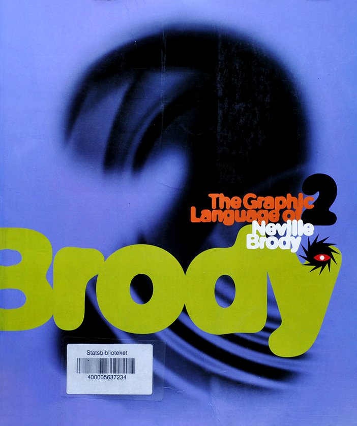
Renowned for his groundbreaking work and commitment to pushing design boundaries at magazines like The Face, Arena, Per Lui, and others, Brody is a true auteur in the world of design. We talked to him at the launch of his spectacular new monograph, The Graphic Language of Neville Brody 3.
Nurtured on 1970s British punk music, which rejected anything that appeared self-indulgent or overwrought, Brody found the perfect launch pad at The Face, the London-based music, fashion, and culture monthly, created by editor Nick Logan in 1980.
The Face inspired an array of fellow magazine rule-breakers, including the late Tibor Kalman, David Carson, and Fabien Baron, who calls Brody’s work “powerful, aggressive, and simple.”
Since then, Brody's journey in graphic design has been marked by a relentless, almost unforgiving pursuit of innovation. His magazine design challenged conventional norms and redefined visual storytelling. Brody’s design approach is characterized by a rejection of conventional grid systems and editorial hierarchies, and a willingness to break free from established design rules.
And he thinks magazines today are missing a giant opportunity:
“That’s the beauty of print, that you can’t achieve in the same way digitally. Digital is so commoditized. We’re not expressing content anymore. We’re just delivering it.
Neville Brody's legacy in magazine design lies in his fearless approach to challenging the status quo and his ability to capture the zeitgeist of his time. By pushing the boundaries of traditional graphic design, he not only influenced the look and feel of magazines but also inspired a generation of designers to embrace innovation, experimentation, and a spirit of creative rebellion. Brody's work continues to be celebrated for its enduring impact on the evolution of graphic design and its role in shaping the visual language of contemporary media.
“Graphic design is all about manipulating the message in order to deliver it. You never have an innocent message.”
Patrick Mitchell: I want to start by asking you an offbeat question: Is it a burden being the spokesman for your entire field every time you take a stage?
Neville Brody: I think it’s more of a burden being in a place where you think that someone else is that spokesman. It’s a difficult question because I don’t see myself as a spokesman for an entire field ever.
Patrick Mitchell: No, I don’t think you do, but I think everyone else does.
Neville Brody: Oh. That’s interesting because there are certainly other spokespersons, -people. You know?
Patrick Mitchell: Everybody just expects gravity from you. And sometimes I would imagine you just want to say, “I just did this because I just did it.”
Neville Brody: Well, sometimes you just do it because you love what you do. And thinking about it, sometimes, is something that happens in retrospect. So it’s not always logical. But at the heart of what I’ve been doing has always been a kind of rigorous structure. And then you improvise within that framework.
So that’s been all the way through. But honestly, just to come back to that question, I think every graphic designer is in a place of being a spokesman. Because I think graphic design is all about manipulating the message in order to deliver it. So you never have an innocent message.
All messaging is about manipulation in one sense or another, even if it’s unconscious. And graphic designers are particularly, I’d say, guilty. But also blessed with that role of turning invisible ideas into tangible concepts. And each time a designer is involved in that process, you’re being quite political, actually, because you’re bringing the designer’s interpretation of that message to play.
So the font you choose, the colors you choose, the images you curate, all of this impacts the way anyone will look at the world. So, yeah, we’re all spokesmen. I’ve just put my neck on the line.
Patrick Mitchell: I was looking at the first edition of your first book, The Graphic Language of Neville Brody, and I paid $85 for it in 1988. And your new book, The Graphic Language of Neville Brody 3, is $85 on Amazon right now. You’ve actually given quite a discount, because in 1988 dollars, your original book is $225. So thank you for that. And now I will hand it off to Deb.
Debra Bishop: Well, I’m hoping that you don’t mind if we go back in time a little bit to start, as we typically do. So, Neville, you received your early education from Minchenden Grammar School, focusing on A-level art. Can you really choose a major that early on in the UK?
Neville Brody: Two things. One, it wasn’t a grammar school. Actually, it was what we call a ‘comprehensive.’ And a comprehensive wasn’t streamed in the same way as a grammar school. You didn’t have to do an exam to enter.
Patrick Mitchell: What age are we talking about?
Neville Brody: We’re talking about the age of 11 to 18. So it’s a proper secondary school and we did O-levels and then A-levels—O-levels at 16, A-levels at 18. And you don’t major either in UK secondary education, particularly. That’s a very American—or North American—thing.
But when you get to A-levels, you do start to be much more selective. And I did English, art, and technical drawing. So I learned how to do bits of machinery by hand, as bits of technical drawing. And that had a huge impact on the fact that, you know, graphic design is creativity and engineering.
But, in all honesty, I skipped school from the age of 14 to 16. And wasn’t exactly an innocent school child at that time. You know, it’s that ‘kidult’ thing of kids in inner cities growing up quite quickly. And doing things like starting smoking at 11, which we were doing here, et cetera. But we’re not going to go into that.
And then I crammed revised at the end of that and came fourth in the score at which point my teachers hated me because they felt that the only way to achieve anything is by applying yourself 100 percent of the time and they were not very flexible.
Patrick Mitchell: Were your parents aware you were skipping?
Neville Brody: I should ask them. I should ask my mom, you know. I think she trusted me to manage it the way I felt I needed to manage it, rather than try and suppress my instincts. She probably knew I was smoking at 11.
Debra Bishop: So you’ve always been pushing the boundaries as a young kid. What was your world like growing up in Southgate in the 1960s?
Neville Brody: Well, Southgate was a North London suburb that was created around an extension to the underground line. It was built in the 1930s, most of it, and it was all similar, patterned housing—very rural, suburban, urban. And at the same time, it was the center for a lot of misbehavior. And there were skinheads at the time—a lot of pre-punk stuff going on. There were hippies. So a lot of the sub-cults.
And I grew up at the tail end of the hippie movement. We weren’t proper hippies, but we weren’t other sorts of tribes. And Southgate itself was obviously boring. But there were a lot of pubs, and for some reason at that time we were allowed into pubs at the age of 12 or 13 without having to show identities, because we all looked a bit older for some reason.
So growing up there, it was an interesting space and a lot of my colleagues that I’ve met since, grew up in a similar area. John Wozencroft, who wrote [my] first few books, grew up about a mile up the road from me. And people like Keith Levene, who ended up as the original guitarist for The Clash, and then worked with John Lydon [aka “Johnny Rotten] on Public Image Limited. And he was a mate of mine growing up, so there was this sort of interesting thing about the suburbs being the center of creativity at that time.
Debra Bishop: It’s unusual. It sounds like the environment and what was going on there at the time was a catalyst for you loving art and beginning the idea of what you wanted to be.
Neville Brody: Well, to be honest, I was drawing before I was walking. So I was picking up a pen or pencil way before I could even stand on my feet. And so for me, there’d never been a question of what I was going to do. I was never going to be a train driver, or a doctor, or a lawyer. I was always going to be an artist. And then it was just a decision then of what form that would take.
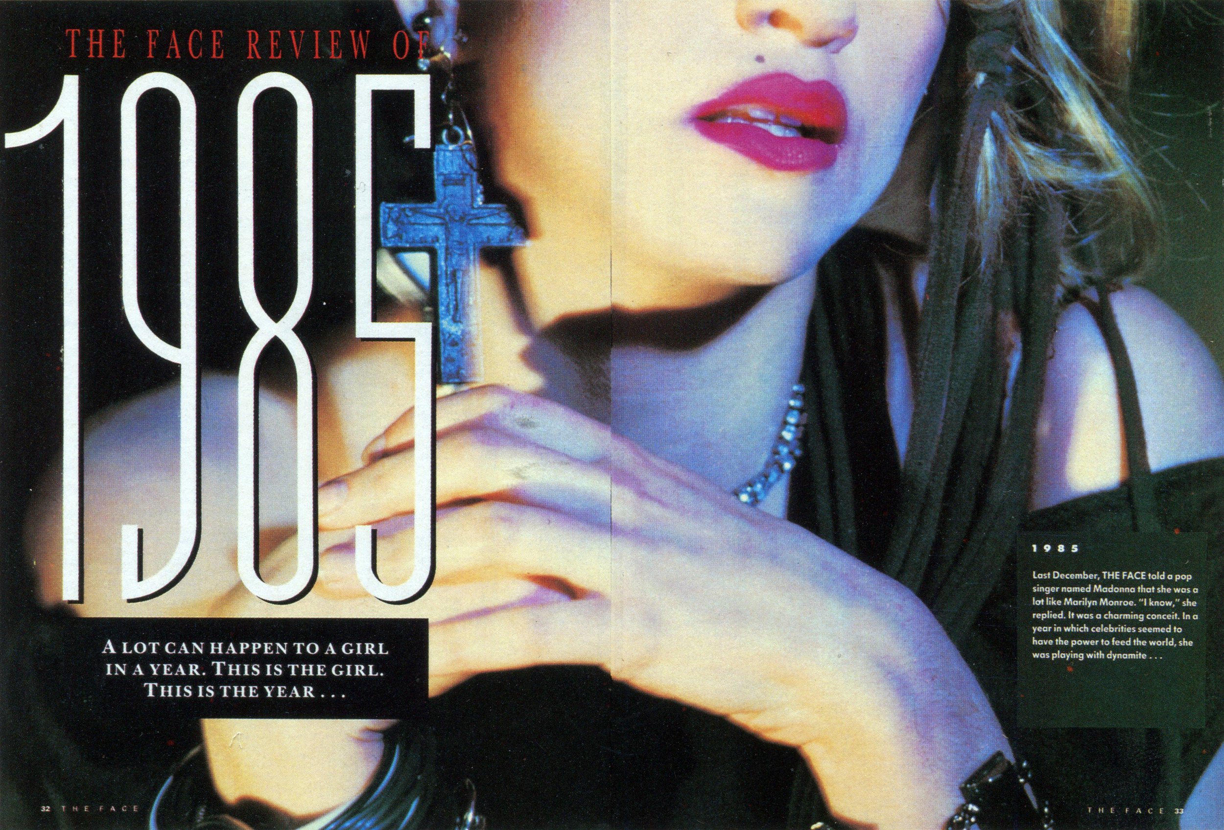
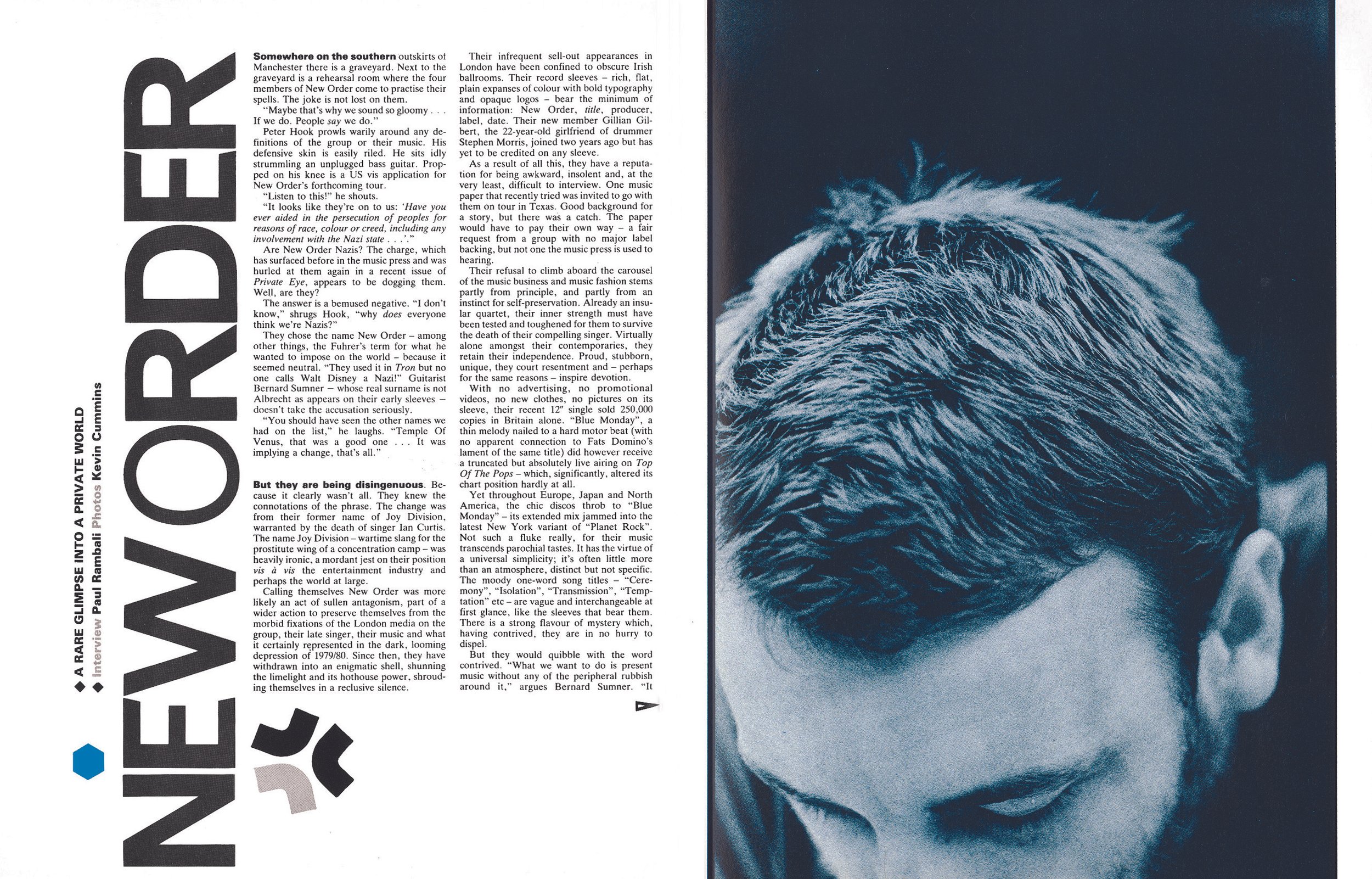
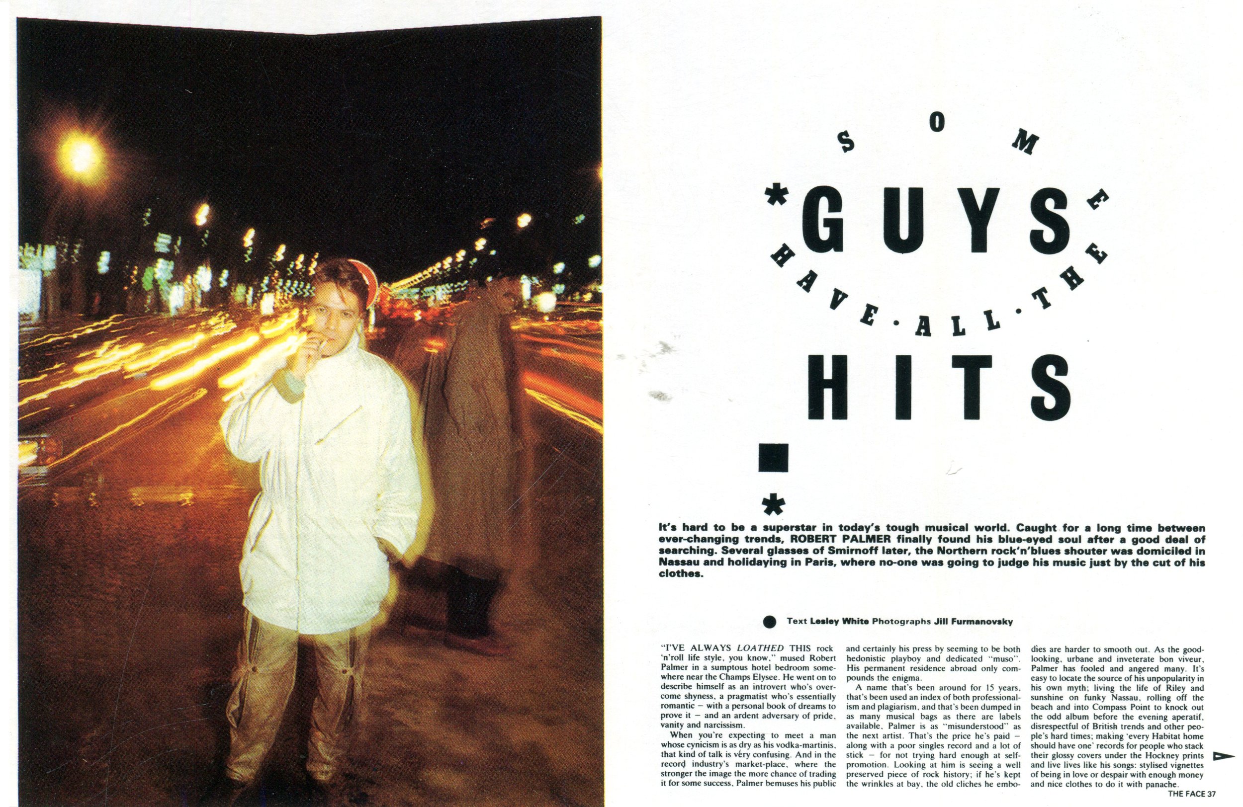
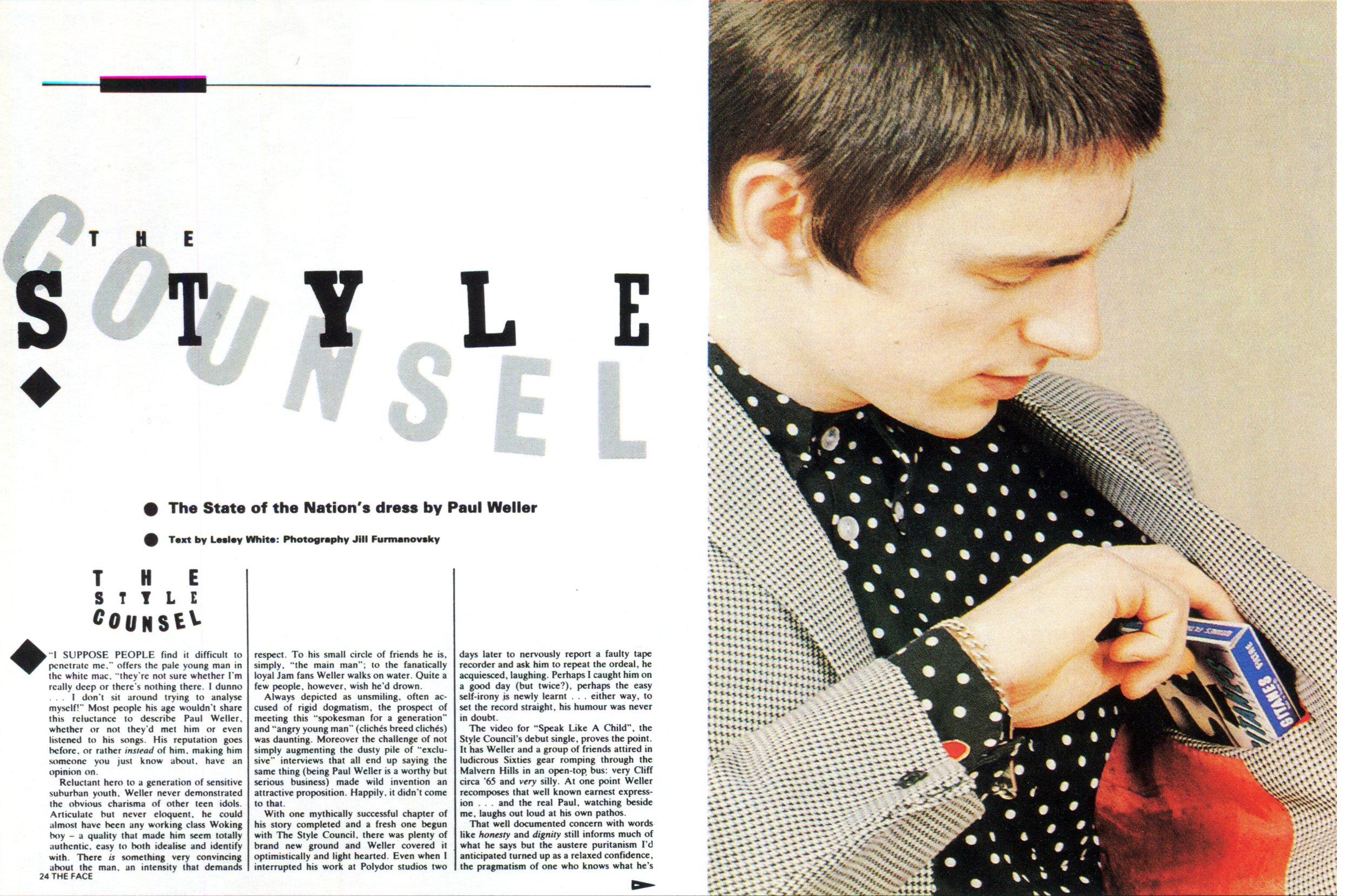
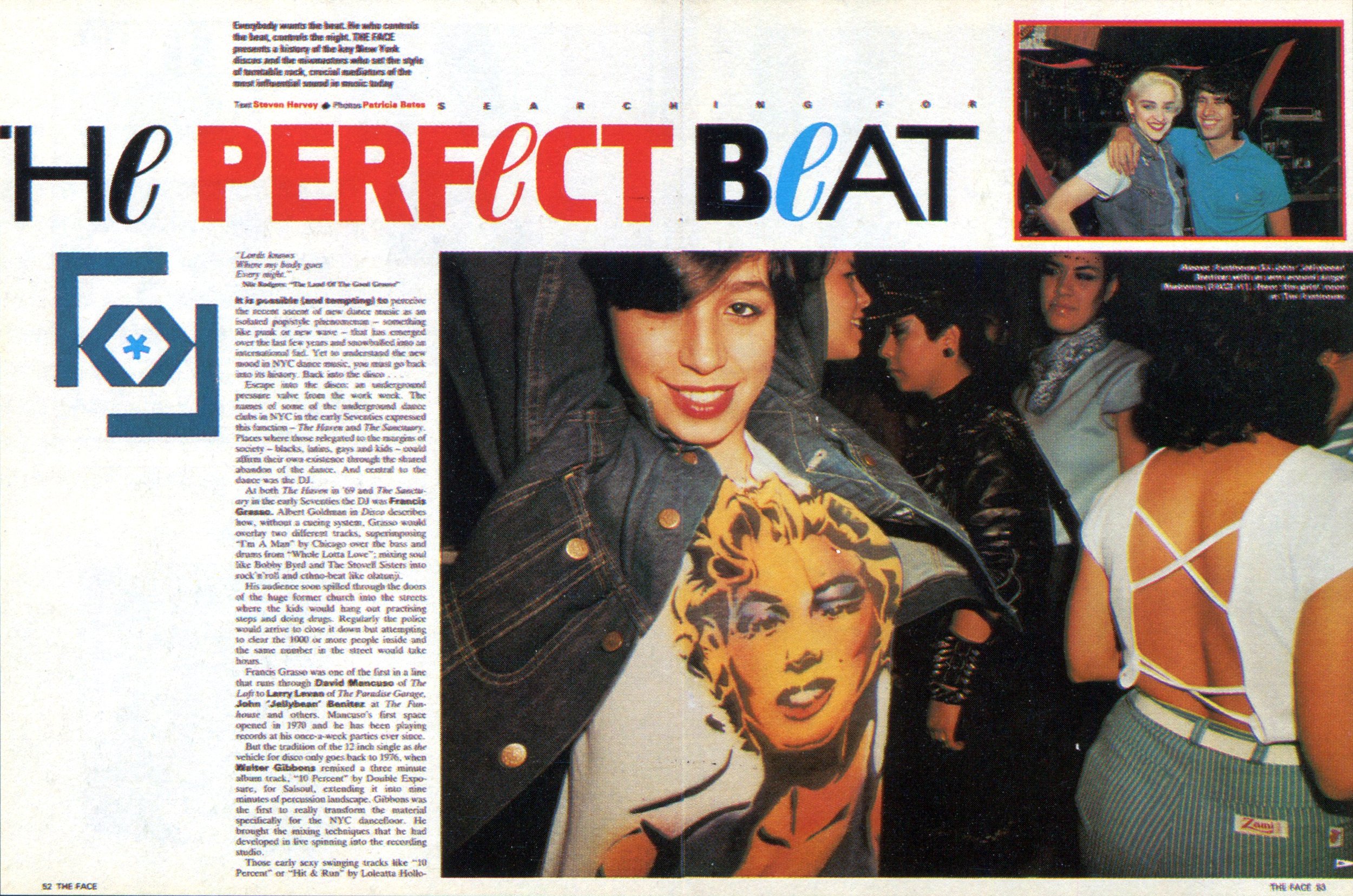
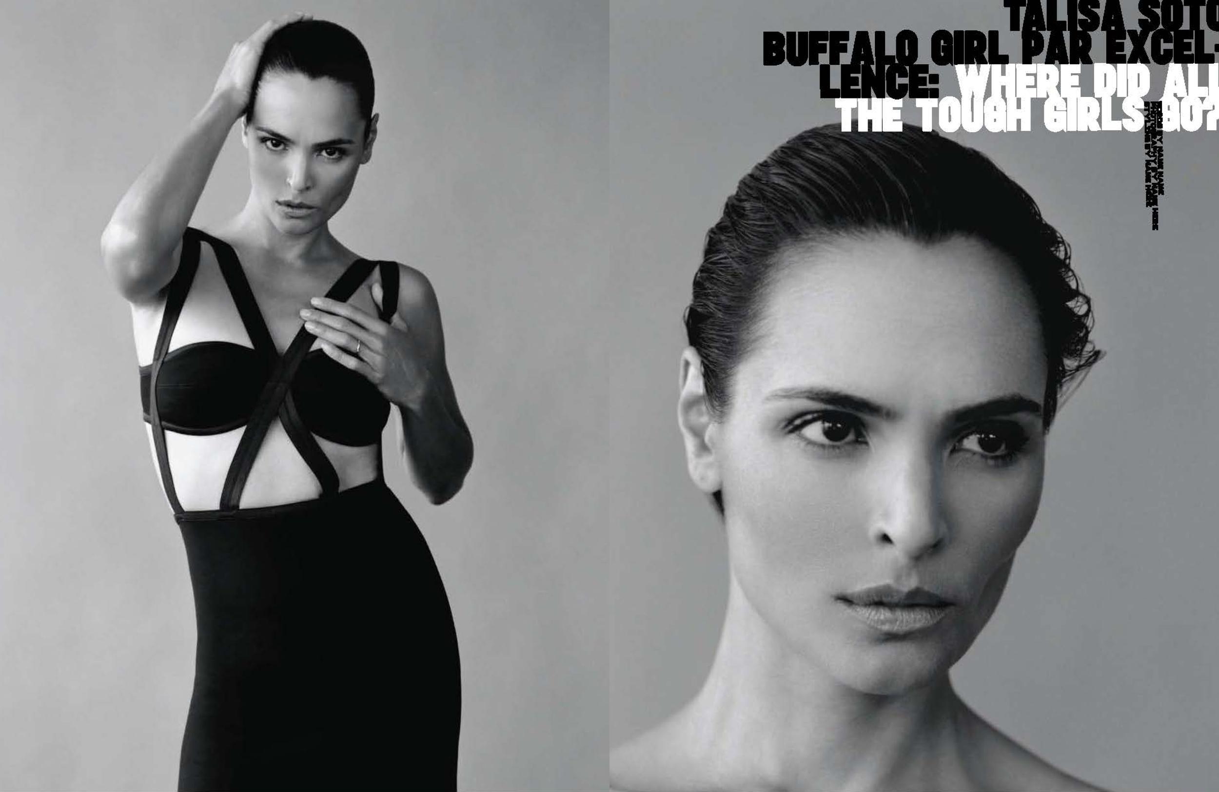
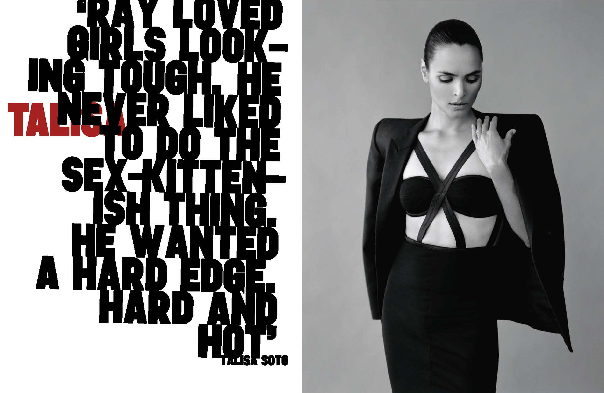
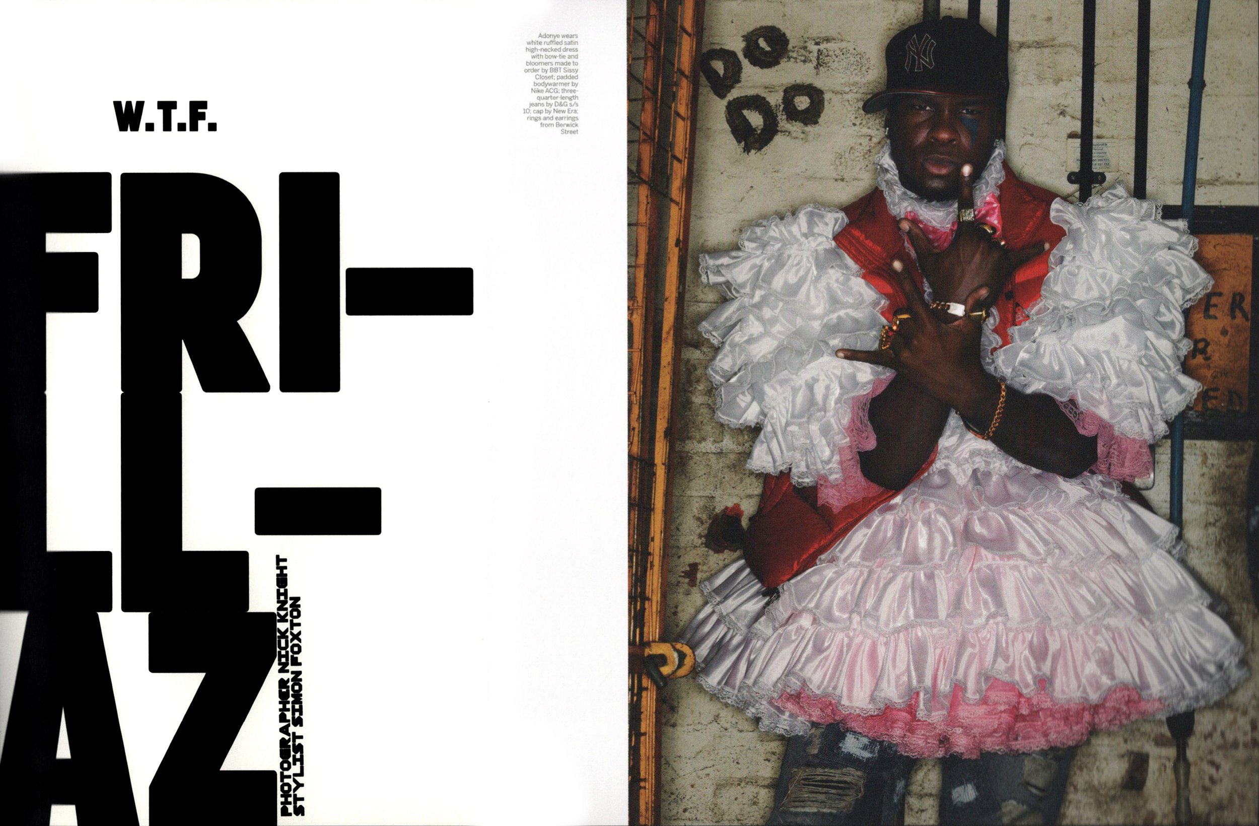
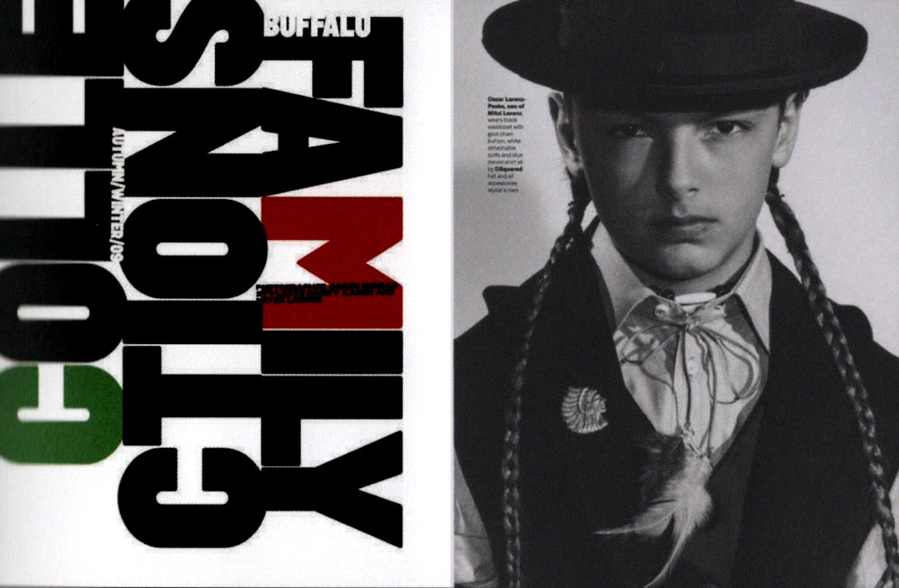
Interior spreads from The Face
“Going to art school is all about finding yourself. But an art school is there to support the development, not to impose the development on any student.”
Debra Bishop: I think drawing is such an underrated skill. Today, especially. So were there any inspirations at that time that you can remember?
Neville Brody: Just coming back to the drawing thing, when I took over as head of program for visual communication at the RCA (Royal College of Art), the first thing I did was to try and reintroduce proper drawing. I think it’s such a critical skill, which becomes ever-more distant with digital technologies and social media. And the instant gratification of our cultures now means that, you know, sitting down to take the time over drawing seems a bit of an anathema, but around that time the biggest influence, I think, on me was what was happening in music.
From the age of 10 or 11, I discovered reggae. And that was really taking off in the UK. And not only was it a huge impact on music culture, but also visually with the record labels being very, let’s say, low-resolution, often done by hand rather than printed en masse.
And that, coupled with gatefold album sleeves. And that led me to become very interested in people like Roger Dean and Hipgnosis. And actually, I ended up, after leaving college, spending some time working with Hipgnosis.
Roger Dean, incidentally, I’d sent my record covers into a book called the Album Cover Album, of which he was the editor, and he looked at my work, apparently, and said, “God, any baby could draw this.” And he rejected it all.
Debra Bishop: I have both of those books.
Neville Brody: I actually did the book of Hipgnosis. Around that time I did a Pink Floyd cover, which I never put my name on. I shall share that privately one day. But in Britain, the music industry was the biggest opportunity for young designers to really find a platform that supported them and allowed them to publish their work. Especially when punk came along and in almost every bedroom in London there was a record label happening. It was an incredible time. At one point there were 200 reggae singles coming out every week in London!
Debra Bishop: I loved record album design. I aspired to that. But you know, by the time I got there things were becoming very small. In many ways.
Neville Brody: Yeah, the biggest influence around then was probably the Surrealists which would have been, you know, Dali. It would have been Escher, particularly. And that gradually got replaced by people like Richard Hamilton, who was a very major influence on my work, William Burroughs, Dadaism.
Patrick Mitchell: Yeah, I have to thank you, because I was not aware of Wolfgang Weingart. But, my God! I went off on a tangent after reading in my research about him being your influence and it’s just like, “Whoa!”
Neville Brody: Well, Wolfgang Weingart—if you look at all that was happening in California at the end of the ’80s or even the, kind of, mid 80s, was all coming out of Weingart’s influence.
Patrick Mitchell: April Greiman? People like that?
Neville Brody: Exactly. Well, she studied under him. And that set the whole pattern for all of the early digital work that was coming out at that time.
Patrick Mitchell: Jumping back to college, you attended the London College of Printing, which is now the London College of Communication, which our friend Alex Hunting attended. What age are we talking about now?
Neville Brody: It would be 19, I think.
Patrick Mitchell: Yeah, so you’re just finding yourself and you’re trying to feel comfortable about an approach to your future, and it sounds like your teachers were very harsh. They condemned the “uncommercial quality” of your work. But at that age, how does that not wreck you at such a vulnerable, fragile place in your life?
Neville Brody: Well, partly because I’d made the choice to go there. I thought if you’re going to learn about anything, you need to probably go to the most strict learning environment to be able to take that on board. And, you know, like jazz, you have to really learn your instrument and the tonal scales, et cetera, in order to then improvise.
And I thought, “Well, I’m not going to be able to undermine or challenge design if I don’t really understand the fundamentals.” I’d been to a foundation course at Hornsey College of Art in London. And Hornsey was the location in the late ’60s where all the student uprising started in the UK. It had been largely neutered by the time I went there, but there was still an undercurrent.
And the guy who sat behind me, he was going to the early Sex Pistols concerts, which I rejected completely at that point. But he turned out to be Mike Barson, who was the keyboardist and songwriter for Madness. So there was a lot of that going on.
The Slits punk band went to Hornsey and one tutor said the probably the best thing to me ever, which was that, “The difference between becoming a designer and becoming an artist is that a designer needs someone else to set the brief.”
And that made me understand that actually I needed to become a graphic designer. And have something to react with—either along with or against. Or use it as a provocation for thinking. To try and bring artistic sensibilities to a graphic design space. And then the decision was—London College of Printing had the reputation at that time of being the strictest environment for learning graphic design in Europe at that point.
Patrick Mitchell: Yeah, and I should say, it wasn’t all their fault. You invited this upon yourself. There’s a quote that says, “If my tutors said they liked something I was doing, I would go away and change it.”
Neville Brody: Yeah, well that was an evidence of me being accepted by a generation that I didn’t want to be accepted by, with the values that they held close. And London College of Printing was a very commercial graphic design environment. And it had rules. It said, “If you’re going to do this kind of project, in this kind of material, at this size, for these people, this is the way you must do it.” So it was all driven by a set of internal regulations.
And I was saying, “Well, you know, the world has changed. And the world constantly changes. So we need to change the way we communicate.” And that was not greatly accepted. And I think on two points they tried to throw me out once for putting the Queen’s head sideways on a stamp, which, now, you’d be like, “Well, yeah? And?”
But at that time it was seen as something incredibly sacrilegious. And they did try to push me out. And then at the end of the course, my tutors failed me and gave me an actual zero. A fail. But the external assessors gave me a first, so there was this complete misalignment between what was going on in the London College of Printing and where the world had shifted to.
And so much so that within two or three years a lot of the tutors I’d had actually pretty much stopped teaching, because they realized they didn’t understand this new space and couldn’t move along with it. And I remember speaking to students there who felt quite lost at that point because they neither had support nor opposition.
So yeah, I think going to art school is all about finding yourself. You’re not there for the art school. And a lot of art schools make that mistake. But an art school is there to support the development, not to impose the development on any student.
Patrick Mitchell: Do you have a sense of at what point that might have changed—maybe because of you?
Neville Brody: No. It’s cyclic, isn’t it? You know, the problem with design education right now is that, especially in the UK, it’s such a numbers-driven game now. Government funding in the UK has almost disappeared for both further- and higher-education. And we’re looking more and more like aiming towards an American model of endowments, of fee-paying gifts, and expensive courses. Incredibly expensive courses.
But the UK is moving towards that without the infrastructure, and structure, and culture that then allows people to be aware that a graduating student is for their benefit. For the benefit of the student. And in the US, I think that’s been taken on board more. That, you know, a good graduating student is good for the industry and for the economy, and for the nation. But here, we’re still putting all the emphasis and responsibility on the student who then has to pay back his or her education for the rest of their lives, pretty much.
Debra Bishop: Yes, it’s the same in the US. So, Neville you, at the age of 19, you had a crucial decision to make: stick with fine arts or change to graphics. What led you to your final decision to be a graphic designer?
Neville Brody: The reason I chose to move into a graphic design or a design field—there were two main reasons. Or three, probably. One was that I felt that graphic design and advertising were having a negative impact on people through their incredible ability to manipulate responses. And what I wanted to do was use my creativity to learn about those techniques and turn them upside down, turn them on their head.
And those are thoughts then that came into the way I approached magazine design and record cover design. The other reason was that I thought that fine art was dishonest and was ultimately about a market and sale value. And that wasn’t what it was wearing on its t-shirt. And that it was putting itself out there as something that was responsible for reflecting the underbelly of society and being able to pose philosophic questions, which it does. But by that point, it had become such a commercialized space.
And the third point was the idea that actually, painting reached a very small proportion of society. With graphic design, with the new access to wide ranging printing capability, meant that you could reach a far bigger audience and market that was moving faster.
The Face was a massive influence on fashion, music, and style for over two decades. Brody served as its art director from 1981–1986.
“What was great about The Face was the ability to use it as a laboratory to explore things and then have them published.”
Patrick Mitchell: Given how well-documented your music career was and the focus of our podcast, I think we’re going to skip that. But I would like to ask how—so you get out of college and you go almost directly into the music business, which is your first chance to really stretch yourself out and apply yourself to real things. I would love to know about the transition from—at a certain point you decided to go into The Face—what was it about what you were doing that made taking on the job at The Face so appealing. What did you learn doing music that made you feel like this was the next logical step?
Neville Brody: Well, a few revelations guided me on that. One of them was that when I was at London College of Printing, I really despised typography and type, because at the London College of Printing, that was the root of all good from their perspective. And I saw it as the root of all manipulation and evil, and it was very traditional. And I was just trying to break the rules. And one of the reasons I’d moved into doing record covers was because I saw myself very much as an image maker. Certainly never as a typographer.
And what I was doing in those record design years was treating type as image. Trying to explore the expressive qualities of typefaces, and typography, and words. And how can you actually treat that by unleashing its emotive quality. And not just assuming it’s just there on the page.
Treating type as image was the big breakthrough for me. And then incorporating that, processing it, experimenting with it. And when I left London College of Printing, the first job I did the day after I took down my graduation show was to work at Rocking Russian, which was Alex McDowell’s record design agency. And that was initially paid for by Glenn Matlock’s new band after he’d left the Sex Pistols. And Malcolm McLaren was involved in that.
So I joined that. And Alex had come out of a fine art background and had been introduced to Russian constructivist graphics by Terry Jones, who was at that time art director for British Vogue. And they came together to create i-D. So i-D was born at Rocking Russian. But by that time I hadn’t been paid for a number of weeks and had to get another job and was working at Stiff Records.
But before then, I’d gone to see Nick Logan at Smash Hits. He was editor of New Musical Express before then. He launched Smash Hits with EMAP—East Midlands Associated Printers—which is kind of a provincial printer that happened on these global titles. And Nick took the idea of The Face to that publisher, and they refused it.
So when I’d been to see Nick working on Smash Hits, he said, “I would never ever employ you for Smash Hits. If something else comes along, I’ll give you a call.” He probably did me a favor at that point. Then he launched The Face by taking out a small—not loan, but emptying his building society of the small amount of money he had in it. He launched it as an independent and I went to visit him after the launch. He was around the corner from Rocking Russian, in this damp basement where the carpet was just rotting with pools of water and ...
Patrick Mitchell: “Snow in the toilet”?
Neville Brody: Yeah, exactly. That was when I was squatting. We’ll come back to that. And nine or ten months in, he said to me, “You know, have a go. There’s this article about Kraftwerk. Here’s some pictures, here’s the type, it’s on these pages. Go and play around.” So I did. And I took it back and showed him, and he said, “You’ve got the job of designing this magazine. You’ve shown me you can do something I can’t do.”
And he gave me a completely free hand on it, which was incredible. He’d been working with Steve Bush before then, who had been doing Smash Hits. But Steve also had that other job. So, yeah. And it gradually became the art director position.
And don’t forget in those days we were putting the whole magazine together in a week. You know, three weeks I’d be doing other work and then suddenly everything came in and you had a week to do everything. There’d often be a bike messenger waiting at the door for you to finish your headline design then he would grab it and rush off to the printers. And often having to work all night drawing nearly every headline by hand at that time.
Patrick Mitchell: So it sounds like you were not making a living wage from The Face. Were you scrapping and doing all kinds of whatever you could find to work on?
Neville Brody: Yeah I was. It was hand-to-mouth at that time. And my dad, at that time, said, “Well, you know what?” He said, “Neville, why don’t you just give it all up and go and work in an ad agency?” And I just became even more stubborn as a result of that comment, of course, even more determined to make it. I didn’t want to sell out at that point.
And I chose four years of 24/7 work and abject poverty, rather than give in. And, you know, I’ve always thought that you have to be obsessed if you’re going to be in a position to make something work for you.
Debra Bishop: Absolutely.
Patrick Mitchell: I’m picturing Sid and Nancy.
Debra Bishop: Neville, when you sat down at your desk on the first day of The Face, did you have a plan? Did you have a plan or did the ideas come gradually?
Neville Brody: No, what was great about The Face—and, to be honest, on a huge amount of projects since especially in editorial—it was the ability to use it as a laboratory to explore things and then have them published. And then respond in real time, you know. What did you keep? What did you throw out on the next issue? What was working?
Wire, the band, at one point didn’t make any record beyond two minutes because they thought, Once you’ve done everything and put the chorus in, why repeat it? And that was something that I took on board very much. You know, once you’ve tried something, if it works, there’s no point in doing it again. Try something new.
And in theory, in digital media, this is what we could be doing right now. But it’s incredible how short the lifespan of a piece of content is on social media and how much it looks like everything else. You know, we could be using that as a real cultural ideological accelerator.
But actually, I think the more that gets out there, the more conservative it is. And we’re almost back at the beginning of the seventies again.
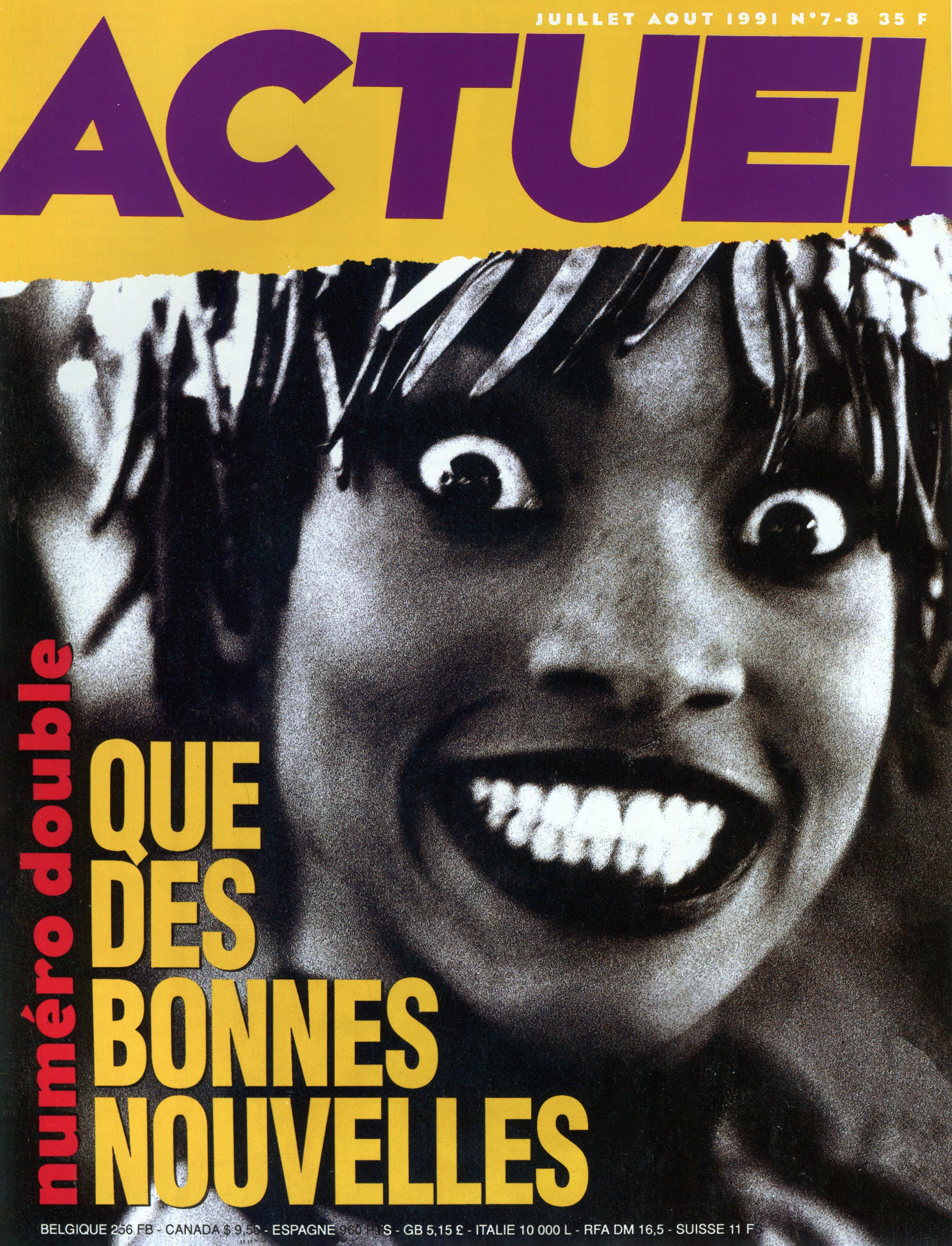
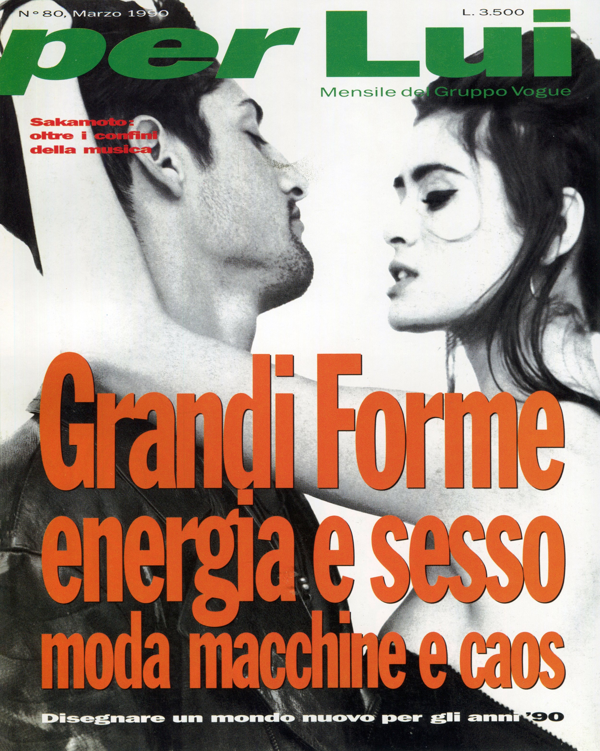
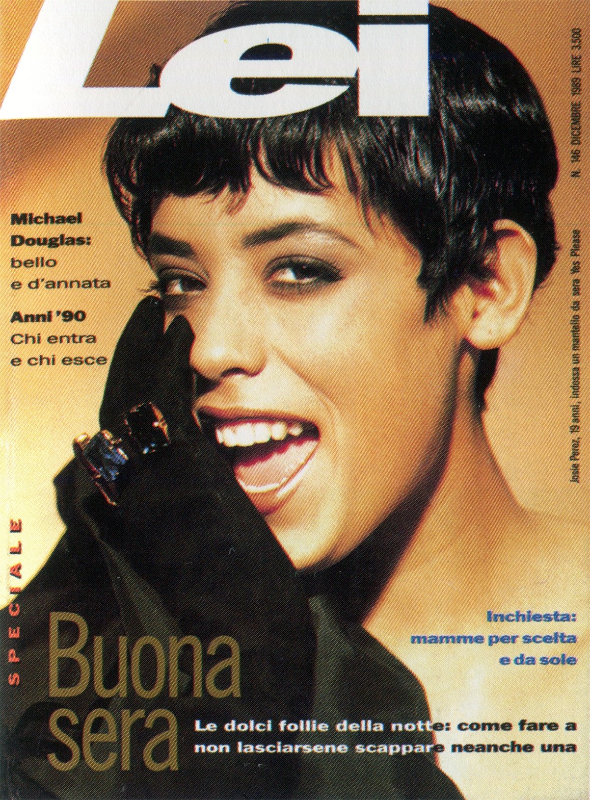
From 1987–90, Brody served art director at Per Lui and Lei, for Condé Nast Milan, as well as the French magazine Actuel.
Debra Bishop: Did you feel like magazines were the perfect platform for you to prove your theories?
Neville Brody: No, I hated typography, remember? So my rebellious approach was to treat it as image on the page. And luckily with The Face, it was possible to do that—to design by hand. A new typeface for every issue at some point. Or hand-draw a complete headline and add twists and experiments. Have headlines that deteriorate and evolve from issue to issue. Yeah, that kind of living laboratory.
And in digital media, it’s not really feasible to do that. So in a way, I discovered it. But by protest, in a way. So I never thought, “Oh, I must work on The Face magazine.” And at that time, record sleeves were shifting away from being ideological and ideas-based and experimental into, you know, what photographer and what hairdresser you picked.
So the shift was away from content and towards image. It was away from theory and narrative and ended up being all about haircuts. And ironically, you know, the band I really despised at that point, who summed it all up, was Haircut One Hundred. And they happened to be on the very first cover I did for The Face.
Patrick Mitchell: Did you want to quit that day?
Neville Brody: I did. I didn’t quit. I wanted to quit. Yeah, you had to take that time ironically, as well.
Patrick Mitchell: Yeah. You know, the way you’re describing the startup of The Face, I imagine it was not like most well-funded magazines, where there’s an issue lineup presented, then a slew of photoshoots assigned and illustrations assigned. It sounds like it was much more of a “throw everything into a blender and make it happen.” So you were, I assume, receiving promotional photos and things like that. You probably had very little control over the photography.
Neville Brody: We actually controlled most of the photography. It’s quite odd now. The Face magazine was 40 years ago, Patrick. You know, obviously there’s something still quite key about The Face, in that not much has happened in magazines since, in some ways. And I’m not saying The Face was great or that it was that pioneering, but it happened to have been produced at the time when it was possible to do that.
So it’s quite odd for me 40 years on to be talking about something that was back then. But the thing that identified it, and coming back to what you were talking about, the photography, was that it was a community of new, young creatives all coming together. And we used to hang out in The French House, which was a pub in the middle of Soho in the middle of London.
And nearly all the people that were writing or appeared in the magazine were frequenting that same pub. And, you know, there’d be, like, 200 people that were architects, or artists, or actors, or photographers, and stylists all coming together into one place. So it was an explosion that was generational that probably happened in the sixties as well.
Patrick Mitchell: I worked at Musician magazine in the eighties and we did 100-page issues and the photo budget was, you know, $3,000. But money was never an issue because nobody cared. They just wanted to shoot for the magazine. They wanted to shoot the people they were shooting. So I imagine it was similar for you.
Neville Brody: Yeah, it was very similar on The Face. People would turn up, people we trusted and worked with, would just turn up with shoots. Especially on the fashion stuff, we weren’t commissioning almost any of that. That was being brought in because people that were producing it saw the magazine also as a platform for getting their ideas out.
Patrick Mitchell: I found this quote, I don’t know who Paul Gorman is, but he said, “The Face was one of those extraordinary publications that not only recorded what was going on in culture, but also played a part in progressing it.”
Neville Brody: Well, Paul wasn’t part of the culture, he’s come along since and written about the culture. So yeah, I often say it was made by the people who would have read it. It was a magazine we made for ourselves, basically. It was a fanzine.
Patrick Mitchell: You’ve also said it should have died at the end of the eighties.
Neville Brody: Well, yeah, I think the role it was playing then—it should have been. I should have been made redundant like 30 years ago and replaced.
Patrick Mitchell: Just at The Face. Not in life.
Neville Brody: Well, no, I think in life, as a graphic designer. I think what I expected was that another generation would come along and smash everything we’d done and come with something that was new and relevant then. And that never happened, surprisingly. And now graphic design isn’t dead, but it’s really shifted.
Patrick Mitchell: And there’s a new iteration of The Face. Have you seen it? Do you have any thoughts on that?
Neville Brody: I don’t have any thoughts on that at all, Patrick.
Patrick Mitchell: You think it’ll make it?
Neville Brody: I don’t know what "make it" means to publish a magazine these days. Now there’s a shop in London called magCulture, put together by Jeremy Leslie, he used to be the art director on Blitz magazine.
And in magCulture, it’s almost like a looping back. And it’s filled with hundreds of independent magazines. Because printing has become more accessible and cheaper to do, especially in short runs. We’re almost now at the “luxury” fanzine time in publishing. And it’s just great to see all those magazines in there. Some of them are only produced in editions of 200 or 2000.
So we’re seeing a sort of circle. It’s not quite the same as the vinyl one. Last year was the most vinyl sold in the UK for 20 years or something. So there’s a return to kind of physicality and unique objects.
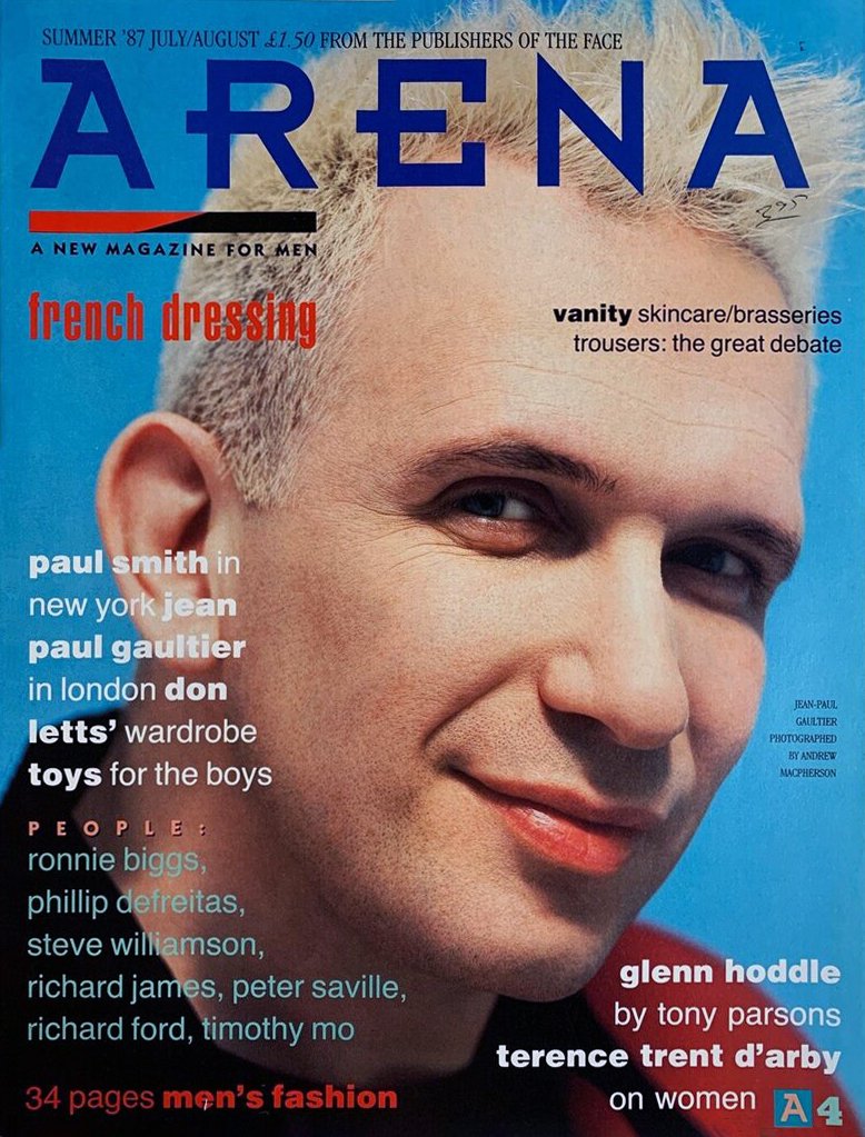
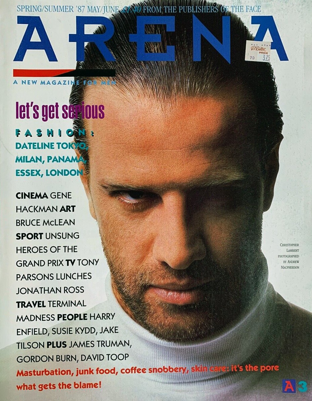
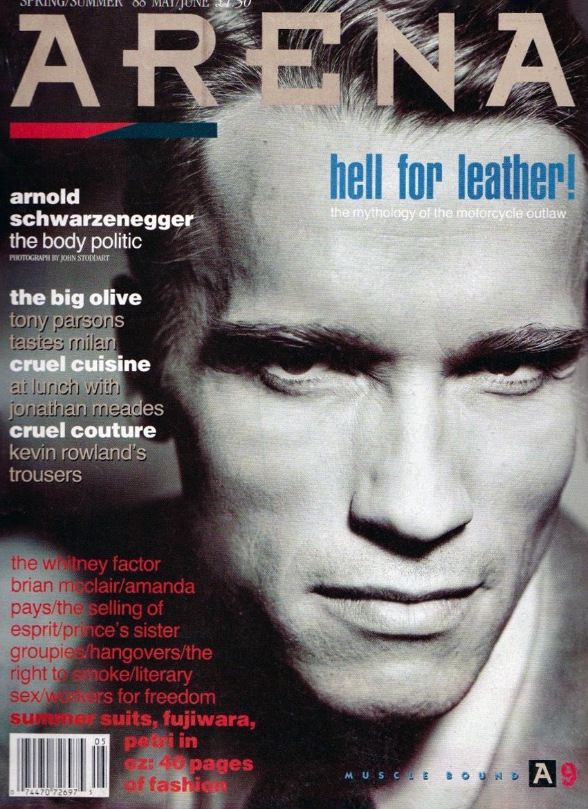
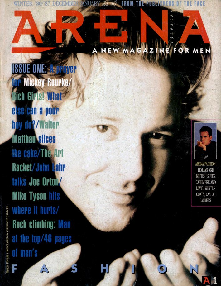
“On Arena, we wanted to see how far we could push the use of Helvetica into an emotional space, how we could try and create what we were calling ‘concrete poetry.’”
Arena was a monthly men’s magazine launched in London in 1986 by The Face’s founder, Nick Logan.
Patrick Mitchell: So you’ve had roughly a 10-year magazine career. You designed City Limits, The Face …
Neville Brody: It comes in and out, Patrick. You know, The Face was—that period was ’82 to around ’90, so that’s probably like an eight-year thing plus, and I was including Per Lui and Lei magazine ...
Patrick Mitchell: Yeah. All happening at the same time. But the one I wanted to ask you about, which was “one of these things is not like the others.” You worked for Tatler.
Neville Brody: Yeah, one issue.
Brody’s one—and only—cover for Tatler.
Patrick Mitchell: How did that happen?
Neville Brody: Well, I don’t know how it happened, honestly. No, honestly, I don’t know how it happened. I don’t know who introduced me to who or called me. But I suddenly found myself in the Tatler, office in the Condé Nast building.
Patrick Mitchell: For our listeners Tatler is, I would say, the most similar in the States is Vanity Fair. But a very high-end, gossipy, glossy rag …
Neville Brody: … Particularly about a specific sector in society, which is not necessarily the aristocracy, but something quite close to that. But I went in there with a remit to try and change things. And I realized very swiftly that it was never going to be possible. But the one thing we did was, we did the first-ever cover which had no cover lines. It just had a single image. So I’m proud of that.
And I’m proud of the fact that I got out really quickly. It was a great experience and hellish at the same time. And the great Mark Boxer, who was the editor at the time, I realized that he, no matter what I was going to do, he was still the real art director and wasn’t going to be open to change.
And we actually did something else. I worked with Mademoiselle magazine in New York. It happened over the summer. And I was coming in, redesigning the fonts, the headlines, the page layout. And Alexander Liberman, who had been on vacation, came back and the first thing they did was show him my new designs. And he actually tore it up and put it in the bin, and said, “How pretentious! Mademoiselle will never have its own fonts!”
Patrick Mitchell: That’s interesting. I hadn’t thought about that, but I would assume that at some point after the big success of The Face, American publishers would be coming to poach, no?
Neville Brody: Well, no, it never happened. Mademoiselle was the only foray.
Patrick Mitchell: Interesting. If it had been the nineties, they would have made you an offer you couldn’t refuse. British art directors were a hot commodity at the time.
Neville Brody: Yeah. Well, the work we do in the US is very different now. You know, it’s clients like the Mayo Clinic, which is one of our big clients. Coca Cola. We’ve done all their new typefaces.
Patrick Mitchell: No, but I’m thinking even back in the nineties, you know, Rolling Stone, where Deb worked, was the premiere magazine. Not like The Face, but there were magazines in the sort of wheelhouse of The Face that were starting here.
Neville Brody: Yeah, we’ve never been approached at all about that. And ironically, I was really influenced by magazines like Wet, which I thought was an incredible magazine.
Patrick Mitchell: Yeah. That was a California magazine.
Neville Brody: Yep. Very postmodern.
Patrick Mitchell: Well, there was a big British invasion of art directors, several years after, in the mid-to-late nineties.
Neville Brody: I think I dropped out of magazines by that point. No, I was never approached. Mademoiselle was the only American magazine I ever got contacted by.
Debra Bishop: Let’s just talk a bit about Arena. I’ll just quote Neville, “On Arena, I wanted to reject style and decoration and show that it is actually the design that counts. We were trying to force Helvetica, which I hated, to be emotional. It was also an ironic statement. Everything was over-designed, design was the content at that time. At Arena, we were saying, ‘Well, no, the content is the content.’ In the end, though, it failed.”
Neville Brody: Well, Arena, for me, was launched as a kind of an antidote to what had been happening at The Face, which was that people were buying each issue in order to look for something new. In order to be able to copy the style. And The Face for me was never about style. Ever. That was the least interesting thing.
It was all about breaking down conventions, looking at the structures of language and visual language in order to allow new things to happen. But people would just copy the surface style of that and treat it as a very, kind of, decorative thing. And, within a week, it would be fed back into advertising. And then appear in the next copy of The Face.
It was looking more and more like the content, and they were catching up. And I just thought, We just have to stop now. We just have to stop seeking the new just for the sake of seeking the new. So by making Arena magazine have the same visual system every week every month—actually, it was quarterly—and use something as industrial as Helvetica, which is the typeface that they’d been largely using at the London College of Printing. If you’re going to boil everything away in modernism, it’s Helvetica.
So I wanted to use Helvetica, which was the antithesis of that kind of exuberant culture in society at the time. But then we found ourselves getting bored with it. But what we didn’t want to do was—and what happened at The Face a lot—we’re bringing in new emotions by creating new typefaces.
But on Arena, we wanted to see how far we could push the use of Helvetica into an emotional space, how we could try and create what we were calling ‘visual poetry,’ or ‘concrete poetry,’ but in editorial terms, and trying to force Helvetica into becoming much more painterly. So instead of introducing a new font to bring, kind of, painterly thoughts, we were choosing a really basic industrial font and trying to make it emotional. And allowing the content to be the thing that led that.
So using scale, using white space, using the way you would crop an image, the way that you would frame the rest of the text around that. Trying to make the page itself express the content as much as possible. And inevitably in the end that also became drawn down as a style, at which point after four or five years I said, “We just need to stop now.” And I pretty much pulled out of magazine design at that point.
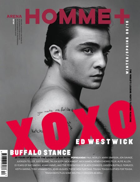
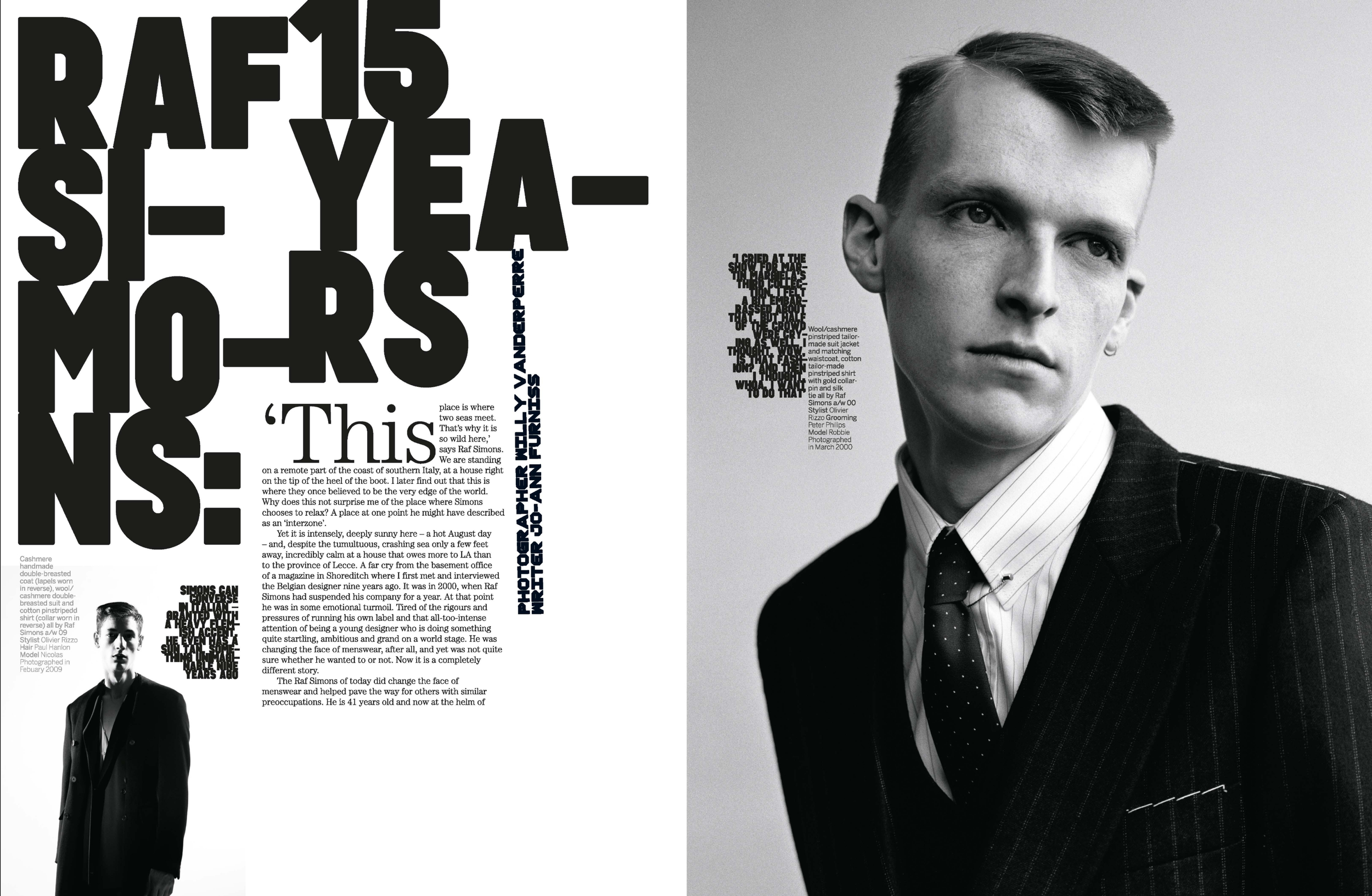
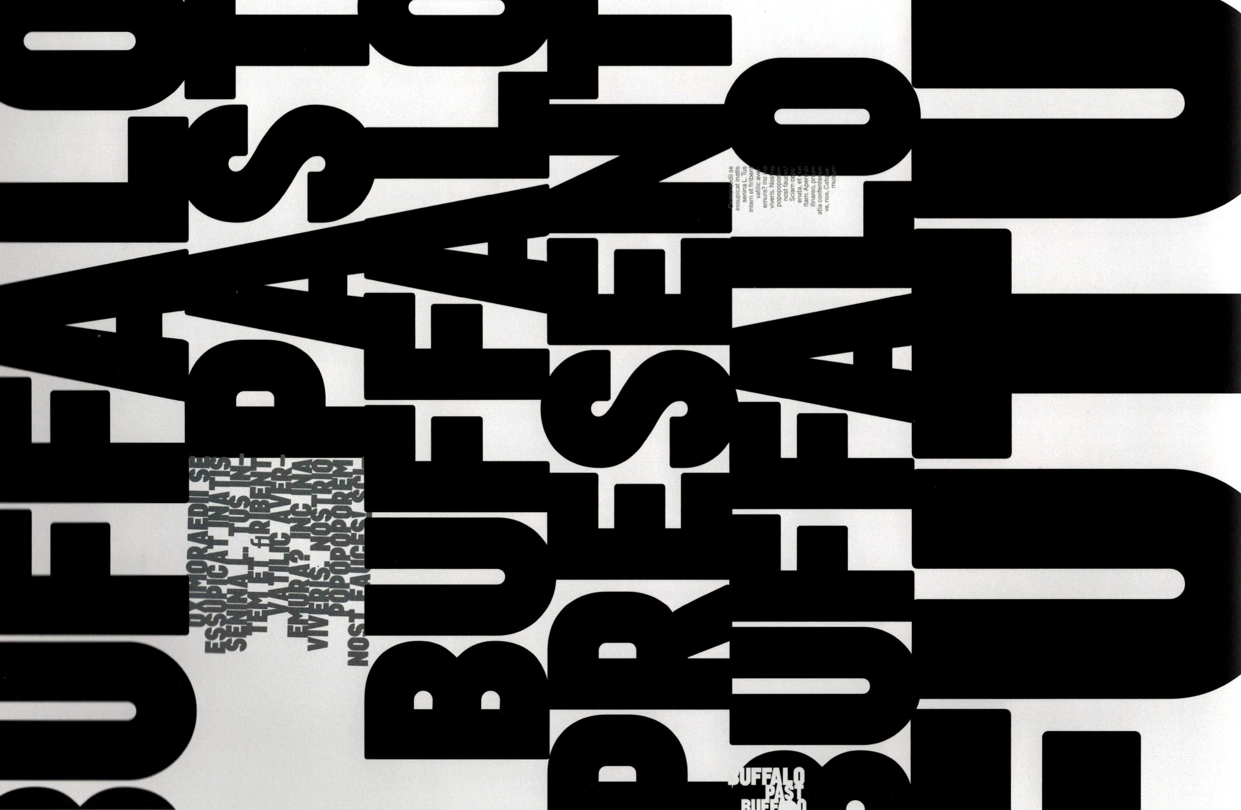
And then in 2010—I hadn’t designed a magazine probably for 16 or 17 years—Joanne Furness, who was the editor of Arena Homme+, approached me. And it took a few lunches, but she persuaded me to come back in. And for three great, emotionally exhausting, traumatic issues we managed to rethink the idea of how word, image, expression, headline, the page itself—how all that comes together as a dynamic force that can carry the reader along a journey.
So I’m loving print at this point. And I hate to say, but it’s a shame you guys haven’t seen the new book yet, because that’s something that I’ve taken into the book itself, where it’s been a very dynamic journey through changing pace, changing the way headlines and chapter openers should work, how pull quotes should work, how content juxtaposes with other content. So, hopefully, you will enjoy that when you get your copy.
Debra Bishop: I can’t wait to read it and see it.
Neville Brody: But that’s the beauty of print, that you can’t achieve in the same way digitally right now. Digital is so commoditized and it’s almost like having a fixed building and then all you can do is look in the windows. All we’re doing—we’re not expressing content anymore, we’re just delivering content.
Debra Bishop: Exactly. It’s a deploying mechanism.
Patrick Mitchell: The last magazine I want to ask you about is Fuse. I distinctly remember getting the first issue—delivered on a floppy disk! I have a quote from you from 1992—that’s 30 years ago! You said, “You can publish a magazine as a multimedia file on a disc, and this is undoubtedly the future. There is still a place for printed work, but I think we will have only just begun to explore the potential of electronic media.” And that was 20 years before the iPad.
When you said that, we had literally just started getting Mac IIs on our desks to produce magazines. But, obviously, you were 100 percent right. A question I want to ask you is, the iPad came along and promised to be the catalyst for digital, I guess, digital magazines, digital media. How do you feel that period went?
Neville Brody: Well, I think it’s quite easy to understand what was happening 30 years ago, if we look at what’s happening now. And it’s almost like a reverse telescope. Thirty years ago, it was the advent of digital design, digital communication, and it was exuberant. We could just experiment. And publish it.
And soon after Fuse launched in Japan, I partnered with the world’s first digital gallery, which was Digitalogue. And that was in Harajuku, near Shibuya. And on Saturdays, Digitalog had Floppy Disk Day, where people would write short bits of program that could fit on a floppy disk and go in and swap with someone else’s floppy disk. And working with them we created the world’s first digital publisher. John Maeda’s first two or three pieces of work, Flying Letters, were published on floppy disks. And this is all related.
So what I’m saying is at that time, digital communication was the new frontier. It was the new wild west. And we could do anything. And now it’s become so structured and frameworked. I call it ‘utility bills with pictures.’ Because that’s what it feels like. It feels like you’re looking at your phone bill and there’s a few pictures on it. And this means that the whole framework is so controlled that all you can do is stick something in a small square or whatever.
Debra Bishop: Yes. We’ve become box fillers.
Neville Brody: Yeah. But then it’s not even exuberant. We used to be able to break out of those boxes and that’s what magazines can do so brilliantly that I think digital media has lost the ability of doing. And … I don’t know. I still love print. I still think print has got a lot of potential.
And you think about, Well, it’s using paper. Is that sustainable? You’re distributing physically. Is that sustainable? But then if you look at the server farms that are supporting our digital social media spaces and AI, they’re far less sustainable, in all honesty.
Brody was invited back to redesign Arena Homme + in 2009
“Friction and difficulty are good things that allow people to get off of the wheel and really think about stuff.”
Patrick Mitchell: Well, on the iPad, it ended up, I think, we learned that it just became the medium, not the message, just another way to look at stuff. Which is not what a lot of people thought when it came out.
Neville Brody: Well, even more than that, Patrick, I think that the real honesty about these platforms now is that the medium is much more important than the content. As a user, it feels like it’s the content, but actually, industrially speaking, it’s the medium.That’s the most important thing.
And it’s so generic and it’s all about numbers and not exceptions. And it’s not about content that really rocks the boat and it’s difficult. And AI is now here and we have to embrace it. I’d actually love to do a whole magazine that’s written, designed, and illustrated by AI.
Patrick Mitchell: Another iconic quote of yours: “Graphic design is an obstacle to what digital media is trying to do, which is to shift the user from an entry point to another page.”
Neville Brody: I think that still holds incredibly true. I think digital media is all about seamlessness. That it’s all about the well-oiled wheels of the journey. It’s not about letting people stop off anywhere. And the granularity of the content means that people don’t go back and look at content again. It’s gone. It’s gone below the bottom part of the screen and you’re never going to go scroll back. You might reshare it, so it may have a moment of extended life, but that’s it.
Patrick Mitchell: But literally every magazine online looks exactly the same. They have their unique logo, but then Helvetica headlines and some serif text.
Neville Brody: Well, the reason behind all of that is that brands today are not manufacturers. They’re manufacturers of narratives and content. So they’re not necessarily physical manufacturers. The physical product is almost like an outcome of the narrative product. And all brands are driven by the content they create. So they become kind of events and entertainment brands more than anything.
And the product happens to be that thing that happens, by the way. And then using the same techniques for selling that product. But graphic design, then, is all about delivering users to content. Or delivering content to users.
Whereas I prefer the idea, wherever possible, that graphic design is what I call ‘friction.’ That it gets in the way of that journey. And it actually allows people to stop, and question, and think.
Patrick Mitchell: You’re saying ‘friction’ in a good way.
Neville Brody: I’m saying friction in a good way. But it’s dualistic, isn’t it? It’s seen as friction by the platforms, because they don’t want it to get in the way. But I think friction and difficulty are good things that allow people to get off of the wheel and really think about stuff. I think we need to keep interrupting that—that process of scrolling—and have moments of thought and reflection.
Patrick Mitchell: I didn’t think I’d ever wax poetic about Flash, but when Flash was around, people did very creative things. And I guess it was a technological problem, but when it went away everything basically looked like a Squarespace site. Everything online is, as Deb said, “A collection of rectangles.”
Neville Brody: Yeah, that’s what I said. It’s a series of—it’s an office block and all the windows are the same size and on the same grid. I’m not sure—is it a hospital? Or an airport waiting room? I can’t work it out, but it is defined by its inability to break out of the box. How can we bypass that? How can we create spaces that are difficult? Or embrace difference? And embrace reflection and debate, proper debate. And maybe print is one of those spaces.
Patrick Mitchell: Yeah, we’re getting out of our element in terms of things that I have the ability to talk about. But based on what you’re saying, it seems like there’s an opportunity—you could say taking print magazines out of the equation probably plays some kind of small part in the way politics have gotten so fucked up around the world, right? Information is now genericized and it’s easy to ignore because it’s all the same.
Neville Brody: Yeah. It’s both generic and it’s entropic—it’s the dissolution of complexity into granular culture. It’s just little soundbites. On an Instagram post, it’s not a place of extraordinary complexity. It’s eye grabbing, iconic, and inevitably supposed to be another part of a journey. But in itself, it’s not a destination.
Debra Bishop: Neville, you are clearly a hugely influential designer and, obviously, a teacher. I feel like I’ve learned so much just talking to you. You’re now an educator at the Royal College of Art. You’ve talked about the “dire future” facing creative education. What do you think the challenges are?
Neville Brody: Well, the challenges are numerous. And the weird thing is there’s more graphic designers—there’s more graphic design students—globally now than there’s ever been. And there’s less job opportunities than there’s ever been. Quite often the graphic designer is bypassed and the people getting work tend to be more, kind of, software engineers or programmers.
And the graphic designer is like the way painters were liberated by the camera. So when the camera came along, it meant that painters were no longer needed to do portraits apart from for, kind of, very vain customers. And they didn’t need to record reality or even fantasy anymore because the camera could do it so much faster, and quicker, and more easily distributable. So we’re in that place that, then painters could explore impressionism and abstract forms. And Dada grew out of all of this. Dadaism, you know, this sort of “liberation.”
And in a way, we’re in that same sort of place now where the role of the graphic designer has been largely taken up by mechanical means, which was the camera. We’re still waiting for people to do extraordinary things with that, those digital mechanical means. But in the meantime, graphic design has the opportunity to do something quite extraordinary.
A lot of it’s moved into gallery spaces or short-run publishing. Or groups where they’re combining with architects and other sorts of disciplines. I call it ‘post-discipline.’ It’s not interdiscipline or transdiscipline—it’s post-discipline. Graphic designers today are communicators, they probably need to know about sound design, or spatial design, or material, or experience design.
So we’re moving into a space—and this is where we’ve been trying to teach at the Royal College, where you’re not learning how to put a font with an image. You’re learning about assessing what is the correct response and what are the right tools that you need. What is your intention behind what you’re doing? So what are the right tools and processes to deliver that intention?
Debra Bishop: So if you were to create a curriculum on your own, what are, maybe, the top three-to-five things that you think students need to learn today? In particular, would you have them learn how to draw?
Neville Brody: Well, there’s two sides to this, isn’t there? One is self-development, in terms of self-directing. And for that, you need to be able to liberate a student from convention by creating a ‘safe house’ for them to explore things within. And to learn that you need to let go of graphic design tools. You need to incorporate them in your learning, but you need to let go of them because they may not always be the right things. You know, maybe as I said, maybe it’s a piece of sound, or it’s a performance, or a piece of theater design.
The second thing I would say is, yeah, definitely learn the skills. Figure out how to do stuff. And the third thing is to understand your context, really. What is the world you’re living in? And how will what you do impact that world? What is the consequence of every single thing that you produce? So, yeah, I’d say self directing, learn the skills, and be aware of your impact.
Debra Bishop: Wonderful. I’ll make use of that.
Patrick Mitchell: Yeah. Deb teaches at SVA. You can apply that tomorrow. Shifting gears now to graphic design—Neville, after you published your first book, there was a big uproar. I know you’ve talked about that a bit. Your book was hugely influential. I remember the minute I saw it in the bookstore—Deb feels the same way—I just think it was career-changing for a lot of us starting out. So thank you for that. But when the book came out, you had a concurrent exhibit at the Victoria & Albert Museum, and there was this backlash. And I know this is true in some European countries, particularly in Scandinavia, but you said this about the British, that “hating people that raise their heads above the wall” is not an uncommon philosophy.
Neville Brody: Well, don’t forget that the book was never published in order to be influential. It was just publishing what was going on at that time. And I was so lucky to be in that place at that time. It was myself and people like Malcolm Garrett, and Peter Saville, and Vaughan Oliver, and then Designers Republic. And in the US it was Paula Scher, and April Greiman, and Zuzana Licko with Emigre. We were so lucky to be working at that point.
And so the book was, for me, it was just publishing the work I’d been doing and because we had to work so hard, not to prove a point, but to make it succeed or make it work. There was so much content that I’d produced by the age of 30, which was mad then.
You know, it was working around the clock, or working up until late evening, going and eating, going clubbing, then going straight back into work. And everything was happening in the center of London. It was an incredibly intense period. And then a lot of the reviews and reactions to the book were negative.
The British particularly love to destroy people they see as successful or opinionated. In other places it’s a bit different. I think in the US I have a sense that it’s actually allowable To celebrate yourself and your work.
Patrick Mitchell: It’s almost a requirement.
Neville Brody: It’s almost a requirement, but in the UK it’s absolutely not. If you want to talk about what you’ve done and promote it, that's not always received kindly.
City Limits was launched by former staff of the weekly London listings magazine Time Out in 1981.
“That’s the beauty of print, that you can’t achieve in the same way digitally right now. Digital is so commoditized. We’re not expressing content anymore, we’re just delivering it.”
Patrick Mitchell: Well, you’re, by definition, an icon. Which is, at least the way I read it, you took a path previously untaken. I don’t get the sense—this may be untrue, I’m just making an assumption—you weren’t influenced by a lot of stuff you saw. I think you felt like you were on a path and you knew what you wanted to do. And then, at some point, enough people see it, the feedback comes, and you know if you’re on the right path or not. At least for what they think, right? And very few people ever do that. And it’s a scary place to be. It’s very lonely, right? And it’s just really sad that the response was so negative.
Neville Brody: Again, Patrick, coming back to, you know, my reaction to my tutors, that if my tutors liked it, I would change it. And I think the book, whilst it was just being set up as a way of publishing what was going on, was also intended as a provocation.
I’ve always seen my work as a snapshot of what’s going on in the lab, in the laboratory. And it’s continually, hopefully it’s continually evolving and challenging itself. So that book was just simply, All right, there’s enough stuff here. Let’s get it out and let’s then move on to the next stuff.
And what happened after the first book, of course, was that the Mac landed. And then what happened after the second book was that we realized that the tools for producing graphic design were also the tools for receiving graphic design.
We never understood at that point that using a Mac would also be the platform in which we looked at what everyone else was doing. So it became the creator, the broadcaster, and the receiver all in one. And that was a unique place and a unique opportunity.
But after the first book was published, and within six months, we were almost bankrupted. We’d lost all our UK clients completely. And if it wasn’t for working with Japan and Germany, oddly, we would have been completely out of business. So the response in the UK was we lost all our clients, and the main people that were slagging off the book were an older generation of designers.
Patrick Mitchell: Do good work, lose your livelihood.
Neville Brody: Yeah, in a way. But, you know, we were never going to compromise in order to soften anything.
Patrick Mitchell: Well, what was that, Deb, that Picasso quote that you pulled out that seems appropriate?
Debra Bishop: Oh, “Learn your craft and then throw it out like an artist.”
Neville Brody: Well, we learn our craft and disrupt it like a jazz musician.
New Socialist burst onto the scene in the early eighties and was required reading for those who felt despair over the UK’s conservative political situation.
Debra Bishop: Okay. But you know, we’re rehashing a little bit. You’ve said, “I hate typography.” I’m personally obsessed with typography myself—I think obsession is a little bit of a love/hate.
Neville Brody: I want to correct you there—I said I ‘hated’ typography. I didn’t say I ‘hate’ typography.
Debra Bishop: Oh, okay. You hated it. Where are you now with that?
Neville Brody: Well, I had to really grapple with typography, grapple with its conventions, and then find I could use it like paint, really. Try and figure out ways to make it fluid, or poetic, or factional informational where it needed to be to find all those nuances.
But what I think we’ve done in the last 40 years is really liberate typography into being a much richer form. And, you know, coming back, Patrick, to what you were talking about before, the people I really admired were obviously kind of Dadaists, you know, Kurt Schwitters, Constructivists, [Aleksander] Rodchenko, [El] Lissitzky, et cetera.
And often when I was at art school, and then afterwards, I would imagine, What would Rochenko be doing now? Not copying what Rochenko did, but thinking what would he do with all these tools? What would he do with digital? And that became a really good way of reflecting.
Patrick Mitchell: It’s the most optimistic thing, I think. I think what you just said is really the right answer. We have to look at the tools now and—the need to express yourself through creativity is not ever going to change.
Neville Brody: No, absolutely.
Patrick Mitchell: But, we are in a rapid-fire change of the platforms for doing it. And I think we’re in a weird in-between phase where the answer isn’t here yet.
Neville Brody: Well, I’d love to see what you think of the latest lab paper, the third book. I mean, it’s been 30 years since the last one. And it’s exactly the same thickness as One and Two together. It’s been a six-year journey to get here.
Patrick Mitchell: We saw a little bit in Type Paris. I think you previewed some of that there.
Neville Brody: Oh, you were there?
Patrick Mitchell: No, I watched it though. It was really beautiful work. Really. And I think you referred to it then as painting and I, I agree. I think it is painting.
Debra Bishop: Graphic design is shifting towards the sort of engineering and system-building thing. It’s more about a delivery system rather than an expressive system. That adds drama to content. We’ve talked a little bit about this already, but...
Neville Brody: Well, I’ve talked about that a little bit, but, yeah, it’s definitely about delivering content more than expressing content now.
Patrick Mitchell: It seems like this is where your focus is now.
Neville Brody: Well, the magazines that we worked on, Patrick, and, you know, they were all about editorialization. How do you editorialize content? How do you bring it together as a narrative? And then how do you lay it out in such a way that it adds to the expression of that content.
And nowadays you can’t do that. You can’t redesign your Instagram page. It’s just boxes. And if we did a magazine in print that was just boxes—actually, maybe we should. Maybe we should do a magazine where the whole magazine is just a series of same-sized boxes.
Debra Bishop: I love it! I’ll work on it with you.
Patrick Mitchell: I watched a video of you talking about Samsung, and talking about Coca Cola, which seems like the essence of this question about systems. Am I wrong in that this is something that you’re really interested in?
Neville Brody: I’m very interested in this. You know, in graphic design, the central gravity is shifted backwards. We used to be brought in to express things, you know? Book covers, record covers, magazine pages. And now we’re much more in the system design where doing research, we’re creating strategies for the design language. And then we’re exploring, we’re building these systems.
But where it becomes quite interesting is that we’re now building components that these systems are built out of. So we’re constructing, you know, fonts—coming back to this kind of toolbox thing—fonts, colors, icons, all kinds of building blocks that someone’s going to need in order to construct their platform.
And then all the guidelines on how all that fits together. And we’re working with the Bundeskunsthalle, or Bonn National Gallery, right now on rethinking their communication space. And we’re trying to give them this sense of dynamic and stretch. Where can they be bold and dynamic. And how can that link into the physical space. You know, where can we put big titles on the wall or big arrows. And then where do we need to be quieter.
So we’re working hand-in-hand with them to try and create something that’s a content management system, but it works by stretching. So I think there’s hope, but it’s going to be kind of an educational process where I think designers are going to have to work quite closely with the clients And take them on that journey.
Patrick Mitchell: You’ve talked a little bit about AI. How does it feel knowing that someone out there could be prompting an AI bot to design like Neville Brody?
Neville Brody: Well, they are. I think I’m going to try and design a bot to design like an AI. I think it’s inevitable. I remember 20 years ago people were creating templates based on designers in InDesign where the templates would be based on people like Erik Spiekermann or Paula Scher.
Patrick Mitchell: Roger Black started a company doing that.
Neville Brody: Yes, exactly. So this isn’t a new thing.
Patrick Mitchell: Somebody was getting paid on every end there back then.
Neville Brody: Yeah, well, we didn’t do it, but people are going to copy anyway, you know, so might as well try and get it right.
Patrick Mitchell: Before I get to the Billion-Dollar Question, I’m just curious, what are you listening to these days, musically?
Neville Brody: Mainly jazz. It’s hard, isn’t it? Because music as well has become shallower, in a way. It’s become shallower at one end and more impenetrable at the other. So there’s been a kind of polarization, I think, where really experimental jazz has become quite difficult but necessary. And at the other end, pop has become so component-driven and engineered that there’s no real breakouts or friction. I think we need friction in every culture. So I often listen to, actually, to be honest, early-seventies experimental jazz more than anything.
Patrick Mitchell: No more Cabaret Voltaire?
Neville Brody: Yeah, but more Alice Coltrane. Or even Pharoah Sanders. It’s hard to find that place where people are prepared to embrace difficulty.
Brody’s ubiquity reached new heights when his Cabaret Voltaire poster appeared in 1986’s Ferris Bueller’s Day Off.
Patrick Mitchell: So let’s get to the Billion-Dollar Question, which is, in your case, the royal family reaches out and says, “We have a blank check. The only requirement is that you use it to launch a print media product.” What would you do?
Neville Brody: Well, if the royal family had given a billion dollars, I would make sure that everything they do was about helping the unfortunate. As we saw even yesterday, it was quite interesting, Prince William was talking about building affordable housing on royal land.
So I think there’s several things we need before we launch a magazine, if there’s endless funds. But if I was to do a magazine, I think I would compile a magazine of all the Life magazines that your previous interviewees have proposed into one.
Patrick Mitchell: And shove them into little boxes.
Neville Brody: No. I do think a magazine that embraces real, deep reportage, as well as being a platform for new talent, new ideas, I think is the most important thing we can be doing. And something that embraces difficulty. And long reads, you know, how often do we embrace long reads?
Even me, I’m looking on my phone, I’m going, “Oh my God, how many scrolls is this?” And someone coming to Print Is Dead is going, “Oh my God, it says it’s an hour-and-a-half, this podcast!”
Patrick Mitchell: “Long listens.”
Debra Bishop: It’s riveting.
The Brody Trilogy
MORE LIKE THIS…
