The Art Director’s Art Director
A conversation with designer Janet Froelich (The New York Times Magazine, T: The NYT Style Magazine, Real Simple, more).
For decades, The New York Times Magazine has dominated the conversation about the best-designed magazines in the world. Much of the credit for that goes to today’s guest, Janet Froelich.
One of the most influential and groundbreaking creative directors of all time, for the better part of her career, Froelich navigated the mostly male-run world of magazines and joined other pioneering women—Cipe Pinelas, Bea Feitler, and Ruth Ansel—in paving the way for the women who would come after.
After learning the ropes of magazine design at the feminist arts collective Heresies in the late ’70s, Froelich moved on to work with the legendary editor Clay Felker, to launch a magazine at the New York Daily News, followed by a wildly-successful 24-year run as the creative director of The New York Times Magazine, and was the co-creator of its sister brand, T: The New York Times Style Magazine.
“She’s an art director’s art director,” says the noted author and design critic Steven Heller. She’s also a New Yorker through and through, having lived and worked in the city her entire life.
In this episode, Froelich recalls her own personal 9/11 story, and what is was like to be in the newsroom on that day, as well as how, in only three days, she helped create the magazine cover that inspired and informed the memorial to the Twin Towers and those who lost their lives there. She talks about other Times magazine covers that left a mark, about her early years as an artist living in Soho and hanging out at Max’s Kansas City, and why you should never be afraid to hire people better than you.
Debra Bishop: All three of us have worked in newspapers and magazines. Janet, can you talk about the cultural and practical differences between magazines and newspapers and what they might be able to teach each other?
Janet Froelich: I mean, newspapers are, for the most part, daily. They’re immediate. They’re about on-the-ground reporting, journalistic approaches to stories. Look at what’s going on in Ukraine right now. You know, that’s very much a newspaper’s purview. And magazines take a longer view. They sort of step back and they come out with less frequency. A lot of it is the sort of difference between the longer view and take on news and short, quick reporting.
Patrick Mitchell: When you went to a monthly, was it kind of a freak out for your body clock? Because everything seems so slow by comparison.
Janet Froelich: It wasn’t a freak out, but there there’s a grace to being able to think about things for ten seconds. The weekly magazine, which was The New York Times Magazine, was almost painful at times—the speed with which you had to produce covers and a well-designed magazine, with good journalism and beautiful photography on a weekly basis. It is a Herculean task. It’s really hard. On a monthly, you have some breathing room. You have time to step back. That said, editors tend to take their deadlines and push them, and sort of wait until the last week to put the whole magazine out. So you frequently had a weekly deadline on a monthly. Yeah. It sort of depends on how you deal with actual deadlines.
Patrick Mitchell: Obviously The New York Times gave you a wonderful palette for doing great work. But what was it like showing up for work every day at The New York (freaking) Times?
Janet Froelich: Well, it’s an amazing place. It’s an exciting place. It’s filled with interesting people, smart people, people who question everything and think about things that you wake up in the morning thinking about because you need to be prepared. That was the biggest part of it for me for the first few years, trying to figure out how to be prepared. We used to have what they called an “ideas meeting” every morning. Every single morning in the editor’s office. A gathering of the people who led each of the departments. And you had to be up on the news. You had to have read the whole newspaper before you got to work in the morning, which was a challenge, a tough challenge, but an exciting one. And a great one to try to meet every day.
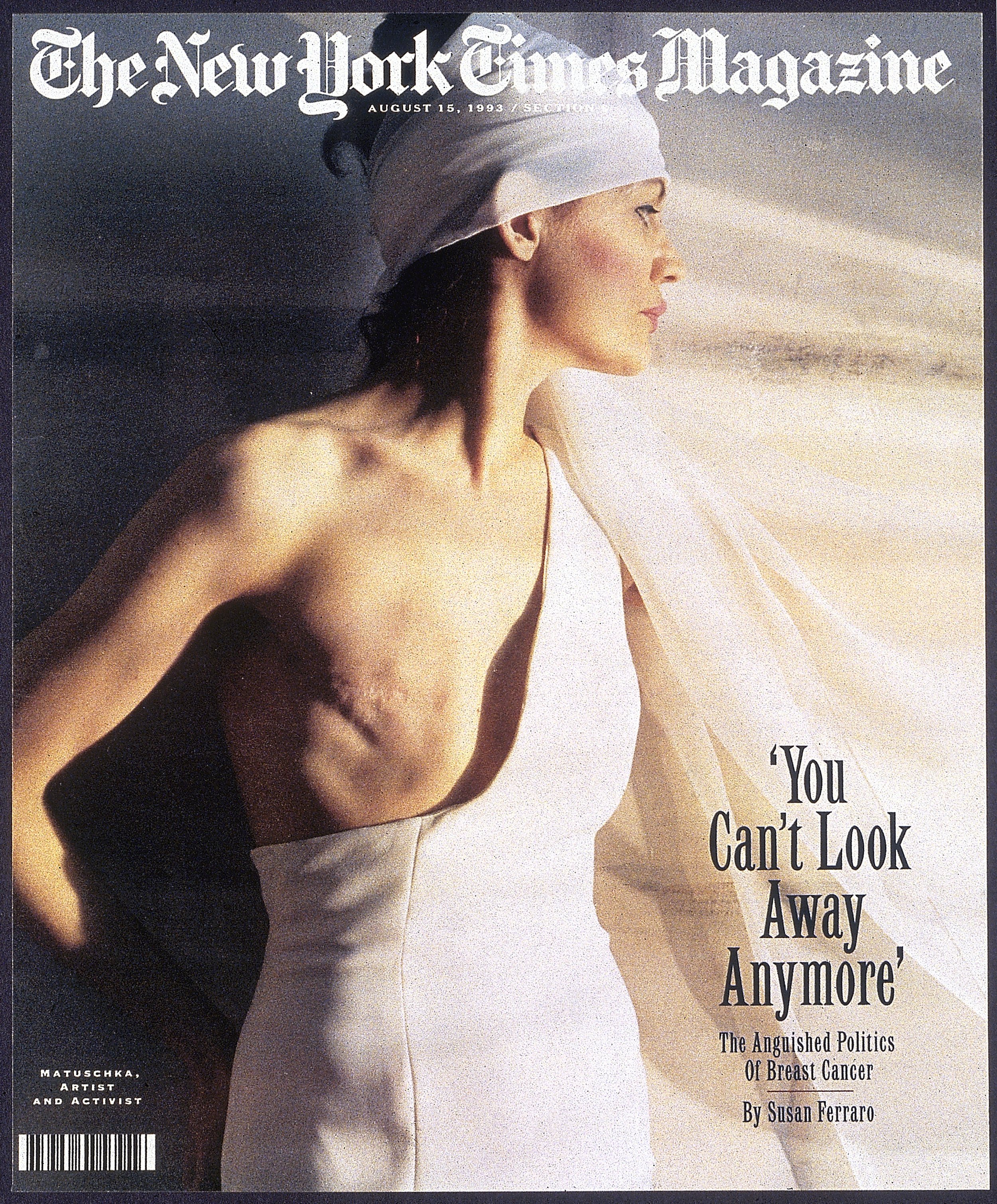
Debra Bishop: Working at the Times, gave you a platform to cover news and make news. And I’m thinking about the 9/11 cover and the Matuschka mastectomy cover. Tell us a little bit about working on these famous covers and any others that stand out.
Janet Froelich: A couple of other ones also stand out. Romanian orphans, which I was thinking about because of the Ukraine. And then a year after 9/11, the Reimagining Rebuilding New York issue. You know, the Times magazine has this remarkable platform to speak to people. And so many people got the newspaper on Sunday. So many people looked at the magazine. So you knew when you created either a story, or an artwork, or a cover, that it was going to find its way onto the coffee tables or the desks of important people. 9/11 was a fascinating case in point.
I live in Manhattan. And on that Tuesday, September 11th, when the buildings came down, when the planes went into those buildings, I was on my way to work. And I knew that I had to get there really fast.
It was the last subway uptown, as a matter of fact, for … I don’t know how long the subways were gone after that. And we immediately set to work ripping apart what we were working on and creating a new magazine. The Times magazine comes out—in those days it was about 13 days, is my recollection. Now it’s more like 10 days before you actually received it in your Sunday newspaper. So we had to be thinking about what people would think about 13 days from this moment, not what we’re thinking about right now. And the buildings were—the dust cloud was still settling in New York. We still didn’t know whether 33,000 people or 3,000 people were dead in that rubble. And we had to start thinking about a magazine 13 days hence. And Adam Moss was the editor through that period. He was a remarkable editor and he asked all the right questions and immediately everyone decided that the way to deal with this was to ask the smartest minds, the best writers, the best photographers, the best editors to each, independently, come up with a personal take on the events.
So they went to great writers. They went to great photographers. And Adam asked the art department to think about a memorial—it was crazy to think about a memorial! This was Wednesday morning, probably a day later, and I walked to work and I walked home. It’s a couple of miles. And he asked us to think about what we want to see on the cover 13 days hence and asked us to think about memorial. So I started calling artists—with a great deal of humility and somewhat embarrassment because some of them lived in lower Manhattan and had looked out the window and seen the planes a day or two beforehand—and asking them to create a memorial when they didn't even know what had happened yet. It was nuts. And most of them just gave me a sort of blank, “No.” But I called Anne Pasternak, who was the executive director of Creative Time.
“We still didn’t know whether 33,000 people or 3,000 people were dead in that rubble”
She’s now the director of the Brooklyn Museum. And she knew of these artists who had all been working in the north tower of the World Trade Center, most of whom had survived because they weren’t there overnight or in the early morning hours. And two of them, Paul Myoda and Julian LaVerdiere, had been part of a team working on something that they instantly turned into a kind of Memorial. They were shooting beams of light into the sky from the top of the north tower. When the towers were still very much, you know, solid buildings in the city. And they took that idea and morphed it into a drawing for these beams of light, two beams of light, that would go to the heavens. And it was a pencil sketch, and we printed it in the magazine on the inside pages. But it was inspired and inspirational.
And we started to think about how to make that into a cover. And looking at photographs of lower Manhattan. Kathy Ryan, the director of photography, came up with literally hundreds of pictures that we looked through. And none of them gave us the kind of background that would feel like the haunted landscape that was in lower Manhattan until Fred Conrad’s picture taken the night, or the late afternoon, after the initial collapse of the buildings in which you have the sea of emptiness, taken from the barge near New Jersey, looking towards Ground Zero. And there was a dust cloud moving horizontally across the picture. And we took it to Nucleus, a digital house at the time. And you have to think—this is 9/11, 2001—where Photoshop was. It was pretty rudimentary still.
And it took six, seven hours late at night with me working with the guys at Nucleus, trying to take this horizontal dust cloud and morphing it into two vertical shafts. But when we were finished, Adam said, “That’s the cover.” And we put it on the cover and within a year, The Municipal Arts Society and Creative Time worked with the city on creating an actual memorial that replicated what the cover looked like, and has, every single year since then, illuminated the night sky on the week of 9/11.
It was an amazing experience. It was a way to process. I think about it right now, with what’s going on in Ukraine, and I feel this great longing to be in a magazine environment where people are actually thinking about what’s going on and how to make sense of it. That’s the extraordinary pleasure of working on a magazine.
Patrick Mitchell: Usually there’s, like, a competition for those memorial designs that takes years, right? World famous architects submit all these designs. It seems like that one just got slam-dunk approved. Probably because of the power of that cover.
Janet Froelich: I don’t know how much the cover actually had to do with that. I sort of hope that it helped influence, but it’s the haunting quality of the light that I think—and it’s not a physical thing because there are physical things down at Ground Zero at this point. It took years to build them, but they’re there.
Patrick Mitchell: And there were a couple other favorites you mentioned.
Janet Froelich: Matuschka and the Romanian orphans. Matuschka was an interesting example of pushing the boundaries of what is allowed on a national magazine that reaches the coffee tables of families, where children—that’s what people always worry about, that your young children might be exposed to images that are disturbing, that shake them up a little bit, that make them question things that are frightening. Matuschka was this really interesting artist who had had a mastectomy and who had decided to use her body and the mastectomy itself as her art form. And so she designed a dress that covered the one side of her body that still had her natural breast and left the other side open, like a kind of a kind of toga. And you could see the scar where her breast had been. And she’s a beautiful woman and she photographed herself and she did a lovely job with the images and they were quite haunting.
And we were looking for a cover on a story about breast cancer. And we decided to try it, you know, we had these mattes and we would put mattes on the images and show them to our editors. And they would kind of say “yay” or “nay” to things. And I was blown away because all of my editors were men. Every last one of them. And the editors of the newspaper have to approve The New York Times Magazine’s covers. I don’t know if that’s still the case now, but it was then. Every single cover, every single week, we had to walk down to the third floor, which is where the masthead was located and show our covers and get an approval. And once in a blue moon, they would reject them. But every single editor said yes to this.
So it must have had some compelling factors that made them kind of look at her and say, “It needs to be seen. It needs to be shown.”
Readers were not all delighted. There were a lot of negative letters and a lot of positive letters, but I think it changed the landscape a bit. And I think it created an environment, or it helped to create an environment, in which it was more acceptable to talk about it, to show it and, and to try and work for solutions to a medical issue that still is with us.
Debra Bishop: Would you talk about the other cover that you mentioned, the Romanian orphans?
Janet Froelich: This is the power of a global-reach newspaper. James Nachtwey had been in Romania photographing the horrifying way that children who were orphaned were tethered to cribs, given practically no food, treated in a horrific fashion, because the state couldn’t deal with it. And he has this incredibly powerful vision. And he had presented the magazine with a photo essay, which we ran. There was an incredible outpouring of sympathy and resolve. And Americans adopted great numbers of Romanian orphans after that. So the reach of the cover on the Times magazine could not only change events, but also change individual people’s lives.
Debra Bishop: Were you able to fight for the stories you felt strongly about?
Janet Froelich: Oh, you can fight. You don’t always win [laughs]. But you can certainly fight.
You know, it was always sort of interesting. Kathy Ryan and I worked together—she was the photo editor of the magazine and still is—for well over 20 years. And we were frequently the only female members of a meeting, a major meeting on stories. The magazine was predominantly male-edited. The newspaper was predominantly male-edited. And so there were any number of times where we fought really hard for a woman to be on the cover of the magazine. And it was refused because the stories were considered “not as interesting, not as important, not as relevant.” I doesn’t happen, I think, as much any longer because everybody is more aware of the reasons for assumptions based on point of view, male point of view, male-dominated point of view.
Patrick Mitchell: I found a post on the website, aPhotoEditor, about an at-the-time rumored move you were making to Real Simple, and it included the line, “She’s likely just burnt and ready to make some serious cash [laughs],” which is funny, but even funnier was one of the comments that said, “Real Simple can pay Janet all the dough in the world. The fact of the matter is that it’s a magazine that had its day years ago. She would be smart to sock the cash away and retire [laughs].” But that kind of came true, no?
Janet Froelich: Well, I don’t know about “sock the cash away.” The Times notoriously did not pay art directors, creative directors, as much as a lot of other magazines. But, that said, those other magazines didn’t pay that much more [laughs]. So I don’t know if salary is really the most interesting aspect of all of this. But I didn’t go to Real Simple for money. And the Times did make an attempt to match any offers that were there. It was more about wanting—after 25 years—wanting a different experience. Wanting to be on the newsstand. Wanting to actually see what mass-market publications were like. And it just seemed like an interesting step to take.
It’s a funny quote, because Real Simple hadn’t been around for that many years.
Patrick Mitchell: I know! Five or six years and they’re already calling it washed up [laughs].
Janet Froelich: But it started out with a very different mission than it had at the point at which I arrived there. And I thought it would be an interesting challenge.
Patrick Mitchell: Given your record, I can only imagine how many times you got calls from other magazines trying to lure you away from the Times. Can you talk about some of them? What were your closest calls? Any regrets?
Janet Froelich: No. A number of people called me at various points, and it feels sort of funny to get into them now just because different people got hired and different things happened. But the closest call, that I thought was sort of interesting for me, was that I almost—I think this probably happened to a dozen other art directors—I almost went to J.Crew. J.Crew, I think, liked to think of itself and its catalog as a magazine and looked to editorial minds to try to, I guess, grab readers and intrigue potential purchasers of J.Crew clothing. So I talked to them quite seriously. And very luckily, at the last minute, a big Texas conglomerate bought them out. And the woman who I had interviewed with, Emily Woods, who was the daughter of the founder of J.Crew, was let go and the whole thing sort of fell apart. Luckily I had not accepted the position.
• • •
Debra Bishop: Switching gears just a little, can you imagine making a weekly magazine during COVID?
Janet Froelich: Yeah, I can imagine it, but I mean, I actually should shift the gears and ask you what it’s like, Deb. Because you actually probably do that at this point. I mean, I know it’s not weekly what you’re doing there, but it’s probably got a lot of tight deadlines.
Debra Bishop: It takes a while to get used to remote working.
Janet Froelich: The thing that I can’t quite imagine is what it’s like not to have the closeness of all those people standing around of the counters that are frequently in the art departments of magazines, talking to editors, photo editors, designers about what’s going on on the pages you’re designing. It’s an incredibly freewheeling, wonderful give-and-take that has to have been missed sorely for the past couple years as COVID prevented everyone from being in the same room.
Debra Bishop: Absolutely. What do you miss most about making magazines?
Janet Froelich: Just what I was just saying. For me, it’s all about collaboration. It’s about the generation of ideas and where they come from and listening to each other and adding to ideas and making them more complex and layering them and getting other viewpoints. It isn’t a solitary occupation by any stretch of the imagination. You have to be a good collaborator to work in this business. And I that’s the thing I miss the most.
The Goddess Issue of Heresies
Debra Bishop: In 1977, you joined a group of women artists to produce a magazine called Heresies. It was described as “an idea-oriented journal devoted to the examination of art and politics from a feminine perspective.” Can you talk a little about the circumstances that brought you there and the role it played in your career?
Janet Froelich: I started out, in life and in my professional life, as a painter. I studied fine art. I went to college and to graduate school as a fine artist. And I spent ten years working on a fine art career. I taught school to support myself, and I lived in Soho, which was a very scruffy artist colony in the early ’70s. And I had a lot of art-world friends, but my career as a painter really never took off. And I think I sort of discovered later on why that was, but I started to look around for other ways to live a creative life. And I thought about going to law school. I actually took the law boards and thought for about ten seconds about spending three years of my life going to law school.
And I became involved with a group of women artists on this publication, Heresies, a feminist publication on art and politics. It came about in an era—I mean, it’s still a little bit like this, but much less so—in which all of the art, the shows, and galleries, and museums were all of men. There were plenty of women artists, but they couldn’t get a show. And if they got a show, it was in a very small, backwater gallery somewhere. And every time there was a Whitney Biennial or a major group show mounted, it was 99% male. There were very few opportunities for women artists and it made women very angry. And some of them were incredibly talented. All of them were incredibly talented women and very serious artists.
So they banded together and created this journal, which had an interesting premise. Each issue was edited by a different group of people, a collective. And each issue had a different focus. Some of them dealt with culture, with art issues, and some of them dealt with issues of personality and focused on sexuality. There was one issue called “The Goddess Issue” which had to do with rethinking religion.
But all of them were focused on art and the art world. And I became involved with them for the second issue. And I became a member of the main collective. And I discovered while working with them that I just loved the process of working with a group of people. Of working with writers and editors and designers. And I think I developed a love of magazines through working on this journal. I stayed working with them for about two years and until I got a job working at the New York Daily News, and there was no time left for Heresies.
Debra Bishop: You went from one profession—art—that was difficult for women into another one: graphic design. And while there have been women who have changed magazines forever, like you, it’s still a male-dominated business. Why do you think that is?
Janet Froelich: Oh, that’s a really good question. And I’ve thought about it over the years because, you know, frequently I would interview candidates for design positions at the Times or even at Real Simple and 90% of the candidates were female. They’re all women. But by the time you walked up the ladder, especially in earlier years of my career, there were only men who had the top jobs. It’s hard to say exactly why that was it. It has to do with the same things that happened in every other field out there. Women tended not to push themselves as hard. They tended to make other decisions about having families and dealing with the responsibilities that children entail. And they also had to deal with the way the people at the top, the bosses who were mostly men, saw them and perceived them and gave them opportunities or mentored them.
Whether that’s all still true now I don’t know. I have to leave that to people who study that stuff. I think it might be changing, little by little. It’s certainly not as bad in our profession as it is in, let's say, conducting. I mean, there are so few women conductors of major symphonies. Why is that?
Debra Bishop: Janet, you said that you learned publication design at Heresies. Were you self-taught or did you have mentors there?
Janet Froelich: I didn’t really have mentors at Heresies because nobody knew what we—we had no idea what we were doing! We had to get people to come teach us, paste-up and mechanicals, you know, those were the pre-computer days. And it was all about rubber cement [laughs]. And this is one of the regrets that I’ve had over the years is that I never really studied graphic design. I never really studied typography. I studied the work of other people who came before me and people who worked simultaneously with the work that I was doing. And so I hate saying I’m “self taught” because that’s a very arrogant thing to say. I stand on the shoulders of so many other people, but I didn’t study it in school. In school I studied painting. I will say that the skills that I have as an artist having studied painting have an enormous impact on the way that I worked and the work that I did over the years.
Debra Bishop: Did you have strong female role models?
Janet Froelich: I suppose a few. The biggest one is Ruth Ansel. Ruth Ansel was an art director at The New York Times a decade or so before I got there and she had been a close collaborator with Bea Feitler, who is a sort of hero in the graphic design world and in the magazine design world. And Ruth Ansel I remember because I collected U&lc, those wonderful publications that Herb Lubalin and Aaron Burns put out. There was a piece on her and they called her a “rara avis”—a rare bird. And she was a rare bird. She was the only woman art director in her time. I mean, there was Cipe Pinelas and a few others before her, but there really were so few of them. So, you know, she stands out as an important figure to me.
Debra Bishop: As a woman, do you feel that you’ve had to fight for some respect during your career?
Janet Froelich: I’m sure I did [laughs], but it wasn’t a predominant feeling. For whatever reason at the Times, I was always respected and I always felt listened to. And I felt like I belonged. And like I was part of the team.
Patrick Mitchell: You’ve worked for two editors who are in the ASME Magazine Editors Hall of Fame: Clay Felker and Adam Moss. How do they compare—two men in two different eras?
Janet Froelich: You know, I didn’t … I know Adam Moss really well, and I worked very, very closely with him for a bunch of years. Clay Felker I didn’t know as well. And he was just a figure in the newsroom at the Daily News at a really interesting moment in time for them, which was trying to compete with both The New York Times as well as other afternoon newspapers in the city. He had developed something they called the Tonight Paper. These are newspaper wars that you’d never see today because nobody reads newspapers any longer, but Clay Felker, it was just interesting to watch him try to transform a tabloid news organization into a sophisticated processor of news for a much more literary, sophisticated audience. And I loved his story ideas. I liked the way he packaged things, but I didn't really know him terribly well.
Adam Moss is one of the best magazine minds of his generation—of anybody’s generation. And he’s an inspiration to work with. And everybody who’s ever worked with him, for him, credits him for the best of their work. He just had a way of pushing you harder and further. He had a way of asking questions, the answers of which would bring you to a much more exciting solution. And he just had a way of pulling people together as a team.
Patrick Mitchell: You predated Adam at the Times. When he came in, what was the brief?
Janet Froelich: Adam came in as the associate to Jack Rosenthal. And I think it was done to—Jack Rosenthal, who was the editor at the time, was very much from a previous generation, an older man with a much more conservative point of view. I believe Joe Lelyveld at the time, who was the editor of the newspaper, wanted someone to be a kind of foil to that, wanted somebody to push Jack a little bit. So Adam was the associate, and Adam had been there for a couple years by the time Jack left to retire and move on to the Times Foundation. Then Adam took over. So the brief for Adam, I think in the beginning, was to push back a little bit towards a more “adventurous” way of editing the magazine. I think Adam established his own brief, which was to make the Times ever more relevant, to continuing younger generations of readers.
Debra Bishop: In 2004, you and Stefano Tonchi partnered to launch T, The New York Times Style Magazine, widely considered one of the most beautiful magazines in the world. And certainly awarded as such over the years. I’d love to hear how you partnered with him to create such a legendary brand.
Janet Froelich: The Times had always published a series of what they call “Part II Magazines.” And they covered a disparate group of subjects: men’s fashion, women’s fashion, home design, travel, and food. And the idea was to try to bring them all under one roof and give them all an identity. And they were advertising magnets and the Times began to see that it had a product that could generate revenue. So they brought Stefano in, and he was a men’s fashion editor—I think he had been at GQ, no at Esquire—but Stefano also deeply connected to the art world. His husband—partner at the time, but then became his husband—David Malcolm was a gallery dealer. They lived with a lot of fine art. The connection between the “low” arts and the “high” arts fashion design and, and painting and sculpture. The lines of demarcation for those things were completely blurred and Stefano brought all of that to the table with T.
And this was just right up the alley for me coming out of a fine arts background, loving working with artists—which I’d always done at the Times magazine—to solve a lot of the visual problems that we had. And so Stefano and I kind of together came up with calling it T, which is a little bit modeled on an Italian publication called D but also W. And we gave the magazine a kind of a particular identity that would be strong enough to cover the disparate subjects and still feel like one publication.
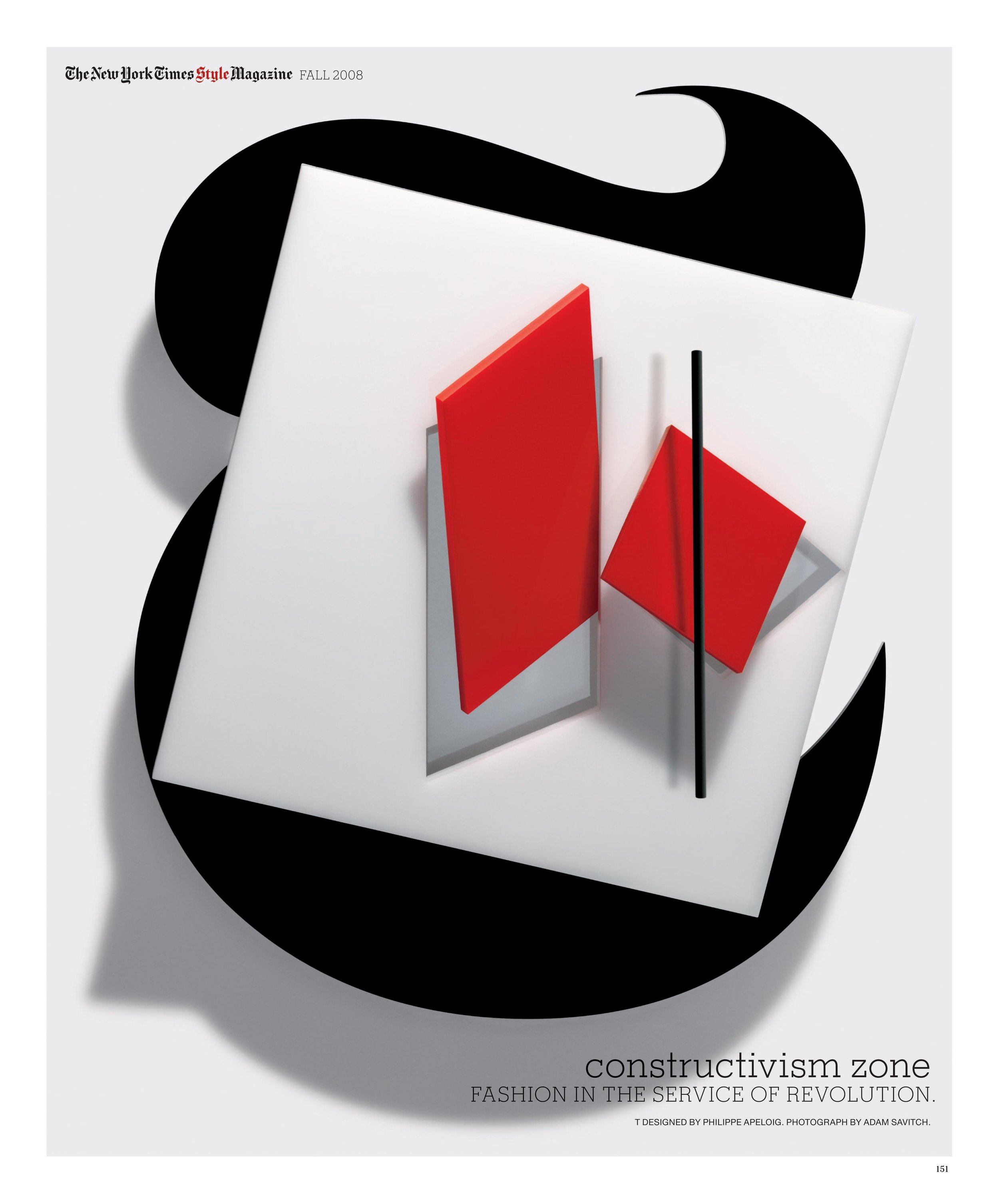
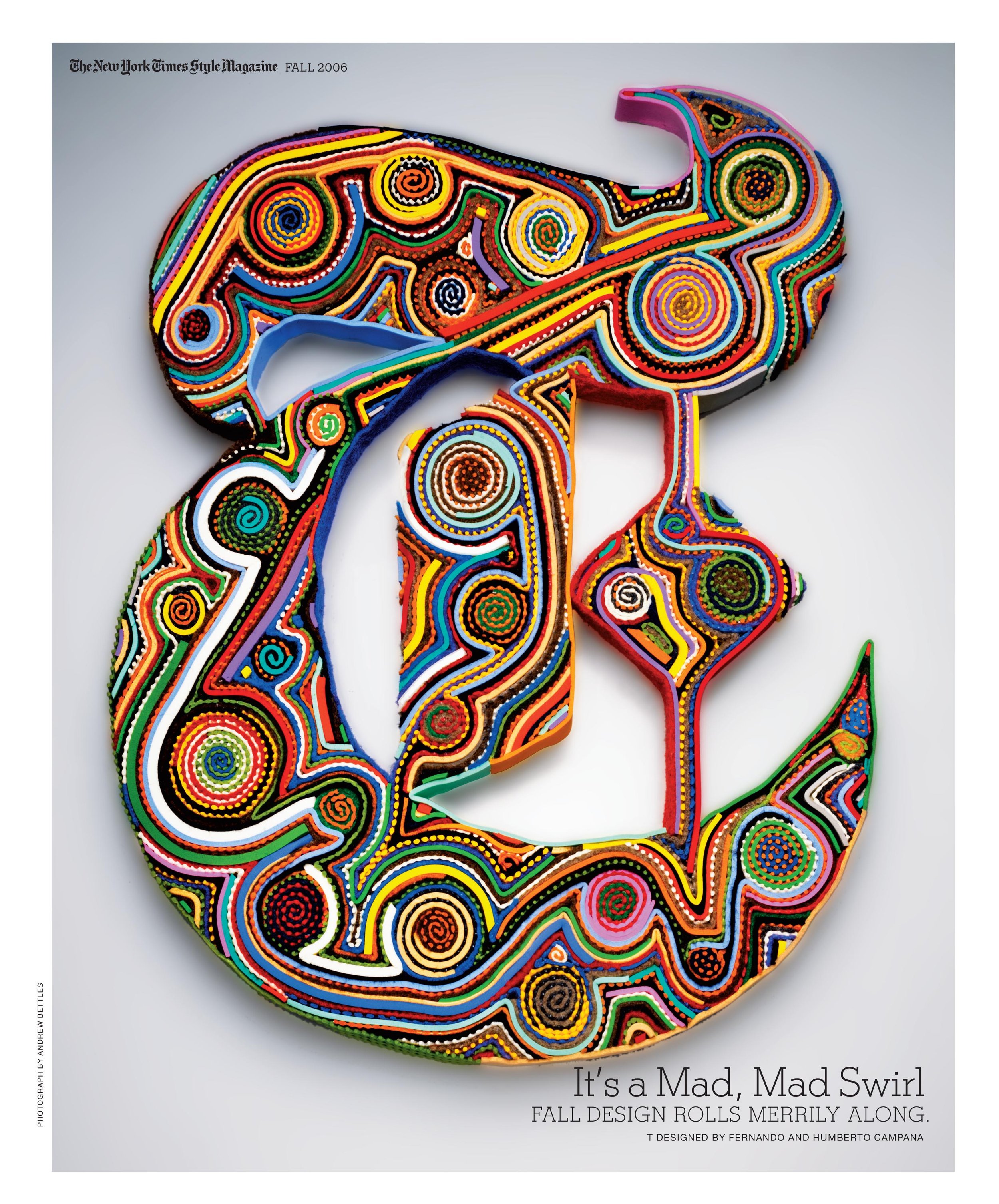
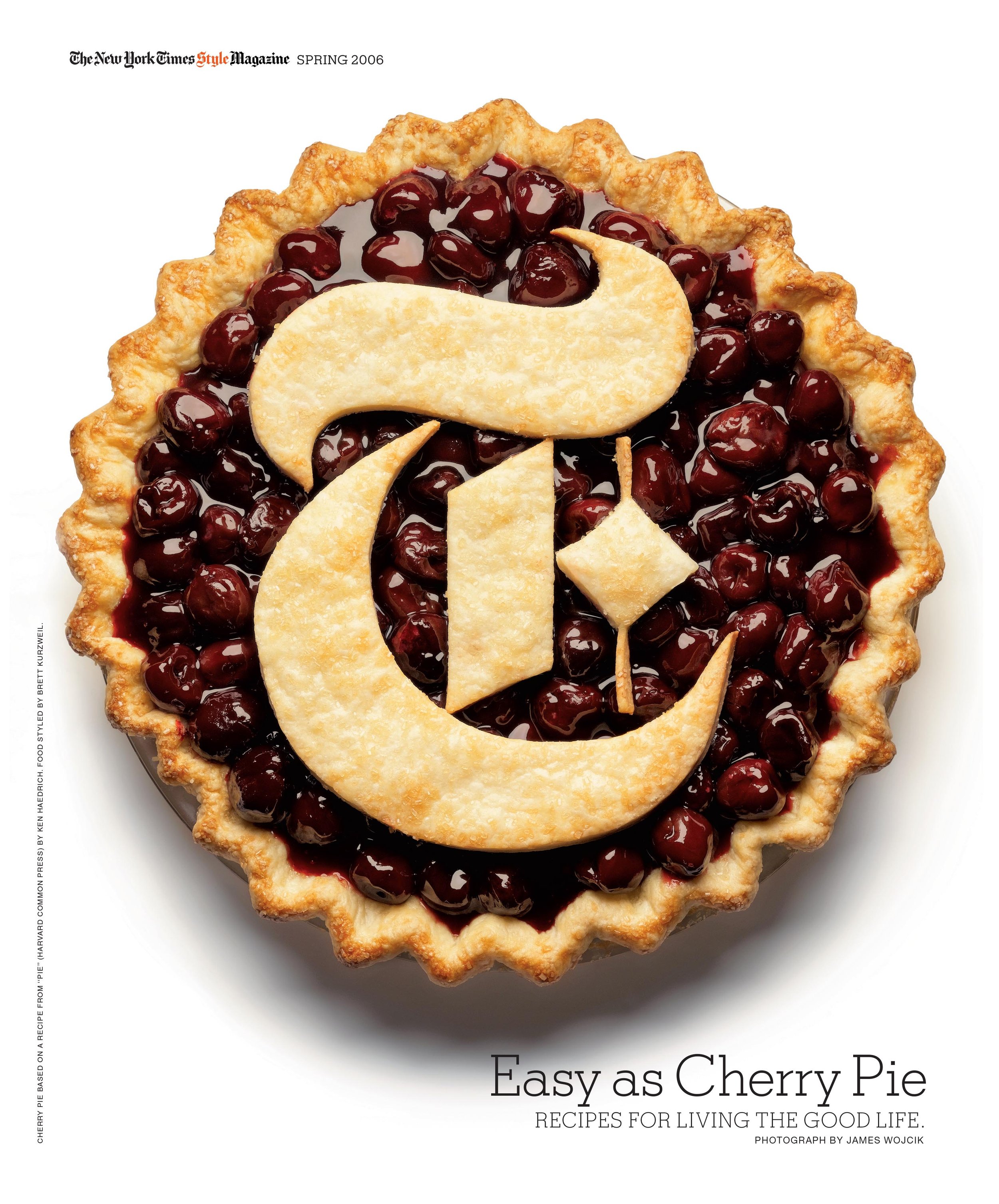
Debra Bishop: Well, I was always enthralled with the way you took the T—I mean, it seems like a natural idea to take the big, giant T and play with it—and created bespoke openers with it.
Janet Froelich: You know, over the years, I’ve always loved taking a particular problem or assignment and sending it to like ten different artists or eight different artists—and I had done a lot of that—and asking them to interpret it. And I think a little bit of credit here goes to Fred Woodward who did “Draw the Cowboy” with a whole bunch of illustrators. And I always had that in my head as Draw the Cowboy—I wanna repeat that, but do it in my own way. And I had done it a number of times in the magazine. I had done it in design issues.
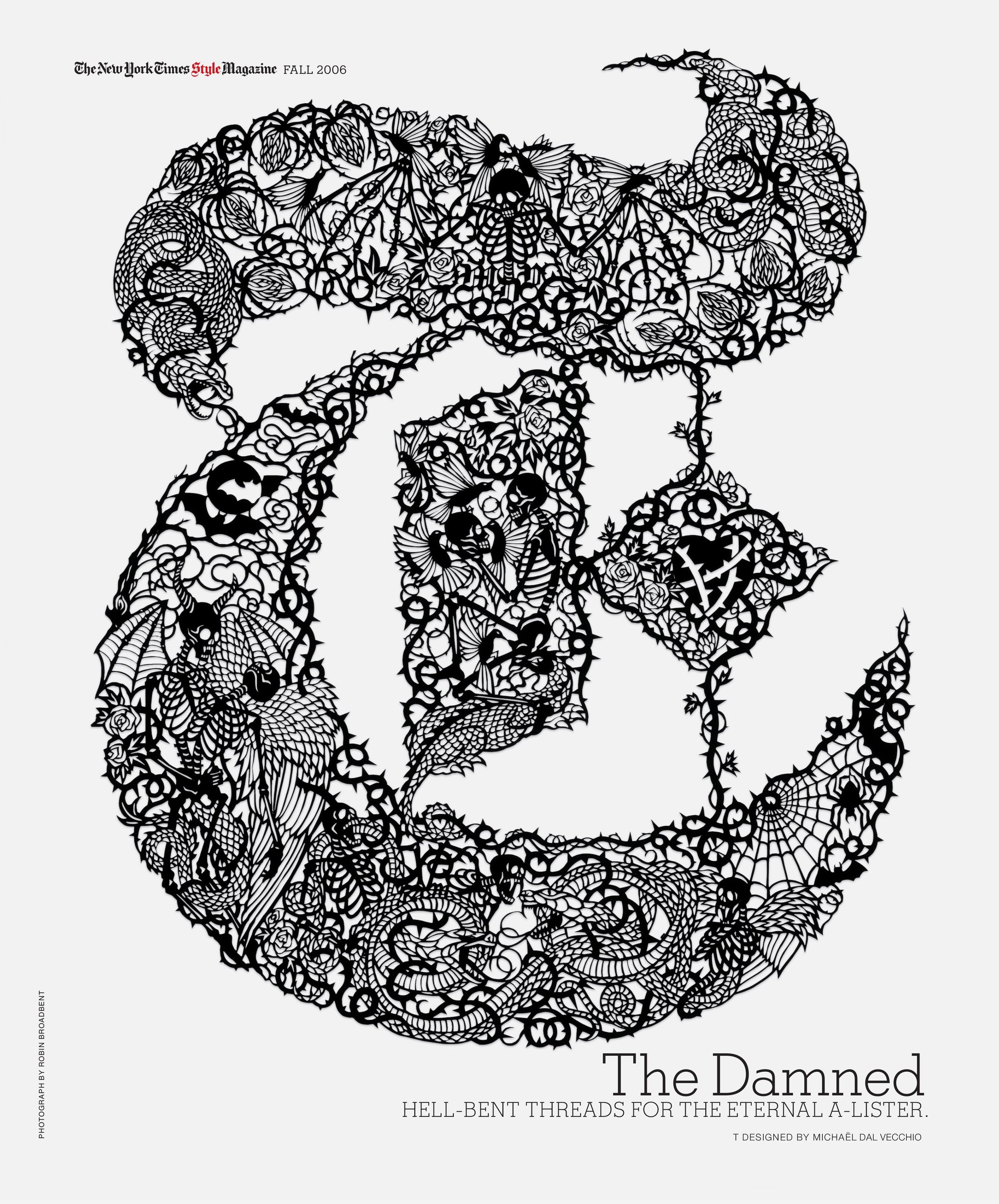
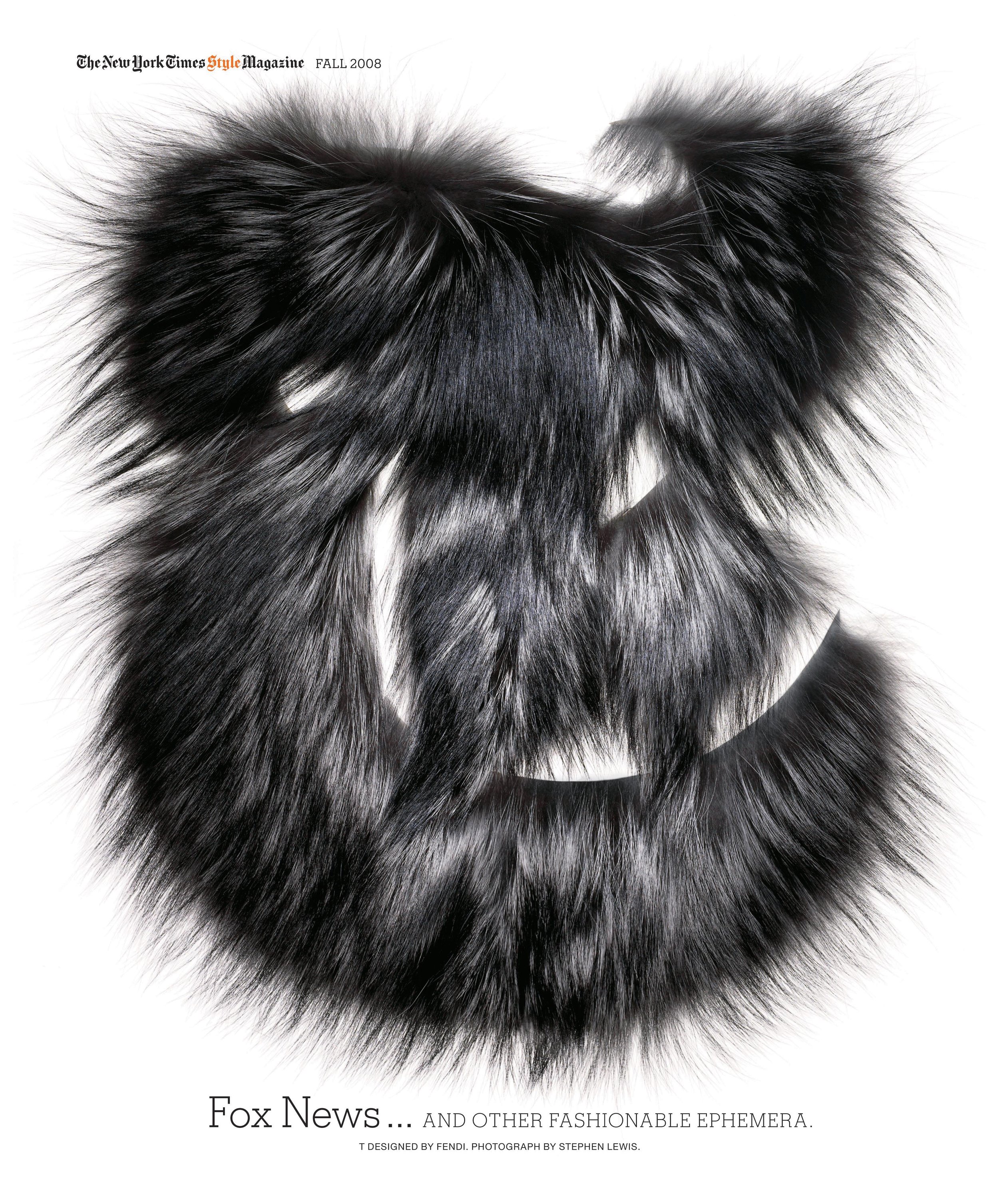
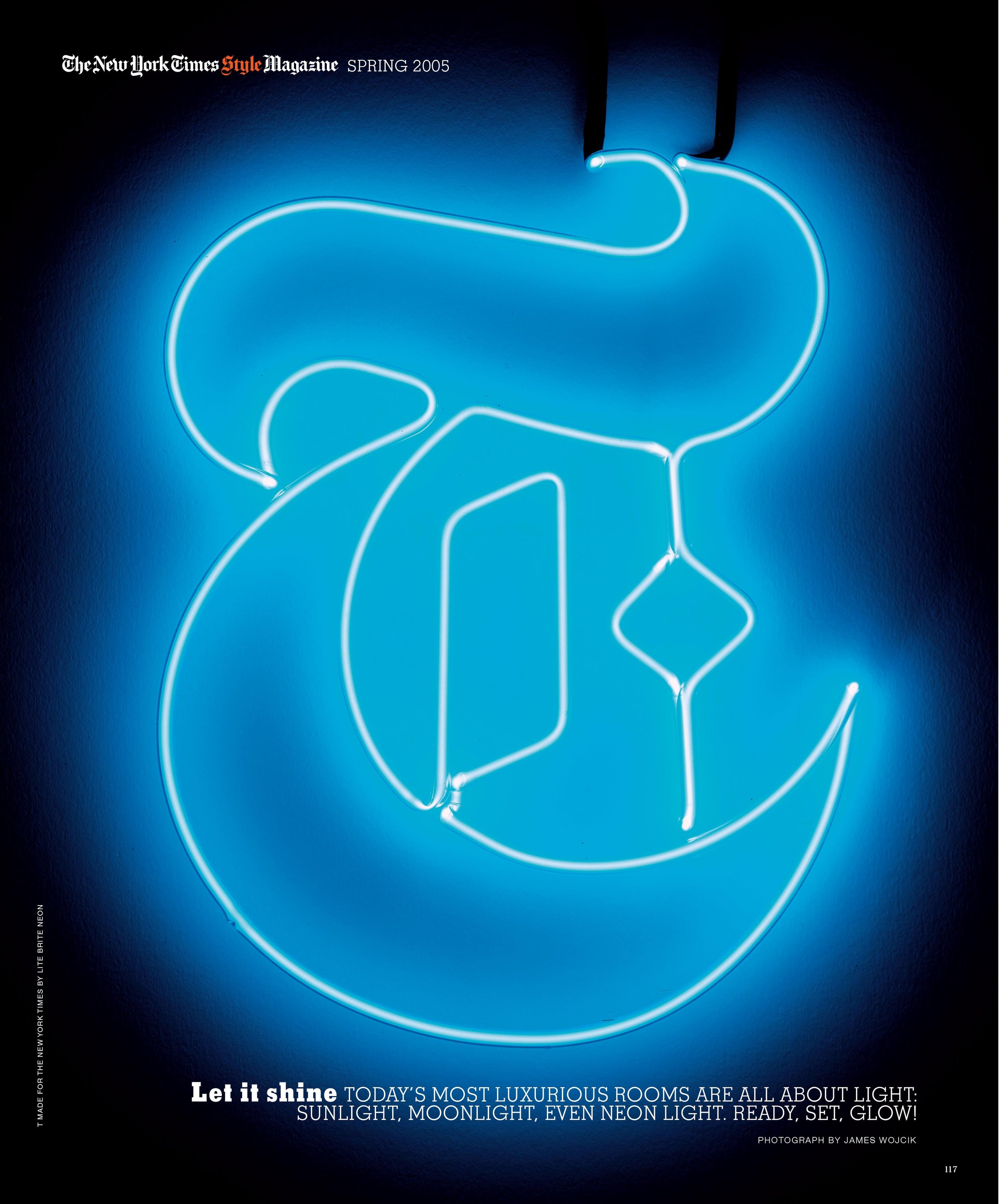
So it was sort of a natural. It was just part of my vocabulary to take the big, chunky “T” that Matthew Carter had done for me and send it out. It wasn’t just to artists though. We actually sent it to Fendi and they did a fur “T.” We sent it to Let There Be Neon, and they did a neon “T.” We sent it to the Campana Brothers, who do furniture, and they made an upholstered “T.” We even mowed a “T” into a cornfield in upstate New York! We just had a load of fun with it. And when I left the magazine, David Sebbah kept it going. And the last “T” was done by Fabien Baron. So it kind of, the full circle was really quite nice. I was very sad when they let go of the “T,” but I am an admirer of the current design of T. And I am an admirer of T magazine now.
Patrick Mitchell: So you spent 22 years in the newspaper business. And even though you were mostly working on magazines, newsstand magazines are a different animal. How did Kristin van Ogtrop convince you to take the leap and join her at Real Simple?
Janet Froelich: You know, I like Kristin a lot. And so partly it was just her infectious personality. And we had a couple of lunches and I really enjoyed being with her. But she wanted something—she wanted to make Real Simple into something different. And, you know, her husband works at The New York Times Magazine. She’s married to a story editor at the Times magazine. So she kind of knows the magazine really well. And she wanted some aspect of what we had done at the Times magazine to be brought to bear on Real Simple. And it excited me to think about working with her. I liked her. I also think I felt that things were changing at the Times, and I wasn't quite sure that I wanted to stay there through whatever the changes that were going to happen were.
Stefano, I knew was going to leave. Adam was going to leave. Adam had left. So I think it was just Kristin herself and her personality. And also, I just liked something about the challenge of doing, as I said earlier, doing this newsstand magazine.
Debra Bishop: Was that the first time you’d ever worked with a woman?
Janet Froelich: No. Claudia Payne was the deputy editor to Warren Hogue. I saw, I think, six sets of editors [laughs] at the Times. Usually they, new editors come in, and they fire the art director. But I always stayed on. I think that has as much to do with The New York Times’ allegiance to people as it does to my own success at the magazine. Claudia Payne was the deputy to Warren Hogue, but she was a very forceful deputy and a force to reckon with. And so I think she was the first woman that I worked for in that sense.
Patrick Mitchell: How did things end at Real Simple?
Janet Froelich: You know, it’s a sad and telling story. The magazine group was sold. Time …
Patrick Mitchell: … Time Inc. started it and sold it to someone else, like Meredith?
Janet Froelich: Meredith came a little bit later. It was Time Warner who was trying to consolidate its holdings and trying to figure out how to staunch the losses of several of their publications. Real Simple was a success and was making money. So they started to take money from Real Simple and not put it back into Real Simple. And we started to have budget cuts and people overseeing our issues and our mission who had nothing to do with magazine. They were business-side people, and you could see the handwriting on the wall that things were changing in the magazine business. That money was drying up. That the vision for the magazine was gonna change. Kristin felt it. And I knew she was going to leave. And I was getting to a point where I didn’t need to work all the time. And I was getting to an age where I didn’t need to work all the time. So I put it all together and decided it was a moment to let it go.
Patrick Mitchell: Good call. It only got worse after that.
Janet Froelich: It got a lot worse. Yeah. But the business is a challenging one now. And, and it’s kind of sad to me. I used to sit on the subway and see the newspapers that I had designed, the magazine that I had designed, in people’s hands, on the floor, you know, kind of being stepped on. But it was alive and people were living with it. Nobody does anything but read their phones now. And I don’t necessarily think that’s bad. I’m not one of those people who looks back and says, “Oh, the good old days, it was so much better.” I just think it’s different. And we all have to learn to live with it. It kind of reminds me a lot of what happened to 12-inch record album covers going down to those tiny, little CD cases, and smaller still, like a little icon on your phone.
Patrick Mitchell: Do you buy any magazines now?
Janet Froelich: I’m a subscriber to The New Yorker, to The Atlantic, to New York magazine. I get The New York Times delivered. My husband and I read the paper every day and I get the Sunday paper. But other than that, I don’t buy them. I used to be a magazine junkie. I used to describe myself as a magazine junkie. I had piles of magazines on my desk all the time, looking to see what people are doing. It’s unnatural to kind of not do that anymore.
Patrick Mitchell: You have a limited selection, but is there a magazine that you really admire the design of right now?
Janet Froelich: You know, the ones that I subscribe to. Yeah. And I do admire T. I think Patrick Li does a lovely job on it. I think it’s a well-designed. And I know there are so many niche magazines. Now, the food magazines and the lifestyle magazines and the fashion magazines that are printed on extraordinarily lovely paper. And you probably print, all told, 500 copies and they go to 500 people, but they’re gorgeous. And there are a lot of those, but they don’t have enormous influence in the culture because not enough people live with them.
Debra Bishop: You’re a New Yorker through and through. You were born in Brooklyn and raised in the burbs, which ones?
Janet Froelich: Oh, I was just raised in Queens. I don’t know if that’s a burb [laughs]. It’s like a lot of hip, young people live in Queens now. But born in Brooklyn, raised in Queens.
Debra Bishop: And what did your parents do?
Janet Froelich: My mother was a homemaker. My father ran a business called Froelich Lightcraft, and he designed and manufactured lighting fixtures. My father died when I was a little girl and my mother took over the business, but she was not a designer. She just went in a couple of days a week to keep the business afloat as best she could. She called it “going to business [laughs].” That was her phrase.
And she was the only mother of any friend I ever had who worked!
Debra Bishop: Have you ever lived anywhere else other than New York?
Janet Froelich: Not in a really permanent way. I mean, I went away to college and I went away to graduate school and I lived for about three quarters of the year in Paris when I was 20 years old. And I took care of a baby. I worked au pair. But other than that, no. I’m a New Yorker [laughs].
Debra Bishop: Things have obviously changed since you were a kid. Manhattan is different. Brooklyn is different. The art world is different. What was the young Janet’s dream in those days?
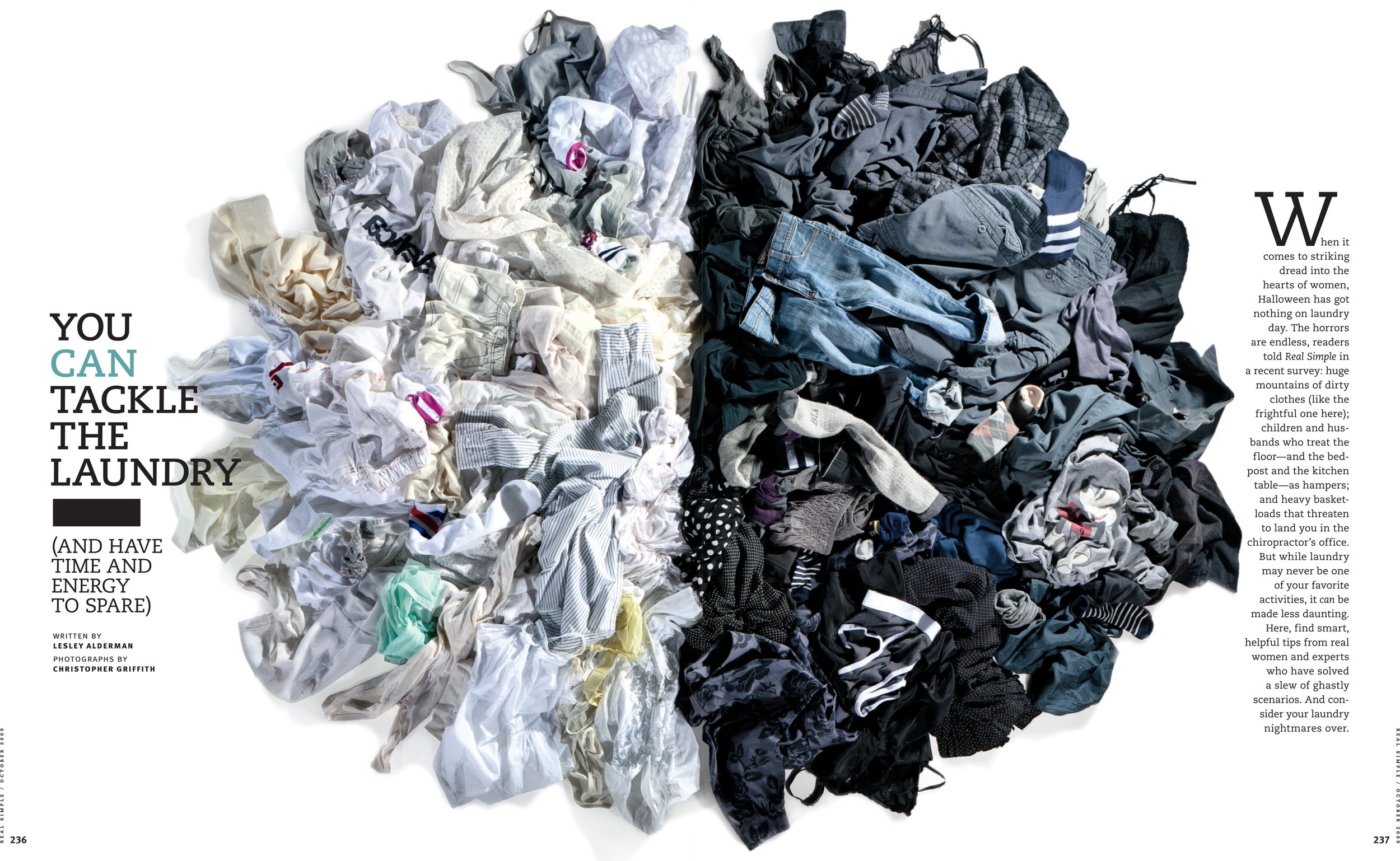
Janet Froelich: I wanted to be a fashion designer. And I drew all the time. I drew pictures of girls in—I’m sure this is a classic girl thing [laughs]—I drew pictures of girls in fancy dresses. And the cover of the book was always “Fashions by Janét” [laughs]. I mean, it’s sort of embarrassing at this point.
And then in high school, I had a remarkable mentor, a man named Philip Frankel, who ran something called the “Art Squad.” And we did signs and posters. And I designed the yearbook. And I designed the logo for my school newspaper. And I loved graphic design. And then I went away to college and graphic design was “commercial art,” and it was really denigrated and I was very influenced by that. And so I became a painter. So it’s like full circle. You know, when I hit my late 20s, early 30s, getting into graphic design.
Debra Bishop: What was the first magazine you can remember having an effect on you where you actually noticed the design?
Janet Froelich: We got Time magazine when I was a kid in my house. And we got Life. And I think Life probably had the most affect on me because of the quality of the images. And because it was well designed.
Patrick Mitchell: You lived in a loft in Soho before Soho was “Soho.” In the ’70s, parts of New York were still frontiers, including Soho. What was it like being in your 20s in that world?
Janet Froelich: It was a mixed bag. And the nostalgia for it creates a kind of glossy answer that it was “romantic” and it was “exciting” and it was “wonderful.” But it was also hard. It was about working all day in your studio and going out at night to art bars and talking art with people and trying to figure out what the next step in your career might be. It was about trying to find inexpensive places to live and to work—which wasn’t easy. But it was a whole lot easier then than it is now. So I suppose even that…


Patrick Mitchell: …I’m a rube from Texas. I didn’t get to New York till the ’80s, but, even then, Soho was pretty rough.
Janet Froelich: I never found it rough. I guess I was used to it. But if you got into a taxi and ask them to take you to Broome Street, or, uh, Mulberry Street—I lived on Mulberry, which was actually more Little Italy, in a factory building in a loft, but more Little Italy than Soho—but the cab drivers didn’t know where any of those streets were. Now you say “Broome Street” and they know exactly where to go. But the neighborhood evolved slowly. You know, I remember the first bar that appeared in Soho and the first boutique that appeared in Soho in the midst of cigar factories, and doll factories, and mannequin factories that proliferated, and rag factories. And the first loft that my husband and I lived in had a stencil on the elevator “Flexide Plastic Novelty Company.”
Debra Bishop: Are you still living in Soho?
Janet Froelich: No. I live west of Soho now. It’s sometimes called West Soho, but it’s also called Hudson Square. It’s pushed far enough beyond West Broadway to no longer really be Soho.
Patrick Mitchell: When you were in Soho in the ’70s and you were in the art world, that was like primetime Andy Warhol, Studio54. Did you get involved in any of that?
Janet Froelich: No, not in any kind of major way. Although I used to love to hang out at Max’s Kansas City. And he was there, as were a lot of other people. But for the most part I was in a sort of less cool group [laughs].
Debra Bishop: How would you advise young Janet to follow her dreams in 2022?
Janet Froelich: You know, I always told young people who came to see me, either with their portfolios or just to talk about careers, “Work for the most exciting person you possibly can. Don’t go for the money in the beginning. Go for the ideas, the talent, the brilliance. You want to work with good people.” So that’s first off. The second thing is, I don’t think editorial is, right now, a career with a lot of potential. There’s so few places to work any longer that I think you really have to kind of mix it up and work for different kinds of organizations and work for different kinds of designers to get a sense of where you can apply your craft.
“Work for the most exciting person you possibly can. Don’t go for the money in the beginning. Go for the ideas, the talent, the brilliance. You want to work with good people.”
Patrick Mitchell: I’m giving you credit for this because, from my memory, it happened on your watch. And I don’t think it could have really happened anywhere else. But over the years, at the Times, you’ve brought in a who’s who of incredibly talented future art directors, among them: Rem Duplessis, David Sebbah, Dirk Barnett, Gale Bichler, Joel Cuyler, Lisa Naftolin, Louise Straus, Chris Dixon, Michele Outland, Jennifer Pastore, Richard Baker, Catherine Gilmore-Barnes, Elizabeth Spiridakis, Scott Stowell, Andrea Fella, Emily Crawford, Kristina DiMatteo, Jeff Glendenning, David Armario, Christopher Martinez, Dragos Lemni, and Jeanette Hodge-Abbink. My God! At Heresies you were part of a collective. Can you talk about how you built your own design collective at the Times?
Janet Froelich: Well, it wasn’t really a design “collective,” but you know, when you put out a magazine like The New York Times Magazine, every single week, and you have to do a good cover every single week and create a good design and it isn’t formatted and you don’t want it to be formatted, you need good people to work with. You can’t do it yourself. And to run a department, you’re not even designing most of the time you’re coming up with ideas or figuring out which ideas work, and then pointing to somebody and say, “You do that.” So I knew I had to hire good people and it’s also spread out over 20 something years, 22, 25. I actually think it’s 25 years. So I looked for, and I was never afraid of, good people. I was never afraid to hire people who I thought were better designers, better thinkers, better commissioners than I was.
So I spent a lot of time looking at, and talking to, good designers and hiring them whenever I could. Sometimes they would just come in for a few months. And sometimes they stayed for a few years. Sometimes they were on staff, and sometimes they were freelance. And I loved it. I loved working with talented people. So I guess—and I think I’m a good collaborator. And I think I’m good at sort of setting people off in the right direction and inspiring them to figure out how to take the puzzle that’s The New York Times Magazine and make it their own. So I, very luckily and happily, got to work with a lot of wonderful people. Some of them were already established, great designers and some of them were at the beginnings of their careers. One or two just fresh out of school. It’s a big operation, you know, and weekly is hard. Weekly is 52 covers a year!
In 2006, Janet Froelich was inducted into the Art Director’s Club Hall of Fame, joining Cipe Pinelas and Bea Feitler. Ruth Ansel was inducted in 2011. On the ADC’s website, Gerald Marzorati, her former colleague at The New York Times Magazine, paid her the ultimate editor’s compliment: “She’s a journalist,” he said. “A journalist, doing with concepts and photographs and illustrations and type treatments what we editors do with words.”
